0

enter image description here

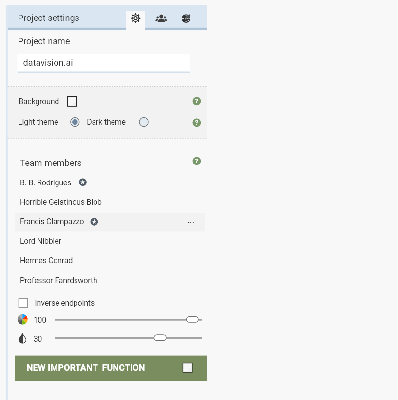
Let's say you have a side panel that's a bit more complex than this, and you have a button called "Fill in with sample data", "Use recommended filters" or "Use AI-generated filters", and you want the user to notice this option above all else. How would you do this? Should you use a color-scheme, if the color-scheme for the button is not enough, should you add some kind of moving icon next to it. How would you attract the attention of the users? It's supposed to be the most prominent button, and something you want every user to try.

I don't know if the image is a good example, but imagine a side panel with 10 times more button and one that's scrollable.

1
  • Ideally it will be displayed as a result of a user action, preferably related. Commented Mar 14, 2023 at 22:49

2 Answers 2

0

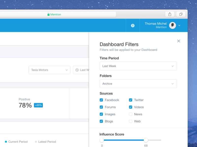
Highlight it as such. Make it different colour and adjust the contract so it stands out.

enter image description here

4
  • In fact, I didn't notice it right away. So I zoomed in, and that dropped it below the fold (viewport). Took me a bit to scroll down then finally noticed it. Maybe it's just me. Commented Mar 14, 2023 at 22:46
  • What would you do if the button is in the middle of the side panel? Would you highlight a large portion around it? Would you move the button to the left and add some text? Would you move the button to the right and put some text above?
    – user154738
    Commented Mar 14, 2023 at 22:56
  • It doesn't matter where it is, you just need to separate and highlight it, so it sands our among other elements. How to achieve that... it depends on your UI, upload a screenshot and I'll try to advise.
    – Garik
    Commented Mar 14, 2023 at 23:10
  • @bloodyKnuckles: it's not just you. I really struggled to spot the option. I think the problem is that with this much contrast it looks like a different sort of UI element (a footer, or submit button). Mentally, I was going "I'm looking for an option, options are dark grey on light grey, ignore everything else, look at UI elements in those colours". This probably wasn't helped by it being at the bottom of the list (previously I've had similar problems with items at the top appearing to be headers). I suspect there's something really interesting going on here. Commented May 10, 2023 at 0:08
0

Applying Gestalt Principles.

  1. Rule of common region: apply different backgrounds for the button and the rest.
  2. Rule of proximity: more whitespace around the button to have it separated from the rest.
  3. Rule of similarity: different color for the Primary button.

Along with this we need to apply the principles of Visual Hierarchy like higher contrast, saturation and larger size.

As many have pointed out in the comments earlier, the order or position among other objects on that page matters as well. Primary button should be visible persistently so that looking at the page users understand what is the first thing to do.

Your Answer

By clicking “Post Your Answer”, you agree to our terms of service and acknowledge you have read our privacy policy.