3

I have an eCommerce site that sells baby clothes. When i think of the different ways i can arrange/organize the main menu i get frustrated on trying to make sense. I start to think of how a physical store is organized. Usually they are separated by gender and age simultaneously:

  • Women (Gender Criteria)
  • Men (Gender Criteria)
  • Kids (Age Criteria)

This really translates in this sections:

  • Adult - Women (Gender and Age Criteria)
  • Adult - Men (Gender and Age Criteria)
  • Kids - Newborns - Boy (Gender and Age Criteria)
  • Kids - Newborns - Girl (Gender and Age Criteria)
  • Kids - Babies - Boy (Gender and Age Criteria)
  • Kids - Babies - Girl (Gender and Age Criteria)
  • Kids - Adolescence - Boy (Gender and Age Criteria)
  • Kids - Adolescence - Girl (Gender and Age Criteria)

So age and gender are the two main filters that people use to start browsing clothes on a physical store and also on the web. I understand this, they are in fact the two most probable mutually exclusive criteria: "Someone who is looking for women clothes most probably isn't interested in simultaneously looking for man clothes", "Someone who looks for adult clothes isn't interested in simultaneously looking for kids clothes".

But in fact they are just two characteristics as any other like size, color, price or even like season, rating, style, etc. In a eCommerce site usually there is a main characteristic that is present on a menu and then a set of filters appear after the first selection. Example:

Main Menu Ladies | Men | Kids | Home

After selecting Men we get something like this, a product area which is already filtered for men clothes and a set of additional filters at the left side bar.
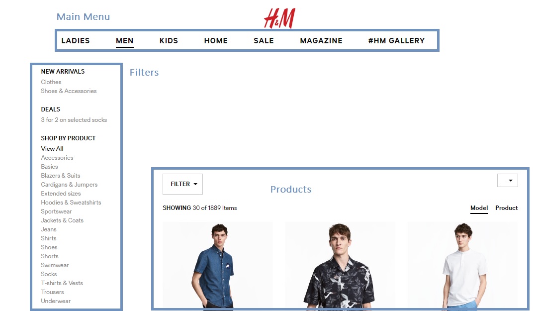
1

Other Examples are just age like:

Main Menu

Adult | Kids | Babies

But this isn't really necessary in a web environment, people could just enter the store and see all products and then have the filters at their disposal, including the typically "man" and "women" filter that is commonly showed on a main menu (in my case "girl", "boy" and "unisex"). This is helpful in my case where i think soon to be mothers would like to browse kids clothes without having to limit the browsing to a gender or age. Why? Because the gender of the baby may be unknown and although they could browse the "unisex" department they may also like to see the options for boy and girl simultaneous. The may have twins, a boy and a girl, and would rather shop for both of them at a time. They may also like to browse clothes for 3 month old and 6 month old at the same time, babies grow very fast and mothers sometimes purchase clothes for different ages. In conclusion, age and gender are not as mutually exclusive in babies.

My options of doing this?

Option 1 Create a menu with a link to the "Store". In this case i would have a main menu with links like this: Store | Contacts | Help

Then all the filters, including the typical "boy", "girl" and "unisex" would appear on the side bar.

Option 2 Create a menu with the typical "boy", "girl" and "unisex" and then have the same filter appear on the left sidebar for filtering. Maybe this would be the more UX friendly option because i would present this in a standard way but i would leave the option for browsing two or more of the gender options ("boy", "girl", "unisex")

None of the options seems very clean, i don't know if there are any other standard ways of doing this. So how do you think is the best option, that doesn't confuse the user and adds value, to take the costumer to an all filter based navigation without the need for him to select any criteria at first? Thanks

3 Answers 3

0

Could you have them as icon? One of a male and one of a female, after they've already selected children's - that should be fairly clear.

Then, for unisex you could either let them select both, or have a third icon of a boy and a girl - ensuring to take advantages of tooltips so the user knows what they're pressing?

3
  • Thanks jock. That was my first plan, to show them as icons on the filter sidebar, as little buttons that showed clearly if they were selected or not, but i think that would bring confusion so i was opting for using a check box filter like the one for selecting colors (a more standard way of multiple selection filter). My topic question is how to take the user to the shop while maintaining this unusual filter for gender but that aspect is also very important because this gender filter is very unusual. Commented Jun 22, 2017 at 15:19
  • You could always move the filter up the page, into the header or nearby and make it really clear. Have the user still 'turn on' the filters in the same way, by clicking the icons, but keep it in the same place so that the user knows they are clearly browsing a certain gender. Alternatively, split the store up, to force the user to browse by genre, so when they click the store it will automatically bring up male/female (whatever is most popular I'd guess) - then, make a very clear button/tab which swaps it to the other options, if that makes sense? Commented Jun 22, 2017 at 15:24
  • Thanks Jock, my main goal was not to force the user to select a gender/age as most of apparel / clothing sites do, i know it's strange. They usually have this option of gender in a main menu and then allow people to filter after that. How do i do this in a User friendly way is my main doubt. Commented Jun 22, 2017 at 16:03
0

Since your domain in more focused, you could use the homepage to reflect on the new styles/trends leading to the inside pages. Baby clothing is a very much of an emotional buy, so you could think of making the experience more about emotionally uplifting pictures/copy and overall content. Home page that shares real pictures of mommies borrowed from Instagram etc could be some options. What I intent to say is keeping the home page as a emotional bait rather than immediate sell could help.

Now coming to the inside pages, menu and filters. A menu item having three options seems good enough. 'Babies', 'Mommies' and 'All things cute' for example. The third one could be the one having all the accessories, toys, teething stuff etc. You know best! An area to keep all the 'extras' basically.

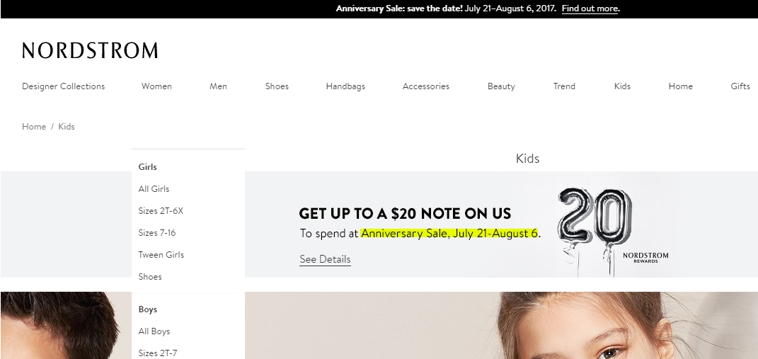
In both the babies and the mommy section, you could then use the left filter bar to segregate the items by age/gender/sizes etc. I like how Nordstrom does that.

enter image description here

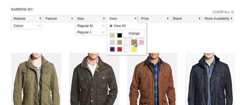
You can also think of the top aligned horizontal filtering bar. A super read here. Highly recommended. enter image description here

0

I'm a big fan of free text and have started to move away from lengthy, multi-depth menus.

We've found allowing the user to type: "mens shoes" even adding "mens casual shoes brown ten," is pretty efficient, however it requires your data to be configured to support this method and the way you handle the query terms so that they return relevant results is very important, especially with fuzzy/misspelt words.

Just another option which may or may not work for your org.

1
  • Thanks DarrylGodden for the info. One thing i find (personally) about free text filters is that products aren't perfectly classified for all search terms and when i search for something in free text im always afraid of not seeing all the items. Maybe there were some really cool shoes that didn't have the tag "man" or are classified as "sneakers". Commented Mar 1, 2018 at 14:59

Your Answer

By clicking “Post Your Answer”, you agree to our terms of service and acknowledge you have read our privacy policy.

Not the answer you're looking for? Browse other questions tagged or ask your own question.