3

For example, take the following data, with: - Recipients - Sent Mails - Opens - Bounced

I want to show the data like this:

  • First whole pie for the reciepents. (100%)
  • Sent mail (80%)
  • Opens (30%)
  • bounced (20%)

Note: opens and bounced are the part of the sent slice.

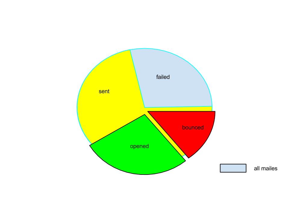
How would it be best to display it graphically. I've thought of using a pie chart, which you can see below.

enter image description here

8
  • I'm confused as to how these will fit into a pie chart...
    – ethrbunny
    Commented Mar 15, 2015 at 12:12
  • I am also is there any other way to represent this graphically
    – siddhesh
    Commented Mar 15, 2015 at 12:36
  • 1
    I think you are talking about >1 chart: sent vs bounced, opened vs ignored, etc.
    – ethrbunny
    Commented Mar 15, 2015 at 17:07
  • Perhaps your segments are: bounced, read, ignored, other where the total 'pie' is all sent email.
    – ethrbunny
    Commented Mar 15, 2015 at 17:09
  • @tohster will you please tell me how to migrate this question to appropriate site.
    – siddhesh
    Commented Mar 16, 2015 at 5:30

3 Answers 3

1

It seems like you're missing data about what users want to see.

Rough guess of what it might be and thing to approach target group with for further feedback and insights of their needs:

  1. Some comparsion of recipient groups sizes. Anyhow. Just a number could be enough.

  2. See a pie chart for recipients (100%). This would display successfully sent emails (80%) and bounced emails (20%).

  3. See open rate. (30%) Number can be enough.

4
  • BTW: Whose dashboard you are designing, if it's not secret?
    – digsrafik
    Commented Mar 15, 2015 at 14:13
  • I m designing the bulk mail system dashboard i want to show the no of recps, sent mails, opens, and bounced mails in percentage and no. both now i m using the tables to show the data but i want to capture user attention by show the data in graphical format something similar to the pie chart.
    – siddhesh
    Commented Mar 15, 2015 at 15:26
  • Please see the image in post for the clarification what i want to do
    – siddhesh
    Commented Mar 15, 2015 at 15:43
  • I get it. In such case take what you have and show it to people who you design the system for. Plus ask for their terminology. You might hear sth about soft and hard bounces that might help you solving your problem.
    – digsrafik
    Commented Mar 16, 2015 at 7:31
0

Stacked bar charts might also work, especially if you want to visually compare multiple campaigns. But I agree that the labels/values shown in your pie chart might not be helpful to the end users. Some people might consider a bounce a failure. Clarification on the data set will help you determine which chart type is most appropriate.

2
  • will you please tell me which type of chart type is used for show the details of one campaing according to you ?
    – siddhesh
    Commented Mar 16, 2015 at 17:22
  • You could look at MailChimp's interface, they use line charts to track clicks/opens across time. Constant Contact combines columns (sent and bounce) with lines for open and click rates.
    – Merrily
    Commented Mar 17, 2015 at 15:20
0

Use the chart to tell a story, without a story the chart just shows the data that’s already in the table, but then in a less readable way.

I can only make a guess what that story should be, but I assume that it is about telling the difference between the total of emails that were attempted to be sent, the amount of sent/received emails and the ones that got opened/read.

Pie charts are good at showing proportions relatively to the total (the whole pie) but not at comparing proportions against each other.

Therefore I would propose the following bar chart. The bar on the left shows the total attempts. The bar in the middle shows the amount that was successfully sent and also shows how much did bounce. The bar at the right shows how many emails got opened and can be easily compared against the other two bars.
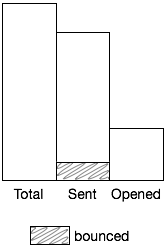
enter image description here

Note: color can make it difficult for people with color blindness to quickly understand a chart, use it with care.
3
  • will you please tell me sir why are you making another bar for opened we can show it to the sent bar also. sorry but i am developer so have less ux knowledge
    – siddhesh
    Commented Mar 17, 2015 at 10:49
  • That’s a good question. It’s all about the story you try to tell. In this case I assumed it is more important to tell how many emails got opened against the amount sent. Bounced emails can point out a risk but is still about sent email so I thought it is less important to compare. You can choose not to show bounced email at all or give it it’s own bar (making “opened” even or less important).
    – jazZRo
    Commented Mar 17, 2015 at 11:24
  • Forgot to mention that it’s easier to compare bars when they are next to each other than when they are stacked on top of each other, obviously.
    – jazZRo
    Commented Mar 17, 2015 at 11:32

Your Answer

By clicking “Post Your Answer”, you agree to our terms of service and acknowledge you have read our privacy policy.

Not the answer you're looking for? Browse other questions tagged or ask your own question.