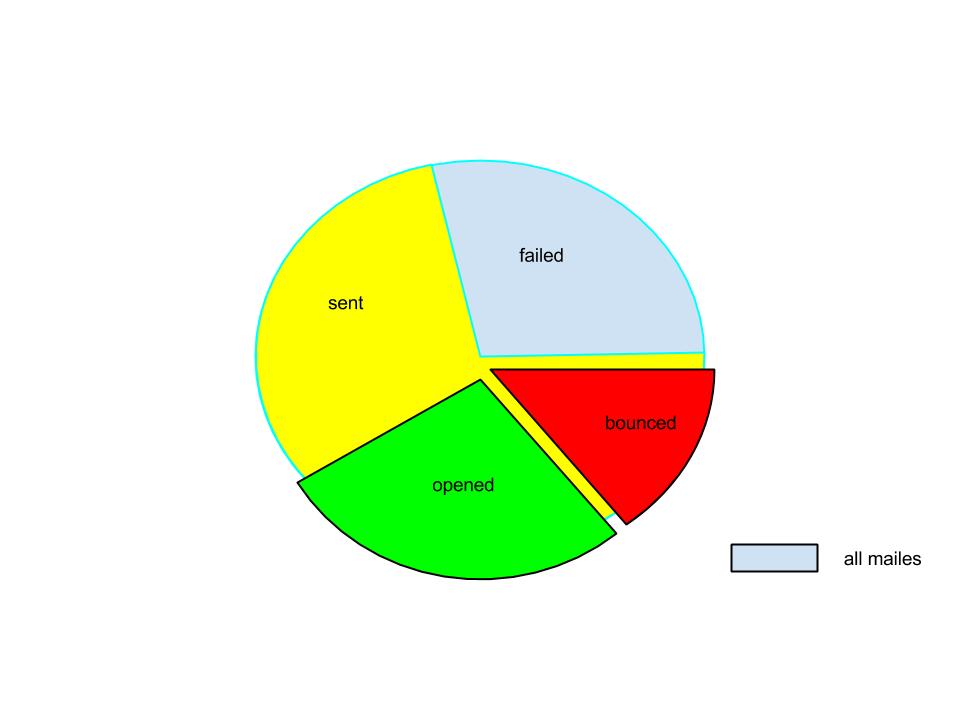
I haveFor example, take the following data something like this Reciepents Sent Mails Opens Bounced, with:
- Recipients
- Sent Mails
- Opens
- Bounced
I want to show the following data like this:
First whole pie for the reciepents. (100%)
First whole pie for the reciepents. (100%)Sent mail (80%)
Sent mail (80%)Opens (30%)
Opens (30%)bounced (20%)
bounced (20%)
Note: opens and bounced are the part of the sent slice.
How would it be best to display it graphically. I've thought of using googlea pie chart or any other better way to display this information graphically, which you can see below.
I want something like this.
