2

Currently I am tasked to create a JavaScript plugin that builds 3 charts:

  • Stacked bar chart
  • Pie chart
  • Multi-line chart

These charts are to be styled ala Bootstrap. I am evaluating colors at the moment, and Bootstrap only has a few base colors at hand, around less than 15. However, the plugin user could have more than 15 columns that should be represented by these colors. For example, the pie chart could have more than 15 slices.

Anyways, I was wondering if in case I cannot fabricate additional colors of the same color scheme, what would be the best approach to this problem if I have more than 15 data for the chart, but less than 15 base colors to represent them?

I'm currently thinking of something like not binding the actual data to a color, but instead, use some indicator that the slice/line/stack is for that data.

Pie charts and line charts should be fine with this. The pie slice could have a label beside/pointing to it. The line chart could have a label beside the end of the line.

But for the stacked bar chart, these bars could be so small that it's not practical to place a label anywhere. Colors would be best to go with this one, so we come back to the color problem.

By the way, the data does have tooltips, but it's not good to let the user figure out the data by hovering at it first. It's best that on display, the user can read the data.

2
  • 1
    Do you only have color as the customisable option, or is Contrast / Saturation type options available (i.e. shades of grey)?
    – JonW
    Commented Jun 20, 2013 at 13:07
  • @JonW At the moment, not yet, but it could be an added option. Currently, I plan to have base colors, and users can add to them.
    – Joseph
    Commented Jun 20, 2013 at 13:16

3 Answers 3

6

You should not rely on color to differentiate between items in the chart.

While it's mostly fine if you have only a handful of items, differences between one shade of green and another are really hard to see. Especially if you need to relate a bar in the graph to a color in the legend over at the other end of the screen, it quickly becomes really hard to be sure.

This problem is further compounded by low quality screens not displaying small contrasts between colors as clearly.

Also, do not forget about the colorblind. About 10 percent of the male population has some problem differentiating certain colors, some don't see any colors at all. If the only way to read your charts is by colors, they're not going to be able to use it.

Some line charts use shaped nodes to add a level of differentiation, referencing these shapes in the legend. However, that has limits as well. While (provided they're large enough) you should be able to pick out the circles, squares and triangles, if you need 15 different shapes you need to be very creative to solve that.

The main problem you can solve by using colors is differentiating one bar from another, or pieces of the pie. For bar charts you hardly ever need more than two colors since you can alternate them. The same goes for pie charts really.

So, using a number of colors will of course make the chart faster to read in many cases, but going beyond 15 colors (I'd be inclined to say that's already pushing it) will only introduce new problems.

So, you are going to need some way to label the items in the chart directly. I think Google Charts does a nice enough job, you could take some hints from that.

4

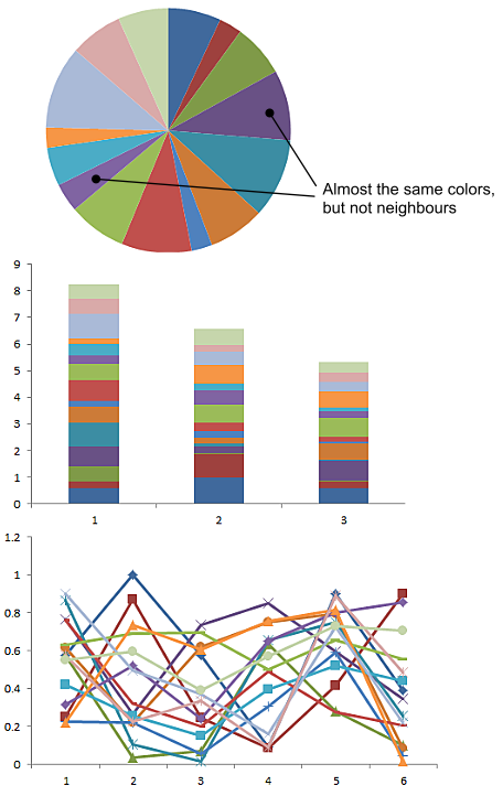
Try to model your diagrams first, I'm not sure colors really help to improve perception. I use 15 rows of data in Excel. Nice but not so usable.

If it is not big problem for you, you can find a bunch of color tools in the topic. Also you can use reduced number of colors using their combination in way that guaranties that two neighbour colors are not the same.

enter image description here

UPDATE
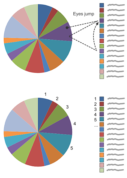
It's hard to eye to get the right legend item even if the colors not the same, see eyes jumpings. So you have the options:

  1. Set the additional cues, see the image. Then you could use limited colors set
  2. Use qualitative color sheme which is guarantees your colors are highly distinguishable among each other. But these sets have limited colors
  3. Display only top 5-8 data items on the graph and/or combine all others into single group labeled "Others"

enter image description here

2
  • So how about legends? If I have 2 or more data that have the same color, how would the viewer know which data goes to which slice/line/bar? I know no one in their right minds would make a chart as crowded as this, but I'm building code that anticipates these kinds of things.
    – Joseph
    Commented Jun 20, 2013 at 13:46
  • 1
    @JosephtheDreamer – I've updated the answer. Commented Jun 20, 2013 at 14:17
1

You can still use the 15 colors and make more combinations out of them by reducing the opacity of each of the 15 colors.

Your Answer

By clicking “Post Your Answer”, you agree to our terms of service and acknowledge you have read our privacy policy.

Not the answer you're looking for? Browse other questions tagged or ask your own question.