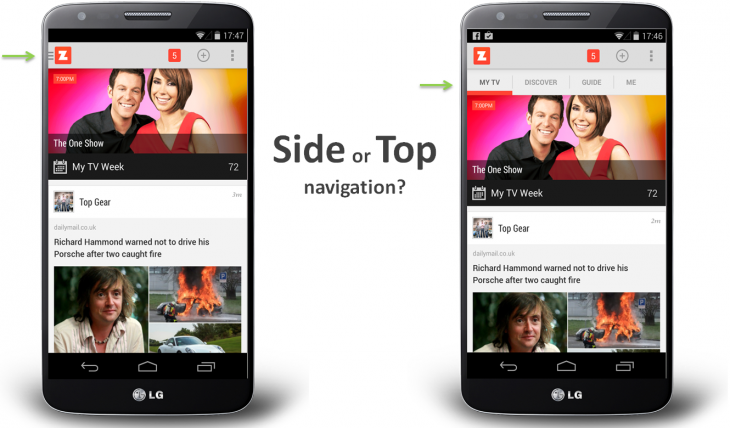
Of course you'll need at least a prototype, that goes without saying. Research on the subject is quite extensive, but in the end, it is highly affected by the site itself, its content, its audience, devices and so on, so it's very difficult to have a "one size fits all" answer.
However, there's a very interesting article dealing with the exact same problem and discussions you're having with your colleagues, only that for mobile.
 Either way, they mention the whole process, the problems, hypothesis, research, testing and what they finally did based on pure objective data, see article here.
Keep in mind you mention this:
Our 25th percentile screen size is 1280 wide
which leaves us out with the obvious question... what about the remaining 3/4 of your audience? This will affect your question greatly. For example, what if a big part of that remaining 75% uses huge screens? A menu on the side on a fixed width layout will be totally different to a side menu on a fluid full screen layout (you can test this if you want, you'll be shocked at the numbers). Let alone if a big part of that 75% navigates the site on mobile.
Finally, as a rule of thumb, and whenever possible, based in our own research, we tend to prefer a top nav by default, and even keep it as "sticky" or fixed. Then again, your case may be different, so you'll need to test and see how it works for your audience
If you're looking for more ideas besides these 2 options, take a look to How To Design Effective Navigation Menus which includes different types of navigation with examples and a short explanation about each of these options

