0

I do have a doubt wrt to the card interaction. We are designing this card for reports.

The primary action for this card is to view this report, followed by downloading the report or following this report

Thru data, we know that people first view the report and then take necessary action i.e download or follow.

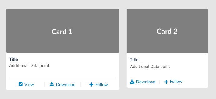
There are 2 variants for this card Card 1 >> The card itself is clickable and on hover, we do have some micro interaction and view written on the thumbnail to make it obvious for the user

Card 2 >> Entire card is clickable and All the CTAs are available upfront to the user

I'm in dilemma between cards 1 and 2. In terms of functionality and UX pov, card 2 works the best. Card 1 design is a solved problem as people are familiar with click behavior. Card 1 functionality is well-known to tech-savvy people in the younger age group but the same is not true for people in their 40s-50s or beyond.

enter image description here

Please help and thank you in advance.
7
  • I somewhat agree with the argument made on card 1. Not every user understands the card design well. It is a trial run that will happen when I click on it. Will it view/download?
    – NB4
    Commented Jan 20, 2023 at 10:58
  • "Card 1 functionality is well-known to tech-savvy people in the younger age group but the same is not true for people in their 40s-50s or beyond." Have you derived that from your observable user testing? Or do you have general studies to support this assertion? Commented Jan 20, 2023 at 15:30
  • @bloodyKnuckles No we haven't done any user testing
    – NB4
    Commented Jan 23, 2023 at 7:04
  • Please elaborate the difference between card 1 and 2. The only difference I see is card 2 has everything card 1 has except "View". And the bulleted description confuses me. Commented Jan 23, 2023 at 10:13
  • @bloodyKnuckles Primary action for this card is to view the report. So the question is should the view be shown upfront to the user or showing some micro-interaction on the card is sufficient to tell user that it is clickable and on clicking it will open the report.
    – NB4
    Commented Jan 31, 2023 at 12:18

2 Answers 2

2

I think Card 1 is better. I find it easy to understand each of its affordances.

For my part, I will always try to see if a report interests me, and only if it does, will I download it. When I see Card 1, there is a very clear link and icon informing the user that this option allows you to view the content (which is what I would do, and which, in your own words, is the primary intended action).

On the other hand, Card 2 does not have this "View" option. Perhaps some users may infer that by clicking on the image they can view the content. But I strongly doubt that an implicit behavior that requires a discoverability process (and thus a high cognitive load) works better than an explicit option.

Finally, and probably because I do not know what the app is about, I find it very confusing what Follow might mean in a downloadable item.

2
  • 1
    If you follow a report you will start receiving updates on the report whenever a new edition is available
    – NB4
    Commented Feb 2, 2023 at 12:16
  • Ahh, I see, now it makes sense. Even though it's not part of your question, I think there is a possible problem: People who have downloaded the report but don't follow up on it may not know that the report was changed at a later date. I don't know if you have a notification process, but maybe I'd add something like "date modified" or, if users are logged in, then track them and if there is a new version of the report, they might get a notification because they have shown interest in that report, which means it's more or less important to them.
    – Devin
    Commented Feb 2, 2023 at 17:33
0

Card two works best from the POV you are describing.

It's not redundant, less visual noise and follows the progressive disclosure.

Two points that could be improved tho.

  1. What is the actions hierarchy? It's not defined, they have the same weight.

  2. Make sure there's a clear signifier that users know they can click and open the card. Most libraries use shadows for interactive components (Jackobs law)

https://m2.material.io/design/environment/light-shadows.html#research

Your Answer

By clicking “Post Your Answer”, you agree to our terms of service and acknowledge you have read our privacy policy.

Not the answer you're looking for? Browse other questions tagged or ask your own question.