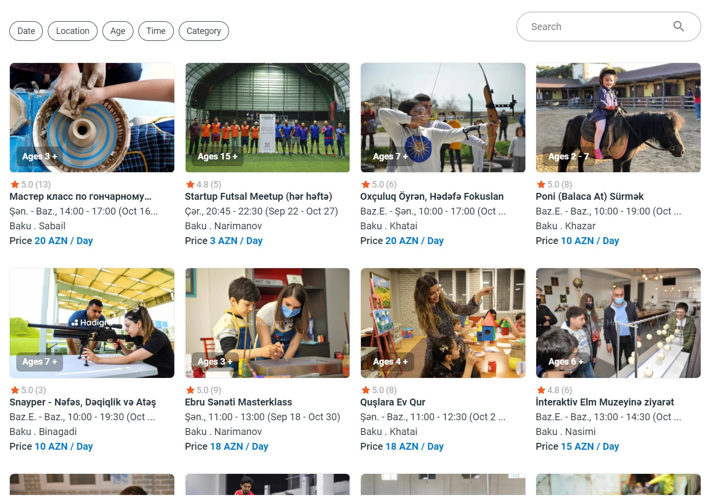
Well, being objective I see several drawbacks on your results page.
1 . Hire a photographer
Actually the photos that you show in the capture, I don't know if they are the real ones of the activities that the web sells, but the truth is that they don't invite to delve too deeply. Without being rude, they look like discarded photos from an image bank. Hire a photographer or at least someone who Photoshop them to give them a little bit of visual quality.
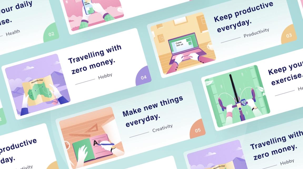
If the photos you have are not of sufficient quality or you think they are not very catchable for the user, there are also other more suggestive alternatives:

Image source Dribbble
2 . Define better the cards
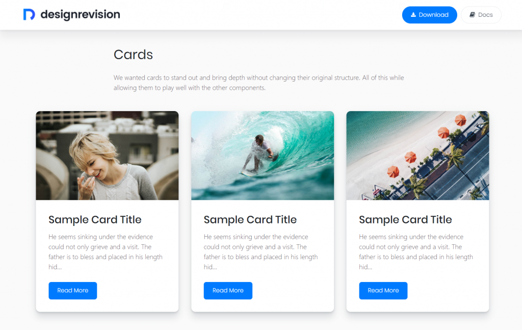
The grid with the cards looks more like an information page, such as the news in a newspaper, the common user may not immediately interpret they are clickable. All the information is at the same level, it lacks remarkable details below the photo. Visit sites with UI card designs for inspiration.
There are two things that interface designers tend to hate: drop shadows and buttons, but in some cases they are very useful elements, and this is an example, the shadow helps define a frame and the button leaves no doubt that it's clickable.
 Image source noupe.com
3 . If possible, don't let the website be just a photo and text grid. There are elements such as color, contrast, typography, design in general that not only enrich the page but also invite it to be visited and used.
Make a real difference between a – booking platform where users choose different types of activities to do in their area – and a boring/annoying/regular real-estate site to desperately look for a small flat to live in downtown ;-). I think your site has a more playful purpose and should broadcast it and invite to feel it.


