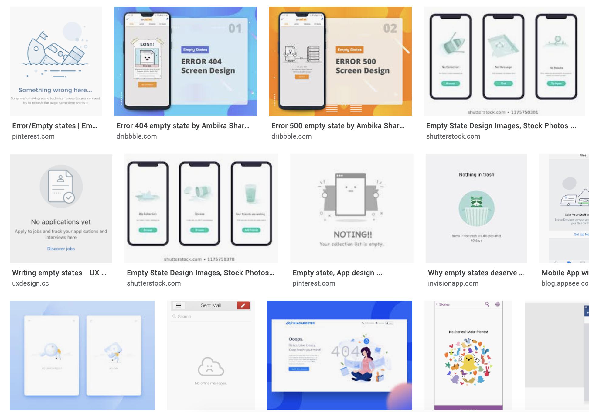
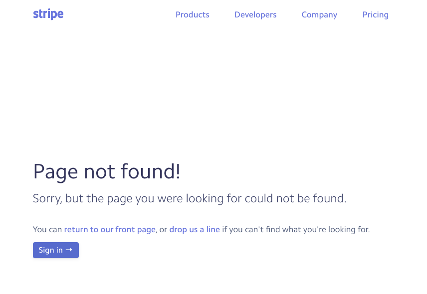
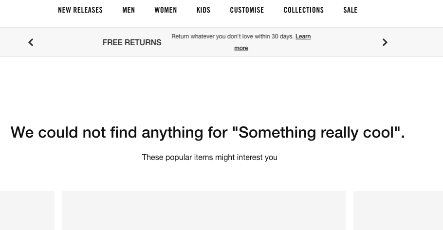
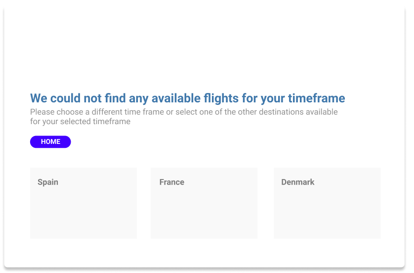
Define "serious brand." Airline/train travel does tend to be somewhat more serious, but there are plenty of travel brands that have a more lighthearted approach (Southwest Airlines in the US and Virgin Atlantic, New Zealand Air, etc.).
The purpose of the error page/message: "Help people get where they want to go and, if necessary, indicate that there's a problem getting there the way they intended." (Torrey Podmajersky, Strategic Writing for UX)
The voice and tone (Whether you say "Golly, that's weird..." or "There's an issue on our end...") depends on the brand guidelines' voice and tone definitions. Those will expound on the brand personality's voice attributes and what types of approaches are appropriate. Personally, I don't love an "Oops" or too much humor. Some humor is fine (if it's on-brand), but it shouldn't get in the way of the person doing what they came to do.
The core components, regardless of voice and tone:
- Don't blame the user, even if it's the result of their action
- What happened(you may need devs/analysts' input here) It's best to be specific, although for security or other limitations (like not wanting to use too-technical of language), it may have to be somehwhat general.
- Apologies: depends on the level of inconvenience (You don't have to do a severe mea culpa for a time out or minor issue) and the brand voice and tone (some companies have directives around apologies). However, if it's a major technical limitation, you need to address the inconvenience and follow up with the next part.
- Recommendations for what they can do. (Refresh their screen, close and reopen the app, try a different search term, etc.)
- Give recommendations for contact - If they can't resolve through your recommendation, give them Support options. Try to avoid just sending them to your Help Center articles/FAQ. That's highly frustrating, especially if Help Centers don't address edge cases or are poorly written and organized. Include an email, a live chat link, or phone number if possible.
Other tips: write conversationally, using positive contractions (It's, you're) but not negative contractions (for readability - cf. Content Design Londons' readability guidelines) and active voice.
We will always need error states. But we should try to avoid them. Sometimes when I'm asked to write an error message, I ask about the flow, the user's tasks, and we uncover that we just need to design the flow better. "Designers should strive to minimize the chance of inappropriate actions in the first place by using affordances, signifiers, good mapping, and constraints to guide the actions." - Don Norman


