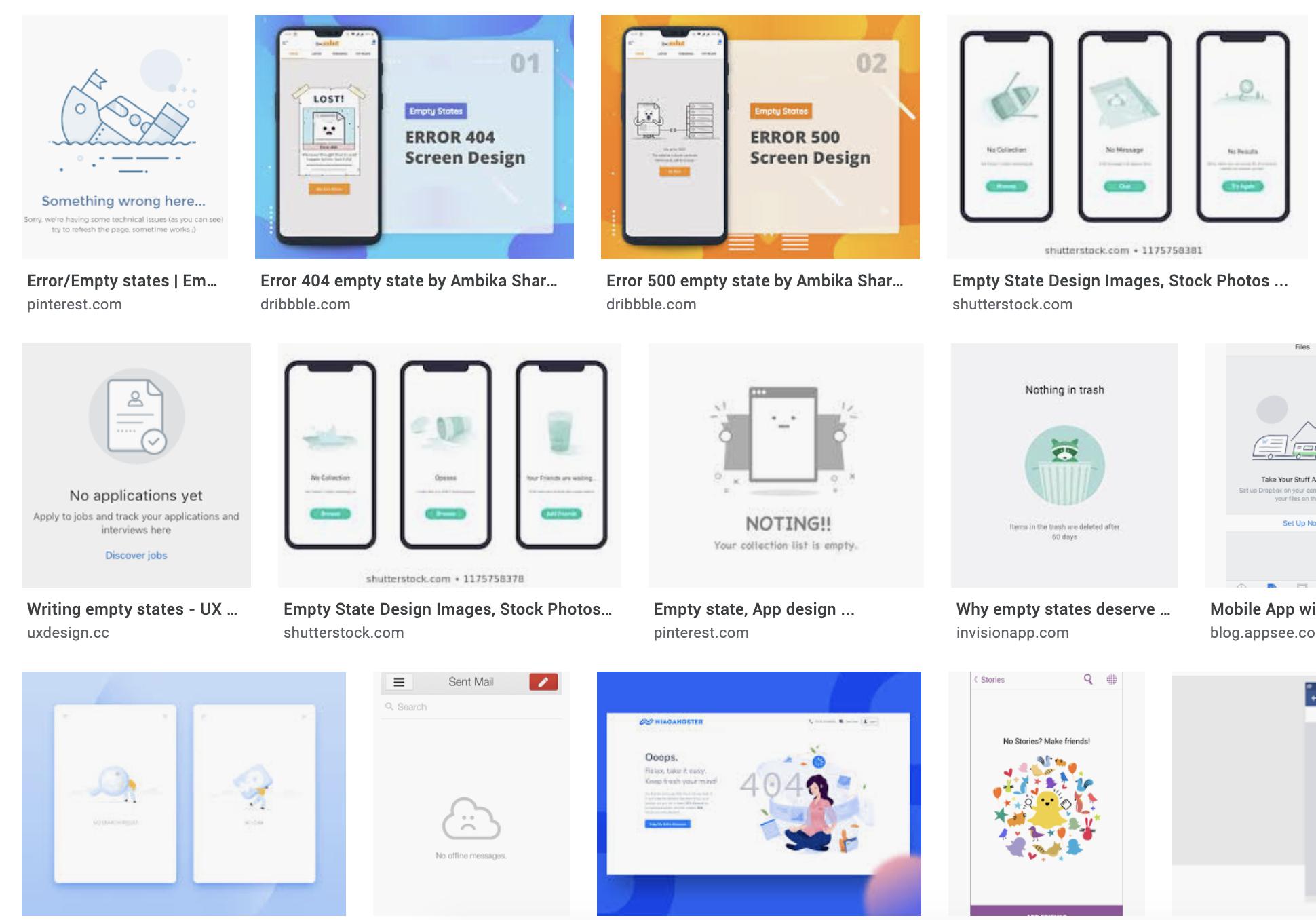
I'm designing some empty state screensempty state screens for an airline/train travel app.
what are empty states. https://www.toptal.com/designers/ux/empty-state-ux-design
I've looked at quite a few examples and what iI noticed is onin most cases is some humour in the copy or some kind of charactercharacters are used for visualvisuals. Of course this is to minimise user frustration when users reach this screen.
My question is: how can this be applied for companycompanies that don't want to use humour or funny characters? anyAny examples would be appreciated.

