29

I have a client that wants me to put 2 buttons on a page that do, look, and say the same things. The button would say 'Apply'. The rationale of the client is that he doesn't want people to miss it, so put one at the top and one at the bottom of the page.

What do you think? Is this a good pattern to allow?

8
  • 31
    Extremely difficult to tell if we don't see how your user interface looks. It could be that its perfectly fine and sensible, but it could also be that its wrong.
    – Paran0a
    Commented Feb 26, 2020 at 18:34
  • 5
    I echo Paran0a's sentiment: It very much depends on the interface. I've seen this done correctly and also incorrectly. Commented Feb 26, 2020 at 19:25
  • 1
    I would say it's not the best practice if both are visible at the same time. Perhaps having one button in a fixed position (so that it does not scroll) is a better solution to having that option visible at all times.
    – ph33nyx
    Commented Feb 26, 2020 at 20:24
  • Is the client's view/opinion relevant? What would the users think? I think it depends on the particular use case and context but a screen shot or mockup would be helpful.
    – Michael Lai
    Commented Feb 26, 2020 at 23:04
  • 2
    If the client explicitly asks for it, it's a good idea to deliver what he asks unless you get them sold on a better idea. "Allowing it" isn't applicable.
    – Mast
    Commented Feb 27, 2020 at 11:53

4 Answers 4

63

That is exactly how it is done.

What usually happens is that the description of the company itself, the open position and the candidate requirements alone are more than enough to fill a screen. Sometimes there's legal lingo – equal opportunity etc – or a map showing the location of the office.

If you place non-sticky buttons top and bottom, people won't see both of them at the same time.

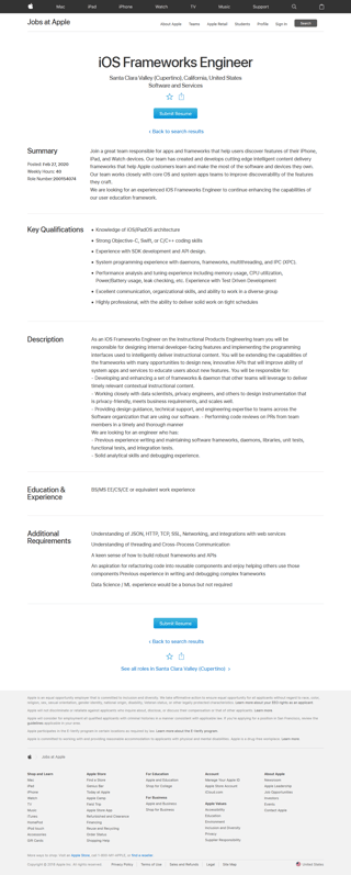
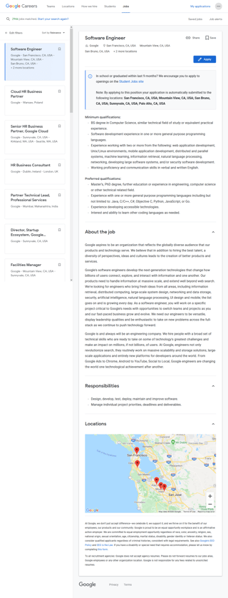
Here are three examples from well-known companies. The screenshots are small on purpose (Click on them for the full size versions.) You can still find the Apply buttons rather easily.

Microsoft (WebM), Apple (WebM), Google (WebM)

Microsoft job offer ⠀⠀⠀⠀ Apple job offer ⠀⠀⠀⠀enter image description here

All of these companies have two positions for their Apply button: At the top and the bottom of the job offer.

The second one from Google appears once the first one is out of view and sticks to the bottom of your visible screen. Its final position is at the bottom of the job offer (ie it doesn't float all the way down to Privacy.) See the Google WebM.

Facebook uses a prominent sticky header to ensure the Apply button is always visible.

However, I for one, dislike this solution as it has the feel of a 5 year old default WordPress page, courtesy of the double header. To stress that this might not be a good solution: The Facebook page has another issue: The color blue, indicative of a primary button on the other companies' websites (plus Atlassian and StackOverflow UX), is used for secondary actions like Like and Share. But see for yourself:

Facebook sticky header:
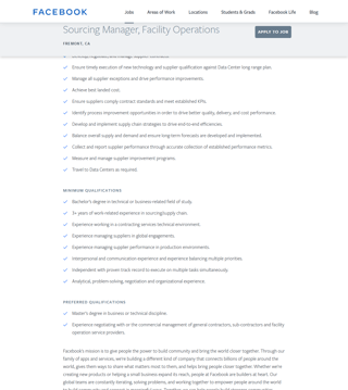
Facebook job offer page

Facebook non-dominant primary color (with second/sticky header in relaxed state):
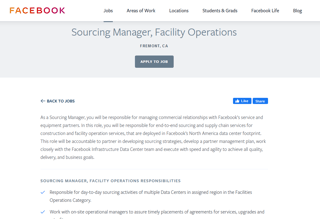
Facebook job offer page two

Facebook WebM.

If you want to see for yourself, here are the relevant job offer pages: Microsoft, Apple, Google. Facebook (sticky header)

A note on mobile UX:

You can't read the job offer on the Facebook page, because the sticky header takes up half your screen:
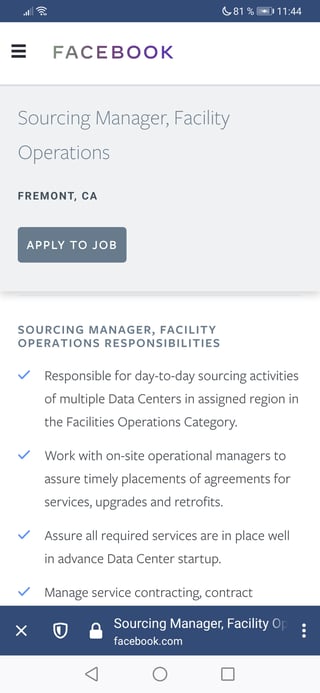
Facebook mobile

The floating Google Apply button works wonders:
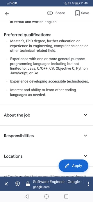
Google job offer mobile

The Microsoft and Apple mobile pages also stick to their functionality. They hide all but one paragraph behind accordions, limiting the needed vertical screen size. (See the Google example, minus the floating button.)

2
  • 1
    Yes. This makes a lot of sense to me. Thanks for sharing all the screenshots. It really helps to see how other sites are addressing problems like this.
    – Nate Gines
    Commented Feb 28, 2020 at 23:39
  • Great answer! Good to see a lot of concrete examples backing up what you're saying
    – mowwwalker
    Commented Feb 29, 2020 at 21:02
15

A lot depends on the visual design of the screen. If there is enough visual distance between their placement it might be useful to the user. They won't have to scroll to use the button, nor remember its existance. But if they are visible at the same time, it can become confusing.

1

I agree with Chris, if two of them are visible at the same time it will create confsuion.

The concern of client is valid but the solution he/she provides might not be.

The problem he wants to solve here "the button is not visible all the time so user will forget it". If you focus on the problem more, you can think of alternate solutions.

Though there are no visuals explaining your issue, a suggestive solution is "Make the button sticky"

1

Agree with everyone above and have received similar requests from client many times. Make the button sticky is a great option, 2 other methods I've done are: wrapping the different buttons in different CTA blocks with different messaging (lower CTA accounts for the fact that they scrolled past the first), A/B test the different positions and choose one based on metrics.

Your Answer

By clicking “Post Your Answer”, you agree to our terms of service and acknowledge you have read our privacy policy.

Not the answer you're looking for? Browse other questions tagged or ask your own question.