0

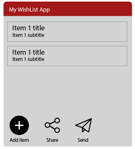
Consider a simple app for making wish lists and sharing the list with a friend (or shopping assistant).

On the main screen, the user is shown the list of items they have added to their wishlist. There has to be a button touching which allows to add a new item. There also has to be another button touching which will allow the user to send the list to a friend.

Arguably both these activities are equally important and can be considered the primary activities for this screen.

Which do you guys think will the most intuitive?

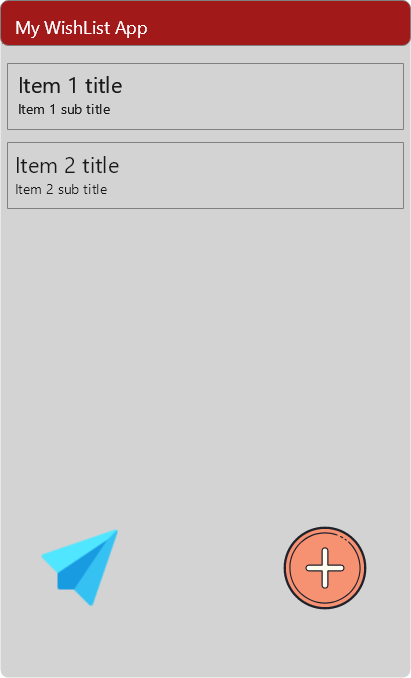
  1. A round red button with a plus sign at the bottom right of the page to add a new item to the wishlist. And a round green button, same size as the red button, with the paperplane icon at the bottom left of the page to send the list to someone.

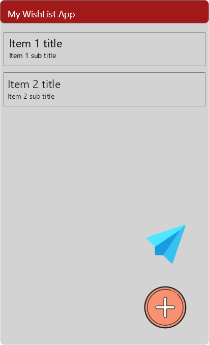
  2. Same as 1., but the green button is also on the bottom right, above or below the red button. Same or different size.

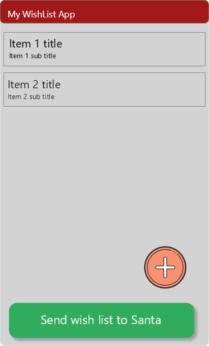
  3. A round red button with a plus sign on the bottom right, and a wide green button at the bottom, with some text like "send to xxx ... ". The red round button is floating just above the wide green one at the bottom.

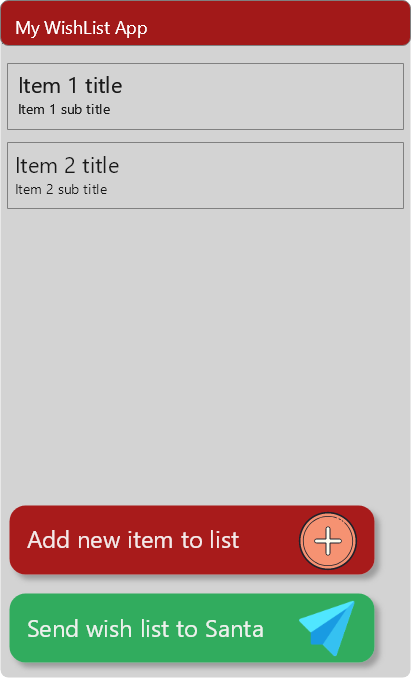
  4. Two wide text buttons, perhaps also with an icon in each button.

2
  • 1
    Do you have any mockup to show?
    – Danielillo
    Commented May 16, 2021 at 19:36
  • 1
    Yes, I do. The mockups are crude and aren't color accurate.
    – ahron
    Commented May 16, 2021 at 20:19

3 Answers 3

2

Before answering, there's a mix of concepts: send and share, in fact there is a different standard icon for each action, they can even be on the same screen (as shown in this question).


More than intuition, I think it is a matter of priorities. What's the most important action in the app?

  • Add items
  • Share the list
  • Send the list to a contact

Once the priority is defined, establishing a visual code is simple, giving greater visual relevance to the most important function, no matter where it's located, right, left, top or bottom, the user will perceive this button as the origin of interaction.

enter image description here

1
  • 1
    Thank you for taking the time to respond, and for making a fresh mockup. I must apologize for sowing confusion - send and share are actually the same. There are only two buttons - 1) Add and 2) Send. But your mockup and also the buttons in the answer you linked to gives me another idea as well - add text to icons, and place them side by side. I just added another mockup (and replaced the one with the confusing text).
    – ahron
    Commented May 17, 2021 at 6:49
3

You are approaching this with the mindset of "Add item" and "Share list" of equal importance but I don't think they are. I imagine users would be adding items repeatedly (main action). When they are done, they might share it once. Hence they are not of equal importance. I would feature the add item button in the bottom right like you have but share is less prominent or under a nested menu or something.

0
1

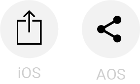
You didn't say how the user is sharing their list with a friend (SMS, email, Copy Link to paste in an Instagram DM?). Like Danielillo mentions, the paper plane icon means "send", not "share".

These mean "share" on iOS (left) and Android (right):

Standard sharing icons

Using these with the Plus icon (standard for Add) will likely provide the user with enough information to complete their tasks without full-screen buttons.

2
  • He's sending it to his friend's account on the same app.
    – ahron
    Commented May 17, 2021 at 17:59
  • 1
    Thanks for clarifying. In that case, you might want to consider the Google concept of a glyph of "users" to connote access. This will be helpful when you think about the use case of revoking/unsharing the list later.
    – Izquierdo
    Commented May 17, 2021 at 18:26

Your Answer

By clicking “Post Your Answer”, you agree to our terms of service and acknowledge you have read our privacy policy.

Not the answer you're looking for? Browse other questions tagged or ask your own question.