2

I have two situations:

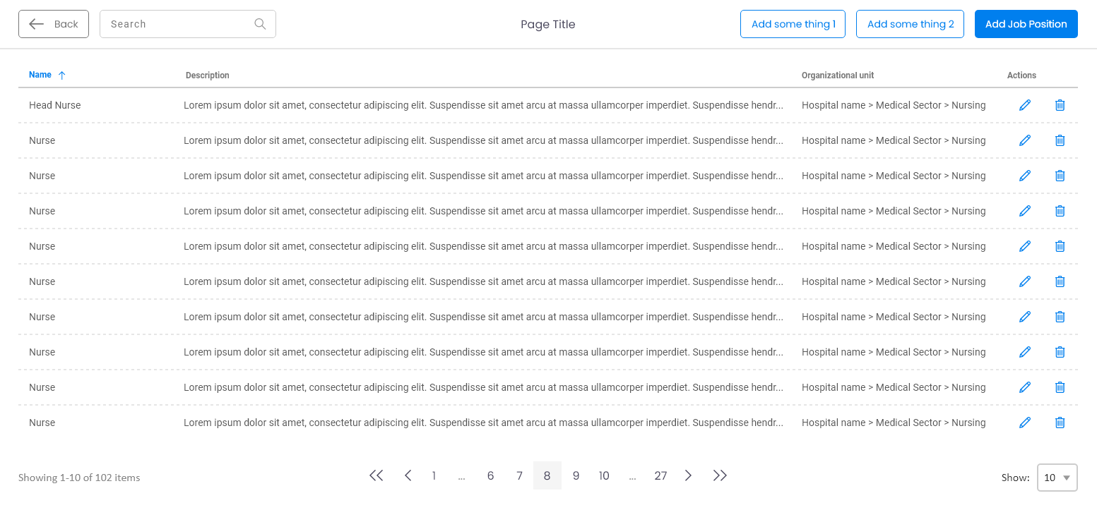
  1. A page with a table. The table can be short or long depending on user preference (items per page).
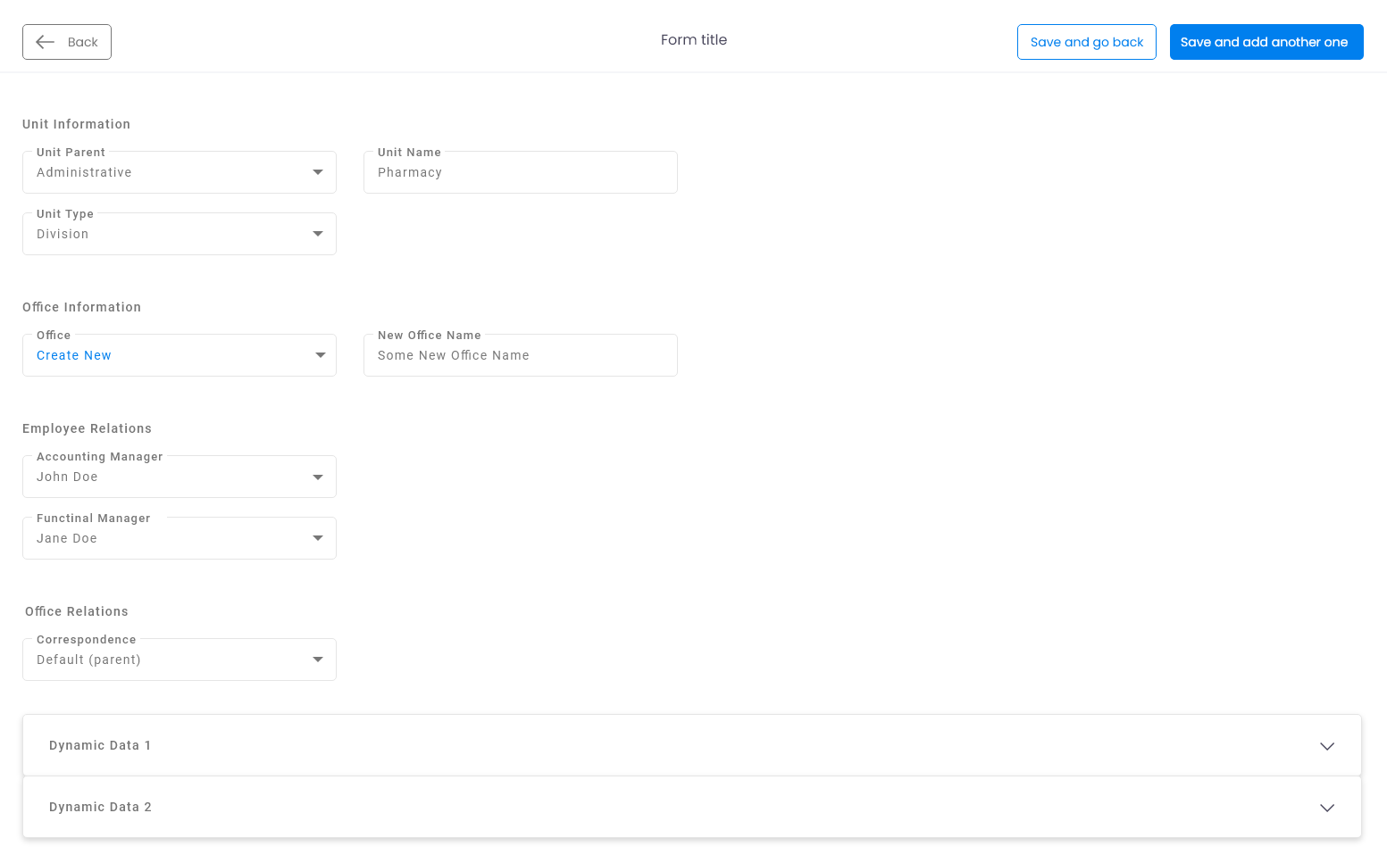
  2. A page with a form. The form can be short or very long depending on some dynamic data.

I need to place a few things in each page:

  1. A back button.
  2. A search field.
  3. One or two secondary buttons.
  4. A primary button to save user input for the case "page with a form" and open a modal containing a form when we have the case "a page with a table".

My questions are:

  1. Should I keep same position for the buttons whatever the case is? Or should I treat each case separately and for example put the buttons for the "form case" after the form on the left side and keep them top-right for the "table case"?
  2. What do you think about the current order I have? Back button, search, page title, buttons? The back button will not exist in other pages so the search will be the left most in that case.

Thank you.

enter image description here enter image description here

4 Answers 4

3
  1. Be consistent across all screens. Consistency is a key design principle and you can help the users by not forcing them to learn new things in each task or screen.Try with users, choose the best one for them and be consistent with that.

good article about consistency https://www.interaction-design.org/literature/article/principle-of-consistency-and-standards-in-user-interface-design

  1. Why not the following order Back button > Page title > search > buttons? The back button it's variable and when is not there, the first thing that the user will see it's the area title and not the search bar.
0

There are two situations with separate expected flows; A table ui where I assume the user is editing fields and then saving those changes. A form where the user is working through filling out the required fields and looking to save or submit. In each case, I would follow conventional norms. In the case of the table, displaying save, edit and action buttons at the top right corner seems to be an established pattern. Since a table can be as long or as short as the user determines, putting those buttons at the bottom wouldn't make sense. If the table is too long for example, the user would never really see the buttons. For the form, maintaining the consistent pattern of having the save and cancel buttons at the bottom of the form is again and expected pattern. That being said, for each screen, you are changing where the user is used to seeing buttons. I just dealt with this almost exact same situation in a project. I brought up the exact same question you are posing here. In the end, we all agreed to keep the form buttons at the bottom and table action buttons in the top right corner. Maybe some user tests could help in your final decision.

Here's a great article for reference; https://uxdesign.cc/buttons-placement-and-order-bb1c4abadfcb

0

See here in both the scenario:

  1. Table
  2. Form Data

Table: In this firstly, the arrangement for the top elements should be like this > Back button, Title, search and then other buttons. Now, talking about the position of this complete bar of action items seems fine, if we keep it at top only because as per hierarchy this is how it should work. If user lands on this page top bar is the place where he is performing action from and then seeing the result.

Form Data: In this case, the button should come at the bottom on the form, here consistency is not required with the table because the flow of data on the form is from top to bottom and according to that the action button should come at bottom after completing the form. If we keep it at top then the user needs fill the form and go back to top to take any action, which would break the flow.

0

I will answer both questions as if it were only one as both are very related.

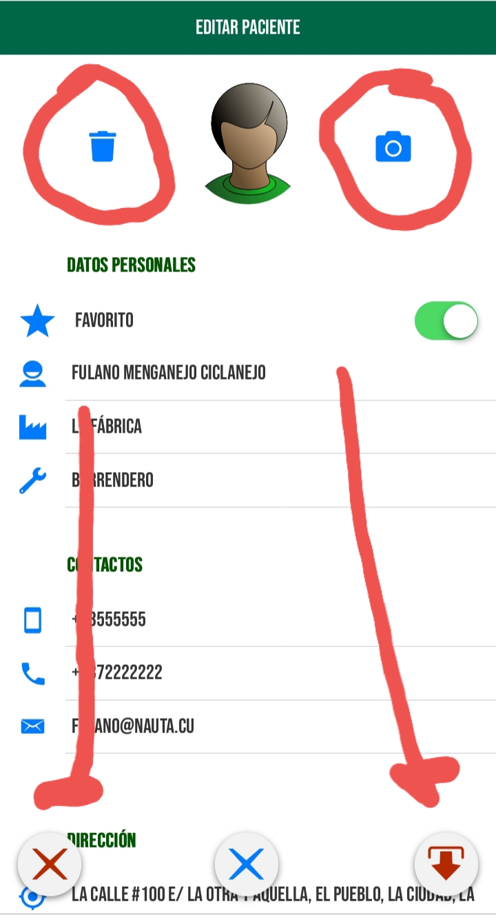
I would create a combined system of nav bar, bottom bar and floating buttons and keep them in the same location across pages or situations for the sakes of user sanity and consistency. I personally would place back button at the left top of the nav bar and search bar from center to right. The primary buttons for general purposes on the bottom bar letting the right side to the save button. Other secondary buttons as floating buttons and maybe some very specific ones within the content.. Remember to stablish a real separation (by means of space and color) between the normal positive buttons and the potentially destructive ones. This is an app in which I am working on

Take notice of floating buttons at the bottom of the screen and how the save and delete buttons are widely apart. The same thing on the buttons to change/take user picture and the delete button. As it is a pop up window the nav bar is just displaying the name of the page but in the parent page the back button is located at the top left and the help button at the top right.

Your Answer

By clicking “Post Your Answer”, you agree to our terms of service and acknowledge that you have read and understand our privacy policy and code of conduct.

Not the answer you're looking for? Browse other questions tagged or ask your own question.