2

Currently, our standards are green colored buttons for primary actions and links for secondary actions. In some cases we use red buttons, such as for delete actions.

The problem I have now is that we find that most people who say they need help with their username also need to reset their password. This would mean that the user would have to go through the security process twice, once to get the username and once to reset the password.

The solution is to allow the user to reset their password after they have completed the security process for obtaining the username. This of course means that we now have one action to get just the username, and another action to get the username and get a link to create a new password.

My question is: how to have two primary actions that do not really have a preferred choice?

My first mock-up is below (please ignore the grammar in the text):

Mock up of the screen I was proposing allowing the user to choose whether they want to get the username only or also have their password reset.

3
  • What's the question?
    – Danielillo
    Commented Aug 23, 2022 at 15:28
  • Surely displaying the full email and phone number like that is a security risk. As is allowing the user to send the username and reset the password simultaneously. A screen like this, left open on a laptop while the user is distracted could cause all sorts of issues. Commented Aug 24, 2022 at 12:52
  • On the actually screen we do mask the email and phone number. I just didn't add that to my mockup.
    – Mike Kelly
    Commented Aug 24, 2022 at 15:09

2 Answers 2

3

You already used a radio query for the first choice. How about rephrasing the button selection and making another radiochoice instead. It would look like this:


Please choose how you want to recieve your information:

o Lorem ipsum

o Lorem ipsum


Please select the information you want to change:

o Username

o Username & password

(primary button (SEND))


0
0

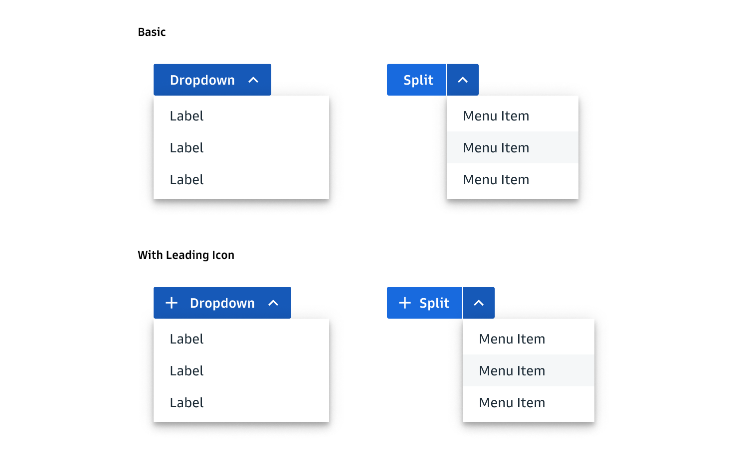
One way I can think of (even though I think in the context of the design what you are doing is my preferred approach) is to use a dropdown styled like a button where the visible label would be "Send", and the options would be "Username and Password" or "Username". But as I said before, I think with only two options I believe that your current design is still more suited to meeting that criteria.

enter image description here

Your Answer

By clicking “Post Your Answer”, you agree to our terms of service and acknowledge you have read our privacy policy.

Not the answer you're looking for? Browse other questions tagged or ask your own question.