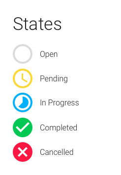
I am currently trying to implement a task system that can have 5 "states". I've been playing with icons to differentiate between each, but also speculated that colors would be beneficial to include. Currently, I have what is displayed within the image below for icons and colors. Curious if these work or may be something more reflective of each?
1 Answer
This is kind of a loose fit for UX (and SE). But there is some general value here ...
Pending, in progress, and completed all look spot on for the message you're trying to convey. My concern would be open and cancelled in the context of task management.
Concerns with your system
Open in task terms is often thought of as "incomplete". I'm not sure how this compares with "pending" in the workflow you've designed, but it still feels like an important thing for the user.
Cancelled in task management often means "deleted because it's unnecessary". In that sense, it's not a particularly important thing. In fact, the user may not even want to see it again after cancelling.
If those two translations are correct, the visual prominence seems reversed.
Visual hierarchy and workflows
In any workflow-oriented system, you want to provide the user with visual reinforcement of the process. IOW, there should be a sense of value and hierarchy embedded in things like the icons.
In the case of task management, when a user looks at the task list they should immediately understand a few key things in a particular order (unless you've intentionally designed something new):
- Is anything behind?
- What do I need to do right now?
- Is there anything coming up that I need to be thinking about?
- What has been achieved recently?
Icons are used as a quick visual cue to get the user through those considerations quickly and effortlessly. Be certain that you're drawing attention to the right things in the right order to make the user's job as easy as possible.

