2

I've been searching for how we design Split CRUD form UX which have "associate with user's task" mode. I have a Master-Detail CRUD web-based form. Basically, my form has 1 fields-form, 1 datagrid, 5 button (create, edit, delete, save, cancel) and have basic scenarios:
- select 1 grid's row to fill the form
- press "create","edit" bring to edit-mode
- press "save" will save changes and bring to read-mode

The form can intergrate with task system. User who is assigned has to complete form. So I've tried to put a button "End Edit" will bring to read-mode instead of button "Save". Button "Save" only make changes saved. (just like batch edit scenario but save each record). I wonder this ux is good or not. Are there any best practice I've missed ?

And how about the ux on mobile application ?(this is a kind of LOB application).

Here are example pictures: enter image description here
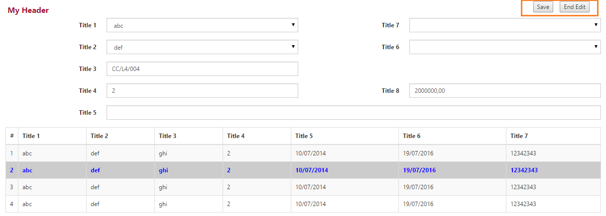
Thanks alot!

Update: Sorry, May be I used wrong term "Master-Detail" on first post. I mean the "Split form" (MS Access term) or "List and Detail screen" (MS Lightswitch term)

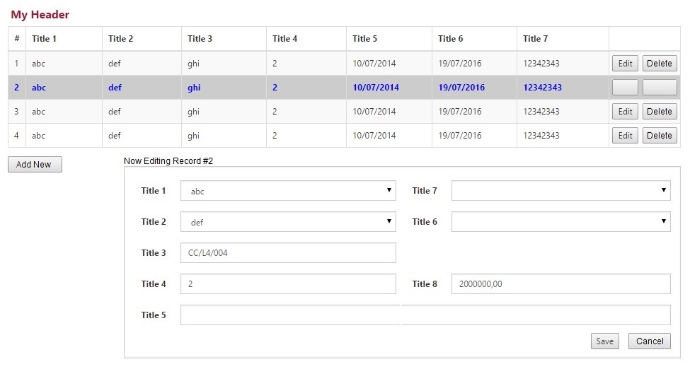
3 Answers 3

1

Since selecting a record to edit comes before actually editing the record, put the list at the top of the screen. Users tend to look for first steps near the top.

Also, batch edits tend to confuse users. I've tried lots of times and never gotten satisfactory results. Better to keep the editing event small scale; a single record, not a session of editing multiple records.

Since all fields are listed in grid, there is no reason to show the lower "editing" screen until the user clicks the "add new" button or any of the "edit" buttons. When they do, title the lower window with an explanation of what is happening.

example

The example above shows only grid row #2 with its edit and delete buttons disabled, but it would be perfectly acceptable to clear those buttons in all rows. This would focus the user on the task at hand, giving them two choices... save their changes to this current row, or cancel their changes to this current row.

0

I think this will be confusing. "End Edit" is ambiguous--it is not clear whether it will save or not. Further, putting it next to "save" is likely to create the impression that "End Edit" does not save.

It would be better to have "Save and Continue" and "Save and Close" as your options. This is an established paradigm in some applications, such as web-based editors, where you may want to save your progress periodically without exiting the edit.

This also raises the question: what if the user doesn't want to save? It would be good to also have a "cancel" button which exits the editor without saving the changes.

1
  • Thank you. But may be because of my bad question, I've just updated it. My form (or I could say "page") is not a single form. It's a list/detail page and how is ux for complete updating the list.
    – khangcv
    Commented Oct 2, 2014 at 16:48
0

Personally, I would feel that "Save and Finish" and "Cancel" would be the ideal nomenclature used for the buttons, as it conveys your workflow nicely without getting in to complicated labels which may further confuse your end users.

Edited to reflect the updated question

1
  • Thank you. But may be because of my bad question, I've just updated it. My form (or I could say "page") is not a single form. It's a list/detail page and how is ux for complete updating the list. I avoid store changes in client and batch update because of complexity.
    – khangcv
    Commented Oct 2, 2014 at 16:53

Your Answer

By clicking “Post Your Answer”, you agree to our terms of service and acknowledge you have read our privacy policy.

Not the answer you're looking for? Browse other questions tagged or ask your own question.