2

I am developing a web application which has a datatable in the user inteface. Datatable has got couple of common actions to do like the basic CRUD operations.

The questions is how & where should the buttons edit, delete and create be placed from the usability perspective.

Here is an example with table having edit and delete in each row. I feel it is duplication of buttons in each row, instead we can select one row and click on edit/delete button somewhere at the top as shown in this example

But, I am not sure that the later one is so clear to understand or usable for a naive user. Any thoughts would help.

1 Answer 1

2

I think the light color on hover in the first example is better and more fast and simple to use. The second one could really be confuse, and you should not have to click on each line (I didn't even noticed at first the I each line was clickable).

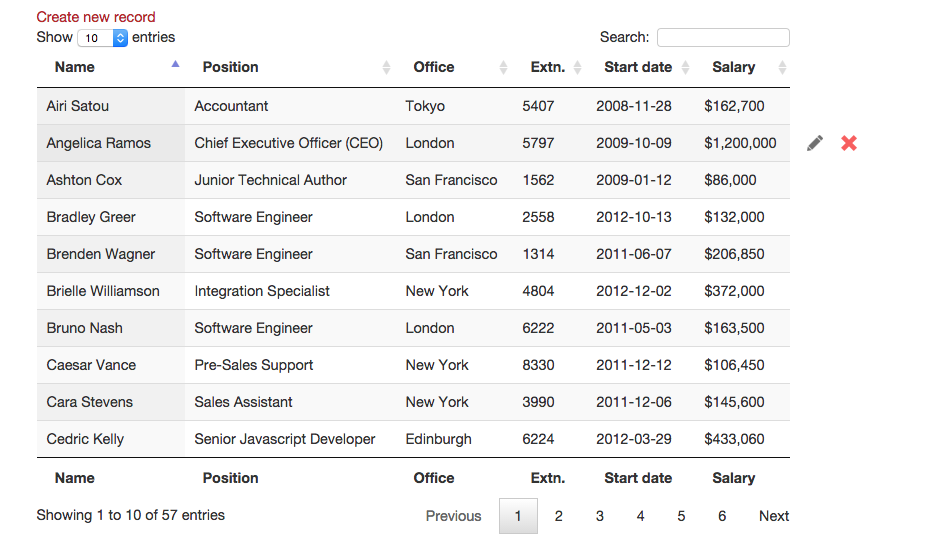
I suggest a simple solution, just show the edit/delete buttons (or icons) on the hover state. The table, in this case, remain with the same size (or smaller) since I deleted the last column and in that space the icons appear only on hover of each row.

enter image description here

The create button is probably better at the top left, and something more like the second example you gave (a more recognizable button) than the just text button on the first example is better too. Also, the filter "Show -number- entries" is too close of "Create new record", the create button should be more visible and elements too close like in this example could confuse and not give the right perception of the importance of it.

Your Answer

By clicking “Post Your Answer”, you agree to our terms of service and acknowledge you have read our privacy policy.

Not the answer you're looking for? Browse other questions tagged or ask your own question.