8

I'm designing a graphical widget to show credit card credit but I'm not sure that the bar moves in the right direction.

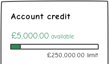
Currently, as the customer spends their credit, the bar moves from right to left:
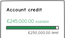
More credit becomes Less credit

Is this example correct or should the bar move from left to right as credit is spent? How would this look? I only have a narrow width to work with (~250px).

1
  • 1
    Test with users.
    – dnbrv
    Commented May 1, 2015 at 17:37

2 Answers 2

13

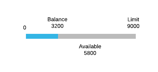
I think it's your markers that are causing confusion, I believe something like this would make it easier to read.

Example

The colours are from Lucid Chart Android elements, there's no reason not to change them to your design guidelines or for something more pleasing.

You could also stick a label under the gray area with "Available to spend: 5800"

Example of above:

Expanded Image

I think you could play around with it, unless we're talking for display on a watch? Compact Version:

Compact Example

3
  • 1
    The blue-on-grey coloursheme isn't so great though. But having labels at each end is good.
    – JonW
    Commented May 1, 2015 at 13:47
  • It's Android Lucid, I'll update to say the colours are representative and should be changed. Commented May 1, 2015 at 13:48
  • I didn't make this clear but I only have a narrow width so I wouldn't be able to use your wider example. Any thoughts would be much appreciated. Available credit is the most important thing to show. Commented May 1, 2015 at 14:05
15

Bend that bar into a circle!

A donut chart is perfect for 'percent of total' visualizations. And using color to indicate account "health" adds another layer for the visual thinker. It makes for a fairly compact presentation that delivers the all the critical data.

For smaller spaces, I would limit the displayed data to balance only and tap/click to switch to the remaining balance.

enter image description here

5
  • 1
    I strongly advise against using a circle starting from 3 o'clock.
    – Blackhole
    Commented May 1, 2015 at 16:39
  • 2
    Them's some strong words. Okay, start at 7:30. Commented May 1, 2015 at 16:43
  • 2
    @Blackhole In the spirit of SE community thinking ... image updated (^‿-) Commented May 1, 2015 at 16:47
  • 1
    @Blackhole Why not start from 3 o'clock?
    – Mac Lover
    Commented May 19, 2017 at 20:51
  • @MacLover Because traditionally and by definition, clocks start from 12 o'clock :). Just give a look to the image in this post before the edit, and see by yourself how unnatural it looks and how difficult it is to read.
    – Blackhole
    Commented May 21, 2017 at 12:33

Your Answer

By clicking “Post Your Answer”, you agree to our terms of service and acknowledge you have read our privacy policy.

Not the answer you're looking for? Browse other questions tagged or ask your own question.