2

Somewhat related to:

Progress - When should I go from 100% to 0%, or vice versa?

I'm wondering if it's appropriate for a progress bar which is a countdown to go from right to left. That is, in this case I want to communicate urgency to the user that a task must be completed before the expiration of a certain amount of time. I thought perhaps it should be more like an hourglass draining. However, since it's non-standard, I'm wondering if it warrants breaking convention in this case or whether I should just stick to a standard LTR progress bar for familiarity.

4 Answers 4

2

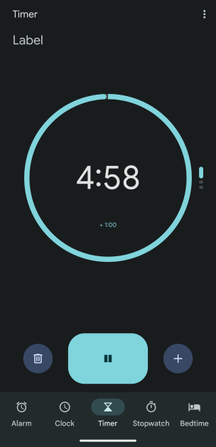
If you genuinely want the progress bar to feel like a countdown, I would suggest using a circular progress bar which is decreasing from completely filled to empty. This would also replicate the real world timer and is used in native android clock app.

Screenshot of android native clock app

1

LTR progress bar would be hard to understand.

Better options would be following:

  • Vertical, top down, draining, if there is enough place.
  • Gauge, right to left, left corresponding to 0 and right to 100%.
  • RTL progress bar. It is not so widely used. But it is recognizable. Everyone knows e.g. battery indicator on smartphones.
1

I think this is a dialectical issue. I can think of at least three possible approaches to representing it using bars:

  • An empty bar that gradually fills from left to right, indicating an increasing label that reaches 100%.
  • A filled bar that gradually empties from right to left, indicating a decreasing label that reaches 0%.
  • A less common choice is to divide the bar in half, with the left side representing a negative aspect and the right side representing a positive aspect. This allows for a quick visual comparison between good and bad.

Each approach has its own dialectical implications.

In the first case, the filling bar conveys a sense of urgency, communicating an increasing likelihood of a negative outcome. This may trigger Negativity Bias in users, who may try to avoid the negative outcome: "The more I wait, the more in danger I am"

In the second case, the depleting bar signifies running out of time, still communicating a negative outcome by appealing to [Risk (or Loss) Aversion bias]2: "I had time, now I'm in risk of losing it all"

Finally, the third case utilizes a comparison between two qualities, one good and one bad. This could be associated with the Contrast Effect, although it's not always the case, it depends on your use case.

All three concepts are relatively easy to understand and are commonly used to some extent. Therefore, it would be best to conduct user research and test which option works better for your specific users. Using cognitive biases is a powerful tool, so using the right one will make a real difference for user and their experience.

0

For your use case, a RTL progress bar can make sense, but instead of thinking of it as a progress bar, think of it as a meter. An example of a widely used meter is the battery indicator. Meters are used to show quantity, so it makes sense for them to deplete. In this case it shows the amount of time left. And yes, you can style it like a progress bar, I strongly oppose having a round one since it needs to be noticeable.

And just as I said, meters show quantity, so please don't make it look like a normal progress bar (LTR), since you're showing the depletion of something (remaining time), not some kind of progress.

Your Answer

By clicking “Post Your Answer”, you agree to our terms of service and acknowledge you have read our privacy policy.

Not the answer you're looking for? Browse other questions tagged or ask your own question.