6

I'm designing a website which elements that have a "progress" property, a bit like change.org or KickStarter.

Both of these websites use the classic progress bar. We would like to innovate. What are good alternatives to the progress bar to indicate progress on websites?

5
  • 2
    What have you tried so far? How would deviating from the traditional pattern benefit your users? Commented Feb 22, 2013 at 17:27
  • We haven't tried much. Vertical progress bars do not look promising. Our format is very similar to the linked websites, but we'd like to "differentiate" in some way or another.
    – Randomblue
    Commented Feb 22, 2013 at 17:28
  • How about a progress "pie chart"? Easy to accomplish using canvas on client-side, and could be styled in so many creative ways (like a real pie being eaten as you get closer to 100% done). Commented Feb 22, 2013 at 17:33
  • 2
    Think of your users and how they will assimilate the data. It's better to use something tried and true that users will understand, rather than try to innovate and introduce any confusion. If you're looking to indicate progress, any graphical interface you provide will likely be a variant of a basic progress bar, no matter how it looks. Put usability, readability, and simplicity first, and then design around that.
    – user8889
    Commented Feb 22, 2013 at 18:28
  • I think it's becoming clear that we need more information about what the progress bar is intended to convey. It it just a number - a single measure, or are there other factors that make this worthy of a more complex dashboard style item. Commented Feb 22, 2013 at 20:28

4 Answers 4

11

I think you should consider whether or not you gain anything from deviating away from a progress bar. The previous answer (describing the Bullet Graph) might be good for displaying more complex values than just a percentage of completion, but it's not super understandable; whereas the progress bar is instantly understandable.

I would think that you should only try to improve what works if what works doesn't solve all of your needs. Being different just to be different can have serious drawbacks as far as users are concerned.

Of course, there's nothing wrong with coming up with a unique visual style for a progress bar while maintaining traditional functionality.

2

Northland International University has (a picture of) a progress bar that nicely indicates the guidance percentage and the exact amount.

enter image description here

However, whatever you do in order to innovate, don't fall into the trap of producing a large area that conveys very little information. Pie charts in particular, due to their round shape take up a lot of space but can sometimes represent just a single number.

Stephen Few covers this topic in his book Information Dashboard Design: The Effective Visual Communication of Data where he discourages wasted space using such mechanisms. He rates (his own!) Bullet Graph as a good mechanism to replace thermometer and progress style displays in dashboards. enter image description here

Perhaps that is something you can utilize if you have some element of target and competitive nature to your progress.

For other innovative ideas - it's worth searching for progress bar or progress on dribbble.

1
  • The purpose of the bullet graph is really to try and condense information into an easy 'one glance' view of information. However, it is normally used for static content, so I don't know if using it for dynamic progress will create visual distraction that detract from its intended purpose.
    – Michael Lai
    Commented May 7, 2013 at 3:44
2

The progress bar is the best solution for kickstarter for the following reasons:

  • It answers the main questions: what's the goal and how far are we to it? How far do we have left?
  • Aspect ratio: it's flat and wide. A nice, central eye-catcher that takes up little of the precious vertical space.

So there are a couple of ways to find a well reasoned alternative.

Where do the mechanics of your site differ from kickstarter's? Is the deadline less important? is there less of a fixed goal? Is there maybe something like competition with other projects that's important? Say that you have projects competing for resources, then you might want to show how much of the total the current project has, and how much the others have, for instance with a stacked graph. If there is no significant difference to kickstarter, then you have bigger problems than the infographics.

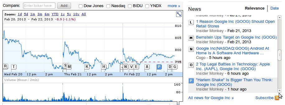
Think of the information needs that the progress bar doesn't show. It tell you how far you have left to go, but it doesn't show you whether you'll get there in time at the current rate. it doesn't let you match significant events like fundraisers to jumps in donations. For these a graph like the YouTube page views or Google finances might be helpful.

YouTube: YouTube page view statistics Google Finances: Google finances graph

You can simplify them to the level of the progress bar. They put more emphasis on project monitoring than project description, but maybe that's a good thing for your site.

1

I had a quick look through dribble using the progress and progress bar search terms, and most people stick to the linear or circle (which is just a closed linear representation) paradigm. I thought one example is worth mentioning because it is a really good example of converting something logical to something that is visual in the context of the subject. Here is another example that illustrates creative use of the progress bar. I am hoping someone will update this discussion with something new that will drive some creativity in this area.

Your Answer

By clicking “Post Your Answer”, you agree to our terms of service and acknowledge you have read our privacy policy.

Not the answer you're looking for? Browse other questions tagged or ask your own question.