0

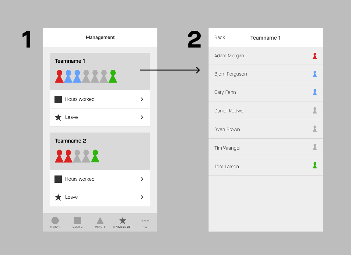
I'm designing an application that has some functionalities in it only for people who are managers and have one or multiple teams working for them (most of the time it will be 1 team). Now on this "Management page" i want the managers to be able to visually see at a glance:

  • How many people are currently at work (signed in physically)
  • How many people are not in yet (but will be there today)
  • How many people are absent (leave, sick, etc.)

Then when they tap on this card/visual (1) they will see a full detailed list

enter image description here

I was thinking of doing something with icons and colors, but i'm looking for more ideas on how to do this. I'm also not sure if this way will work for bigger teams (20, 50, 100+ people..)

Somebody here got some ideas i maybe can play around with? Some examples to look at?

1
  • 1
    I'd recommend you start by unpacking your goal of visualizing the state 'at a glance'. Think about which information is most important. Is it equally important that a manager see how many are absent and present? What are they in fact measuring? And what do they do with this information? Commented Oct 12, 2022 at 11:45

3 Answers 3

1

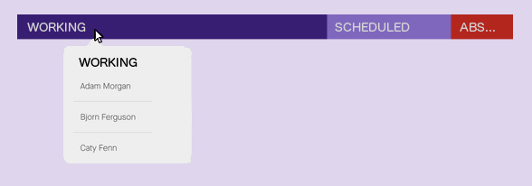
Here is a suggestion - show the three status within one filled bar:

enter image description here This is simpler than stacked avatars, but has the same informational value, and scales well to accomodate large teams.

From a development perspective, it can be implemented as a stacked column graph -- with labels and value appearing on hover.

1
  • Inner-bar labeling would make this even better. A flyover can give even more info. Commented Nov 14, 2022 at 15:20
1

Expanding on @essbee 's answer, adding inner-bar labels:

distribution bar

...with mouseover activated popup to provide more information:

mouseover popup

0

Your approach would not work with large teams, since you visually represent every team member with a icon.

The solution depends on the need of the users. Is it necessary to have an rough overview or exact numbers? Is it important to see only the percentage of the team etc.

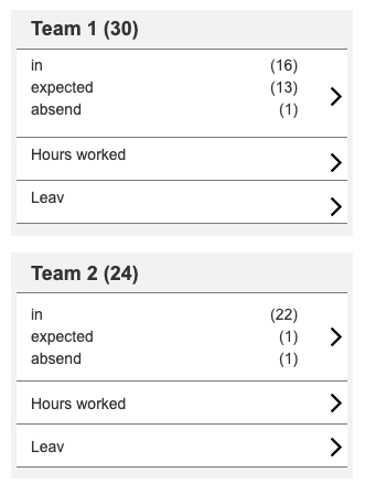
I assume it is about the numbers. Therefore I would suggest to use numbers instead of icons. Also the color coding alone would not be enough you would have to add an explanation.

Here is one possible approach, which would solve these problems. You could even use additional icons or color coding for the status.

enter image description here

1
  • Hi Bruno, thanks for taking the time to answer! I'm not sure how important it is to know the exact numbers. Because if you see like 2 people are late, you still want to know who they are and you would have to go to the detail page to know that..so maybe it isn't that important. I was thinking maybe something like the avatar-stacking effect could work for this, but not sure. What do you think?
    – Awesom-o
    Commented Oct 12, 2022 at 10:50

Your Answer

By clicking “Post Your Answer”, you agree to our terms of service and acknowledge you have read our privacy policy.

Not the answer you're looking for? Browse other questions tagged or ask your own question.