I think the best solution has largely to do with what you're trying to achieve by displaying this information. Is it like a resume where someone wants to just get across the message that they know a lot of different things? Or is the goal to more clearly show someone's relative experience between different skills? And how accurate does the comparison need to be?
If it was a real data visualization you'd probably want to be more precise, but in this case it's unclear.
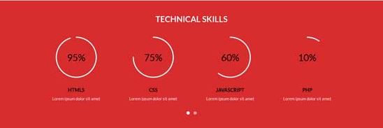
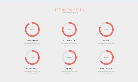
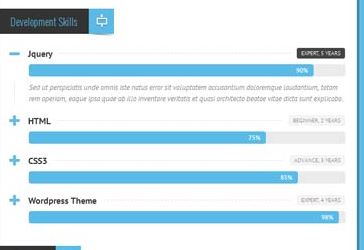
In your first examples, those aren't really pie charts but instead radial bar charts with only one value each. The last example you gave is more like a normal bar chart.
Displaying the data as a regular bar will likely give more precision and make it easier to compare between different skills. But is that what you really want? Does it really matter if someone is 74% CSS vs. 76% HTML? The radial bar charts are less precise as a visualization tool, but perhaps they still get the point across that this person knows more of some things than others. And since they aren't as accurate as straight bars, you aren't caught up as much in comparing exact percentages.
see this chart on the capabilities of different visual encodings:
http://complexdiagrams.com/properties
The second question which you pose well is whether or not these percentages are a good way to present someone's skills at all. I like the more subjective measures like "Expert" vs. "Beginner" better, since you don't have to deal with issue of determining a number of years that would get someone to 100%. A person could use HTML5/CSS3 for 5 years, but that doesn't mean that they're an expert. But if you do go with those, you'll probably have to find a way to present the information in a more visually appealing manner like the other examples.


