5

I have been trying to find solution for coming up with a better pie chart for couple of reasons.

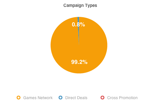
Overlaying #% (text) on top of tiny portion of piechart wasn't really working in my opinion. example of pie charts
Also, another common way is having thin lines branching out from portion of pie chart to indicate legends. example of legends
I didn't find that as the best, either.

This is what i have to make with. For example,

Network: 80%, 1 campaigns

Direct: 20%, 4 Campaigns

Promotion: 10%, 2 Campaigns

Purpose of this info to show it as a graph (it's pie chart for the moment): Giving information to users not only #% of these 3 main parts but also to notice the fact that it can be "80% is what you make of is from ONE campaign" vs "even if you have 4 campaigns, that can only be your 20% what you make of"

I would very much appreciate for any solutions can be provided!

The last image is not a solution, it's where I stopped. This one includes a hover action, i.e. the number changes on hover but people said it's doesn't let people to grab all infos at one sight.
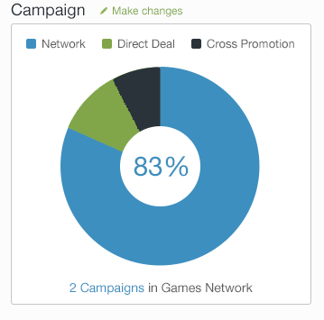
dynamic pie chart

1

1 Answer 1

5

The best chart type depends on what is the metric you are trying to show or compare.

Pie chart is good only to show the relation of a couple of values. It works best if you have two or at maximum three segments. It also might get too cluttered if one or two segments are really small (as in your example).

Usually the basic bar chart or even a dot-plot is a good alternative to a pie chart. You can show the value and name of the column on (or above) the column itself. It also shows the relations very clearly. Depending on the data, an alternative form of visualisation is a grouped bar chart.

The main problem with interpreting pie charts is that humans are much better at judging differences in distances (bar charts) than differences in angles (pie charts).

If you need to emphasise that the values form some whole (e.g. 100%), you might use a stacked bar chart, or combine the two and use grouped stacked bars.

You might want to check out Edward Tufte's work on information visualisation to have a more complete reference of the different possible graph types and what they are good for.

3
  • 1
    Even though its difficult to interpret angle differences, pie charts display how much a piece belongs to a whole. Stacked bar charts also convey this, but are not as easy to read. But, as @jawa points out, for your scenario where you have lots of categories that have a marginal value, stacked bars might be a way to display the information. Another way, would be grouping all categories that have marginal values into a new category called "others".
    – jff
    Commented Feb 10, 2014 at 7:52
  • If the stacked bar chart comes with an axis displaying the percents it is likely to read as accurately as a pie chart.
    – Andy W
    Commented Feb 10, 2014 at 13:08
  • I have seen columnar pie charts that take a slice of a pie and break it down into a stacked bar chart (not sure if chord or arc divisions would be better). If one group of values constitutes perhaps about 20% or less of the pie, this might work well. (This is a variation of jff's suggestion of an "others" category with the assumption that individual components are imporant.)
    – user43012
    Commented Feb 13, 2014 at 23:50

Your Answer

By clicking “Post Your Answer”, you agree to our terms of service and acknowledge you have read our privacy policy.

Not the answer you're looking for? Browse other questions tagged or ask your own question.