Points of reference, please, for documents and/or discussions that supported the design rationale.
I'll add one answer, I don't know whether it's ideal.
Background
A brief, two-screenshot introduction to how the bar responds to a click on the title/URL:
- GNOME Web 3.11.90 released with new addressbar and improvements | fedoraFTW | fedora = free open-source (2014-02-24)
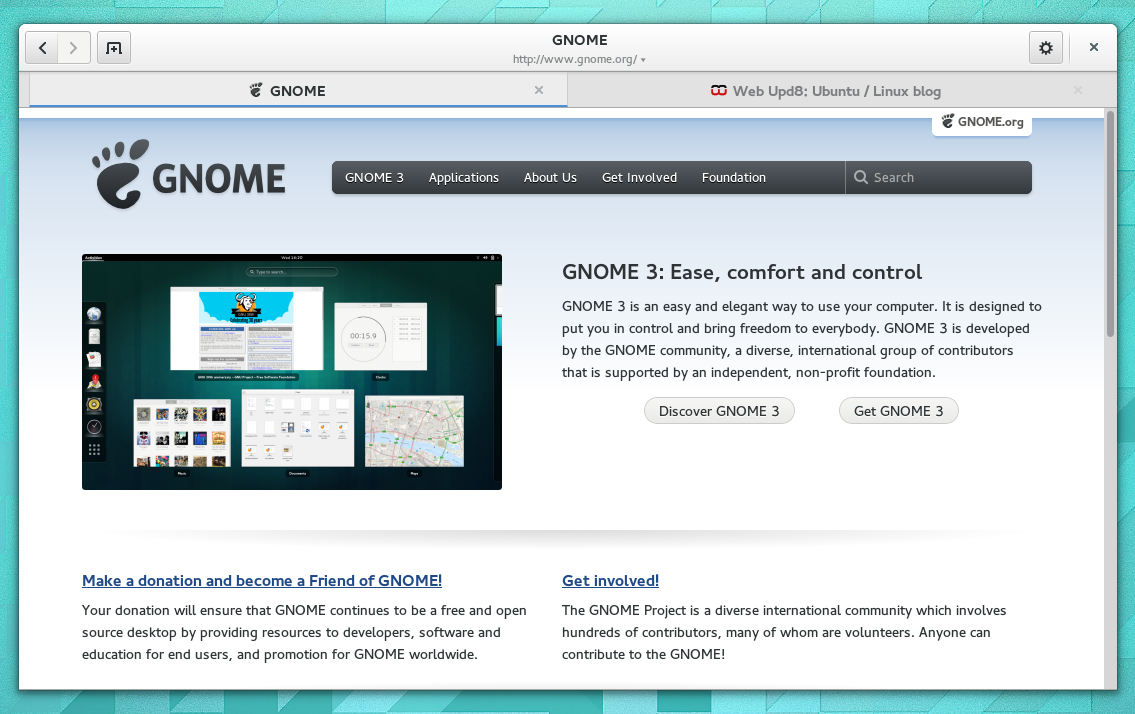
The following screenshot (source) exemplifies a clearly presented title and address, complementing tabs with favicons:

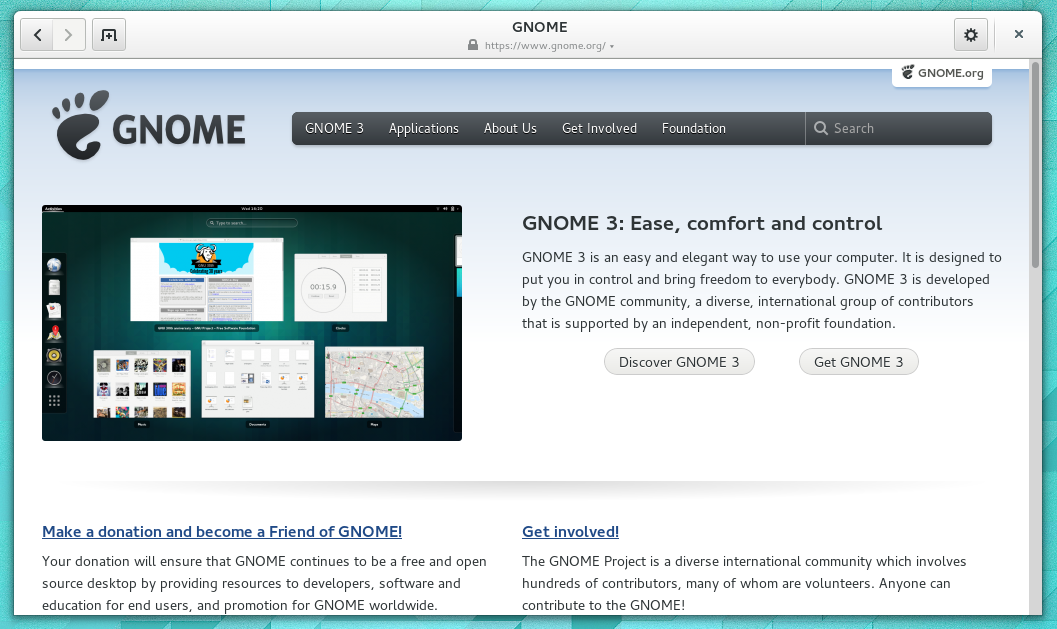
From Apps/Web - GNOME Wiki!, a more familiar shot of a single window without tabs:

UX Stack Exchange answers such as https://ux.stackexchange.com/a/26055/16809 and https://ux.stackexchange.com/a/4879/16809 help me to know that the current design of Web is pleasantly consistent with relevant parts of the Gnome Human Interface Guidelines (HIG). I'd now like to find discussions that demonstrate/reinforce the value of those consistencies.
Personal opinion
I love the design of the header bar in the current Gnome Web.
I dislike what Apple has done, publicly, to Safari 8 in the first four developer previews of Yosemite – up to and including build 14A298i of OS X 10.10. Where previously we had a title bar (with a visible title) and address, now there's neither.
Whilst there's personal dislike of that design, I would like potential answers to be fairly free from bias …
Ideal answers
Links to discussions that demonstrate:
- healthy argument with multiple points of view
- logical conclusions.
Keyword:
- rationale
Thank you
