1

Here's what the top of an app I am working on looks like: enter image description here
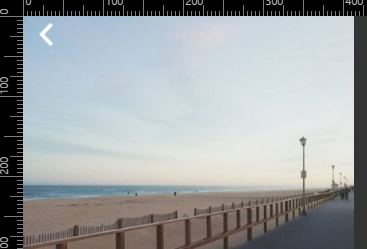
As you can see, there is a white chevron. Before this, I was using a header but I kind of prefer this look so I get more screen real estate. However, I am planning on adding a couple more icons, such as a red heart (to like the photo) and a share icon.

However, there is an issue I will face which is when the image might be too bright at the top and the white back arrow or the share button might not be visible. How can I address this issue? Have you ever faced something like this?

Unfortunately I do not own a smart phone so I cannot test any apps that might do this already for inspiration. Also I do not know weather to put this into CSS or if this website is even the right place to ask, so sorry in advance.

2 Answers 2

1

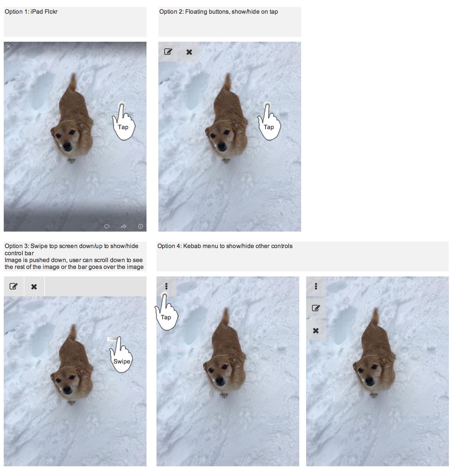
Here are a couple of options, including the toolbar. The toolbar can just be displayed on demand so the user can see full image by default. enter image description here

2
  • This works, but anything out of sight is more likely to be out of mind to the user.
    – Mike Milla
    Commented Dec 15, 2015 at 0:07
  • @MikeMilla think if you slide the screen down it might be more obvious that there is more content below. But yes agree that it's more likely that it will be missed. Commented Dec 15, 2015 at 18:31
0

Use a vertical black gradient toolbar like this.

enter image description here

1
  • "black gradient" is a bit prescriptive for my taste, but the bottom line is that you need something you can rely on to provide contrast / separation for your actions regardless of the background. Commented Dec 14, 2015 at 23:31

Your Answer

By clicking “Post Your Answer”, you agree to our terms of service and acknowledge you have read our privacy policy.

Not the answer you're looking for? Browse other questions tagged or ask your own question.