2

We currently use a handful of blank states within the sections of our app to inform users about what things are, along with the benefits and a helpful example.

The problem is that this is a team based app, so once one member creates a piece of content, that blank state is no longer there. So, when another member logs in for the first time they only see the content that was created by their team member (no blank state to explain the section).

We are currently thinking about a couple solutions, but are welcome to others as well.

Approach 1 - All users see the blank state. Once content has been created, new users still see the same blank state but it is dismissible. The problem here is that they aren't aware that content has been created until dismissing.

Approach 2 - Once content has been created, subsequent users see a tool tip banner next to the content for a brief explanation. The problem with this is that it is less effective in explaining the purpose and likely to be dismissed without reading.

What is the optimal strategy for informing ALL new users in a seamless and helpful way in this particular situation? Thanks!

2
  • When you're testing the concept, how easy is it for users to understand what to do without a "tour" of some type? Can they pick it up by looking at example data, or do they need a walkthrough?
    – Izquierdo
    Commented Apr 20, 2020 at 15:25
  • @StacyH They should be able to pretty easily understand "what" to do. I guess my main concern it that they understand the "why" around how it can benefit them. More of an "Oh that is useful" feeling vs. expecting them to investigate further.
    – Rohrski
    Commented Apr 20, 2020 at 16:39

1 Answer 1

1

You're correct about approach 1, users might be confused about a dismissible blank state, especially if they look over and see nearby team members adding content to the same system.

The nice thing about approach 2 is that you're treating the empty-state scenario differently from the populated-state scenario. You might want the user who engages with the empty state to have even more help than those who see populated containers.

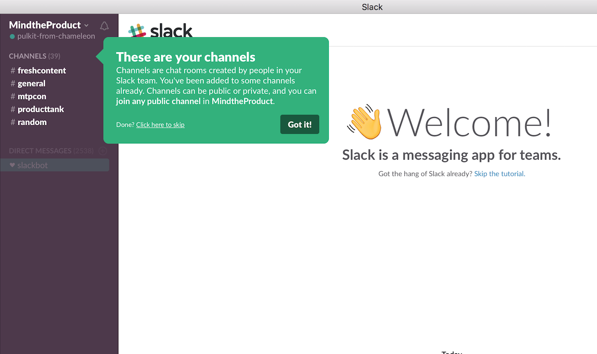
A dismissible tooltip explainer highlighting features shown at the moment the user needs to know about them (based on what they're likely about to do) would be a UX-friendly strategy. This can be shown to all users, whether there is content or not.

Slack lets users see channels that have been previously set up by team members, and explains them in an unobtrusive and contextual way.

enter image description here

1
  • Thank you for the feedback. It seems to make sense that the new user viewing a populated state would need a little less explanation vs. the blank state user.
    – Rohrski
    Commented Apr 21, 2020 at 18:45

Your Answer

By clicking “Post Your Answer”, you agree to our terms of service and acknowledge you have read our privacy policy.

Not the answer you're looking for? Browse other questions tagged or ask your own question.