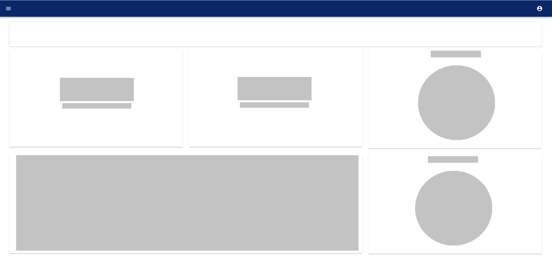
I'm creating a dashboard that retrieves a significant amount of data from an API before displaying some charts and metrics.
I have read that skeleton screens are perceived as being shorter in duration when compared to other options. Thus, I wanted to try it.
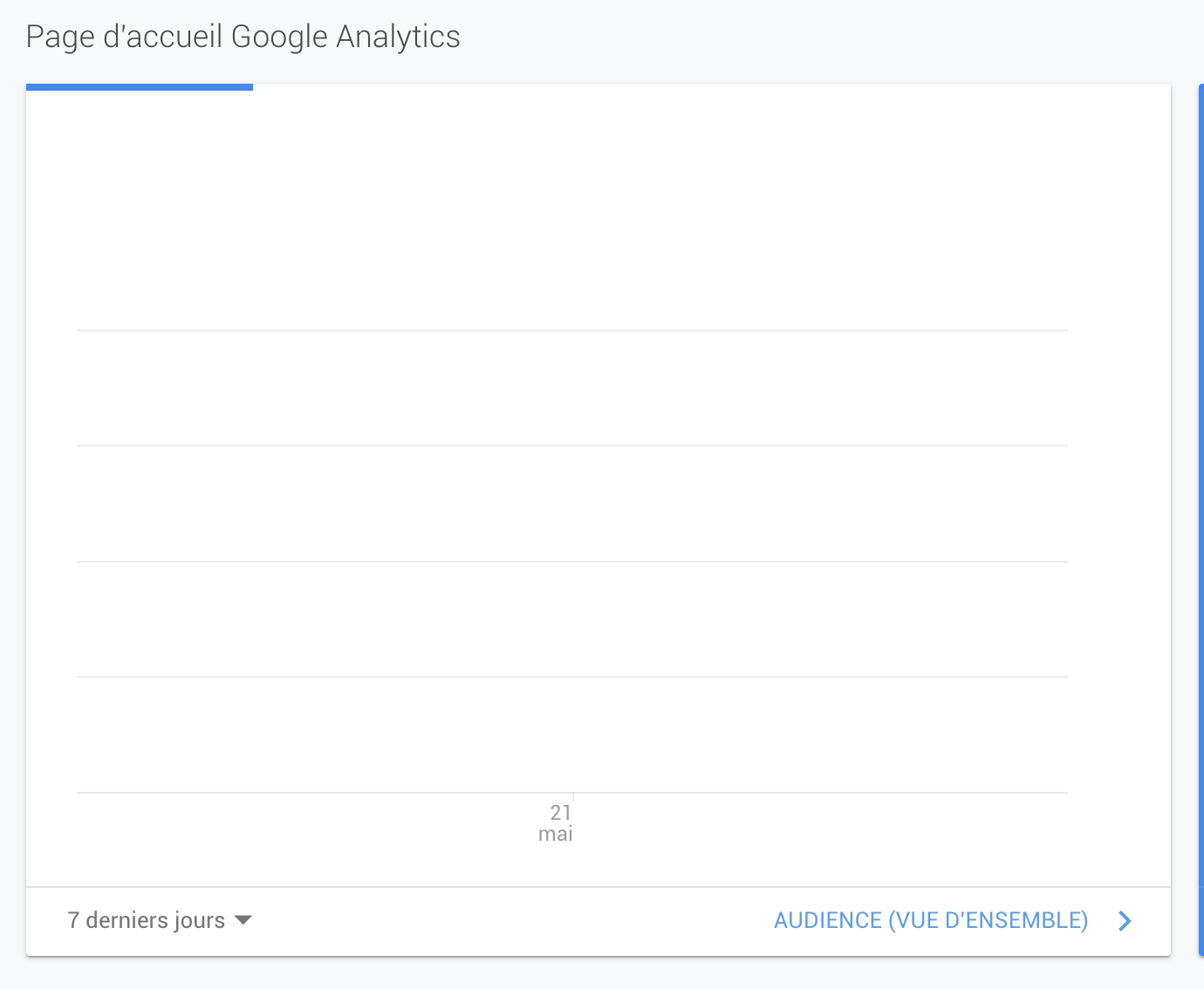
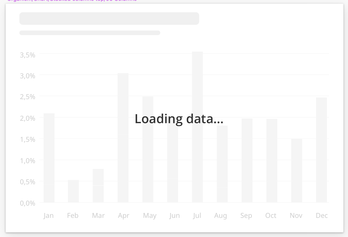
It seems that people replace use animated basic shapes to indicate what it will be replaced with. In the case of a large graph, I find myself bothered by a large rectangle covering the entire graph area:
- it does not indicate anything about what's loading in that placeholder (and what's to expect once it's loaded)
- it is arguably ugly
I could also use animated charts instead but that seems to break the idea of a skeleton screen.
Has anyone faced something similar and found something that works in that case?

