3

I'm working on a Statistical Analysis project and I have to draw a bar or column graph to show data that has both very large and very small values. Like for example:

Number       |        Count
----------------------------
1            |     12
2            |     100
3            |     1
4            |     610
5            |     50

The problem here is that values for some rows can be so large that when drawn on a simple bar or column graph, those few bars really dominate the whole graph and the smallest values become almost invisible to the user. I need to show those small bars because the user hovers on them to show more information about the data.

It seems that in most common charts/graphs like pie or line, there is the same problem that the largest values dominate the really tiny ones and make them almost invisible.

I know that I can just create a simple table and dump the values in there, but it's not an elegant solution and frankly, doesn't look very pretty.

So what solution do you think can be employed to have a graph without this problem? What can be the best graph for this situation? I'm free to employ any graph or chart as long as it can show clearly both the tiny and large data points.

Thank you.

1
  • Plotting the logs are your best bet, but keep in mind that there's a compromise: you'll lose the intuitive grasp of the value differences that regular charts give you. Logs not only cut this difference, but they make non-linear relationships seem linear.
    – R. Barzell
    Oct 20, 2015 at 19:50

3 Answers 3

5

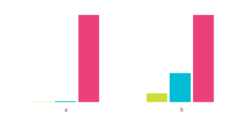
Thing is there is no type of data vis that works well for data that is dispersed too much. Hence the solution will depend not on the type of graph but on the application of the logarithmic scale to the data (not the original data you display, but the data you feed to the datavis component). Log scale will eliminate the dispersion. Here is my detailed answer to a similar question with an illustration how it works and how to do it: Graph for properties with a big gap between them

Chart (a) with log scale applied to data (b) enter image description here

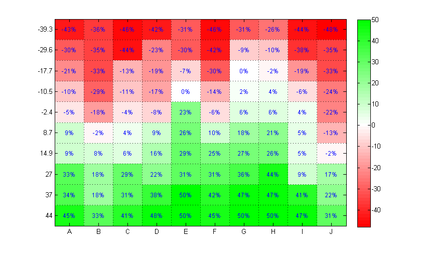
Once you use the log scale, you can then choose whichever kind of graph you want. If you are working with the table, from the top of my head I would suggest a heatmap. If it's a list, bar chart would work better. But you can also use a bubble diagram, or a pie chart — really whatever the data & it's organization dictates.

Heatmap: enter image description here

1

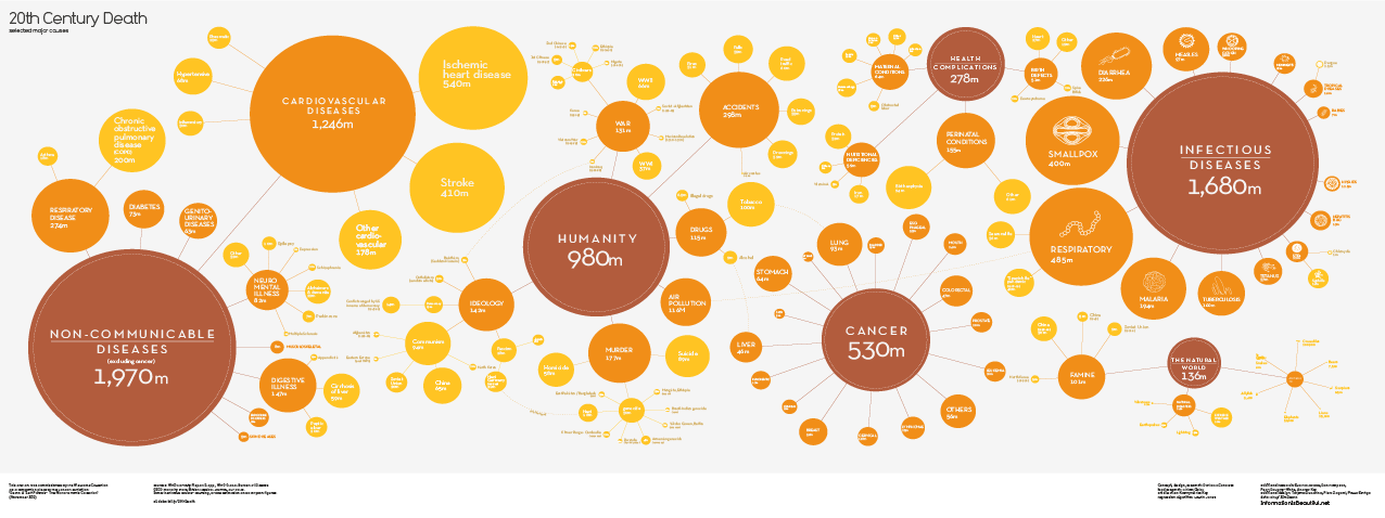
Are both columns of data needed? If not, a non-linear bubble chart would work, like this 20th Century Death bubble chart

1
  • This is good if displaying the relative size is the key requirement.
    – user31143
    Oct 21, 2015 at 6:11
0

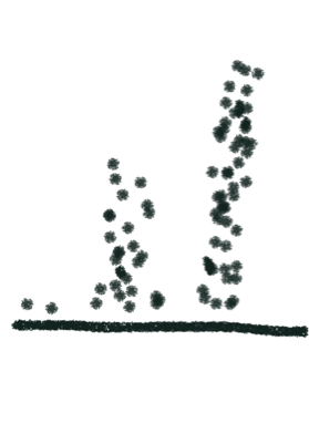
Represent them as piles of dots in some form or shape

enter image description here

3

Your Answer

By clicking “Post Your Answer”, you agree to our terms of service and acknowledge you have read our privacy policy.

Not the answer you're looking for? Browse other questions tagged or ask your own question.