1

The user needs to order a stack of cards, let's say each one representing a task. Let's assume the user has already ordered a set of tasks and now he needs to place a new one within the stack at the right priority order. In order to find the right place for the card the user needs to inspect the tasks.

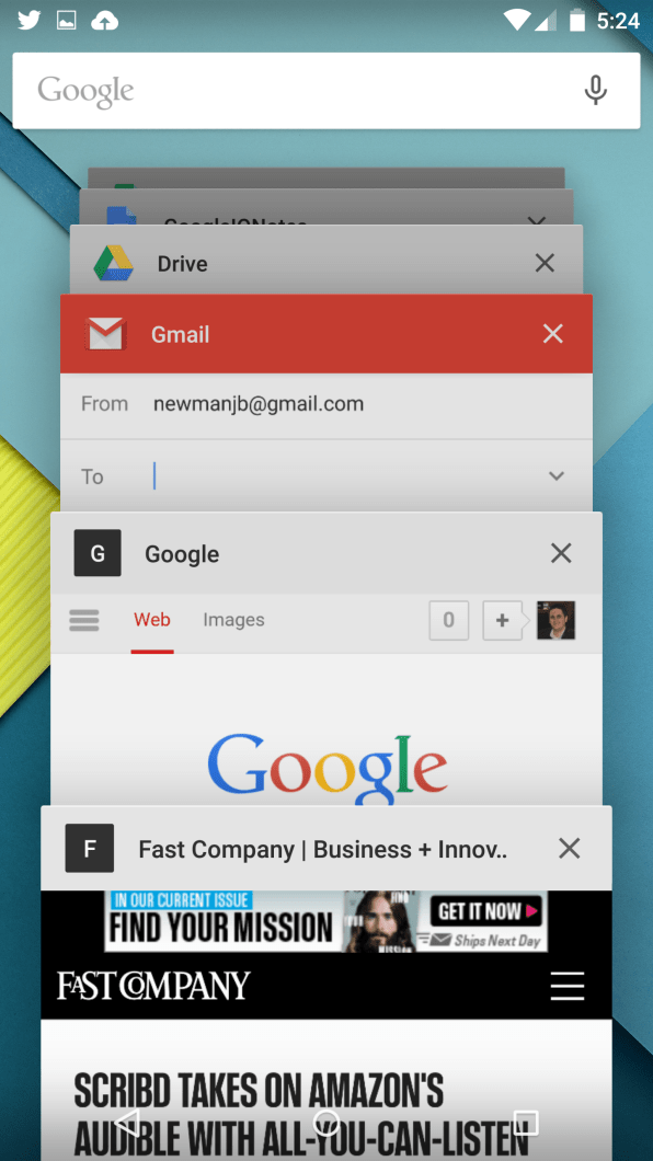
One idea would be to implement some sort of android multitasking view, but I would need that at least the card I'm inserting and the one that would stay just on top are fully visible, so the user can make up her mind about the position.

Any idea of existing designs to achieve my goal?

Android Lollipop View

4 Answers 4

1

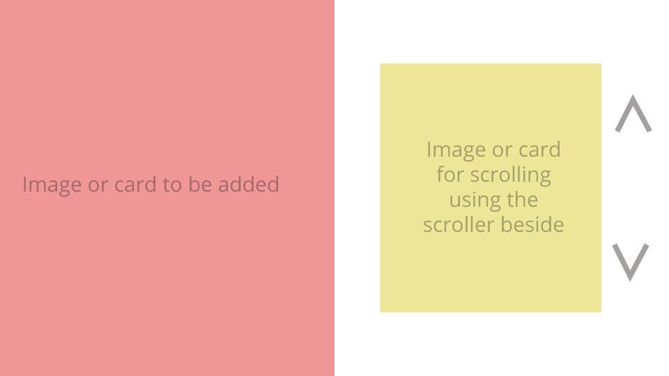
The scenario you have mentioned suggests that you need to simultaneously view the card to be added and the top card compulsorily. One drawback of using mobile device is that you dont have enough space on screen. In such cases you can do something like split screen where you would give 2 image boxes. In one you can select the card that is to be added and in other you can just scroll in between the other cards.

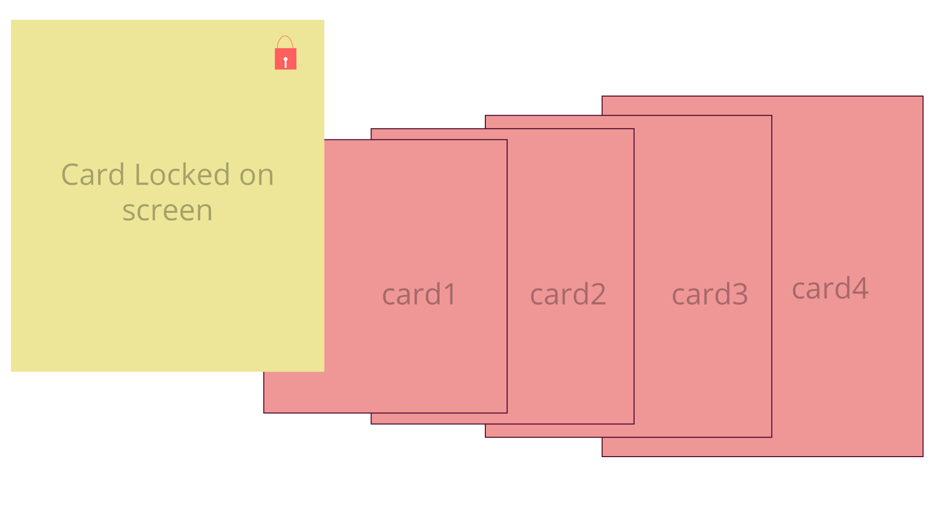
Else you can implement a functionality that will lock the card on your screen somewhere and remaining screen can be used to navigate in between the other cards.

The scenario is quite similar to the one you mentioned but in both the solutions I gave, you have control on whats movable and what not. Also, you can keep the experience similar to other tab and desktop views which would maintain consistency. You can reduce size of cards asper needed

Check images for refrenceenter image description here

enter image description here

1

What about something related to the way people order numbered cards in a deck. There are many algorithms, but the one people tend to jump to is effectively insertion sort, but you have an ordered list already.

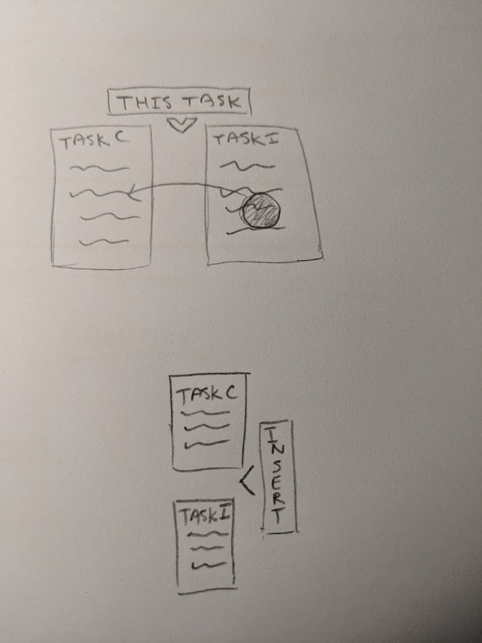
You can make a reference card on the screen (can be used vertical or horizontal), but indicate where the card would be inserted with a visual gap.

Allow the user to swipe/slide/scroll the cards in the sorted list until they find the spot to insert. Horizontal and Vertical concept of the layout/interaction. Detailed horizontal concept with more detail

1

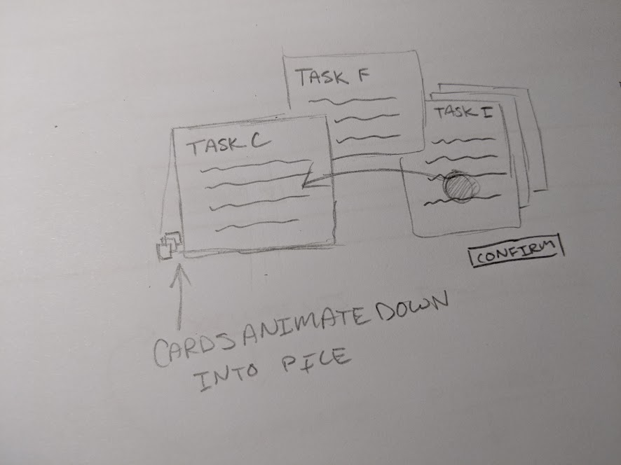
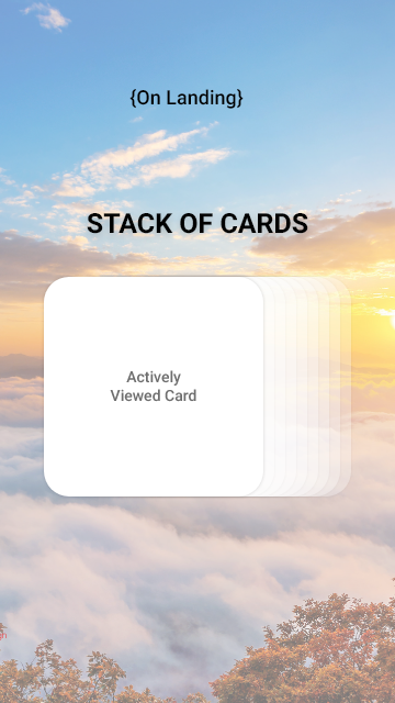
Here's a concept that should solve the design problem.

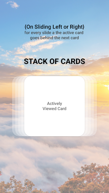
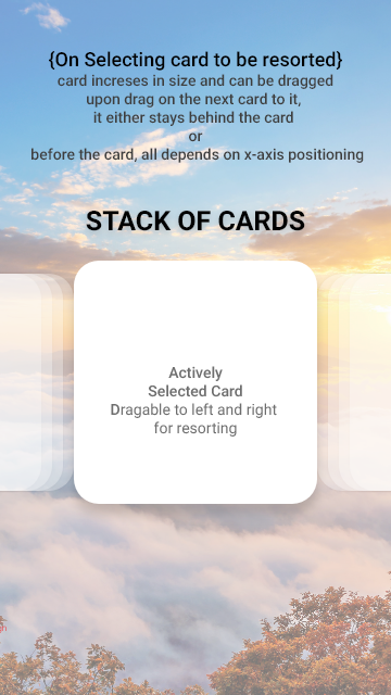
Just an improvement on the popular android multitask card vertical scrolling stack, here the scroll is made horizontal.

ON LANDING

enter image description here

ON HORIZONTAL SCROLL

enter image description here

ON ACTIVE CARD DRAG

enter image description here

0

One thing you could do is to have the same presentation as the multitasking view in your post, with the new card in a fixed position (where the Google one is in your picture), and the ability to scroll through the other cards.

Whenever a card that is "behind" your new card gets to the same level as the new one, it just "pops" in front of it, and continues its move. Likewise, if you scroll back, it will move behind the new card.

Initially I would guess the new card is "on top", so there are no cards in front of it, just behind it.

At any time, once you release the scroll (lift your finger), cards would move back to the right "step" (rounded position), to avoid a card being just behind the current one, or your card being barely visible behind another one. This would make it more explicit where the card is.

Once you have used it once, it should be self-evident. The only issue I see is communicating initially how you use it (a user may want to drag the new card and move it to another position rather than moving the other cards).

This could be solved by actually having two different possible interactions:

  • you can drag by starting anywhere but the new card, and all other cards but the new one will move accordingly

  • or you drag by starting on the new card, it will move the new card a bit (but "bounce" back to its position as soon as you release), and have the other cards move in reverse direction (so if you drag the new cards towards the top, it would actually be the other cards moving towards you).

Only actually testing will reveal if this actually works :-)

Of course, there's the issue that the spacing between the "other" cards will be different depending on their position. Whether you adjust it "as you scroll" or only when you "snap back" the cards into position after releasing is your choice.

A slight alternative is to have your new card on the left side of the screen, possibly only half of it or so, so it's a bit more obvious that there is a difference between that card and the others.

Your Answer

By clicking “Post Your Answer”, you agree to our terms of service and acknowledge you have read our privacy policy.

Not the answer you're looking for? Browse other questions tagged or ask your own question.