6

It's the first time that i came across the design of a mobile-only UI app. I'm not experienced with it and i would like to know what is the best place to put form submission buttons in a mobile application?

For instance, is a good idea to let form actions stay fixed in a bottom bar or in top-left corner?

I'm concerned about the fact that if an user updates just one field he has to scroll to bottom to find form actions.

5 Answers 5

1

Different in different contexts, but consider the use case. If it's a form with various fields, make sure the user can always see the next action.

So as a user engages with any given form element, they should be able to see that element (obviously), but they should also be able to see the next element.

While engaged with last element, they should be able to see the final buttons. It gets more complicated with more and optional fields.

1

Presenting the the actions at all times it will allow the user to complete the task quicker. The first thing that comes to mind for this is to put the actions to either confirm or back out in a fixed header or footer.

If you take this approach, you would really help out the user if you gave them feedback for how far down they are in the form, or how complete the form is.

The first one could be done with a deliberately placed scrollbar that's device agnostic (not my favorite if this is a web app and not a phone app, but I have seen it done well in browsers).

The latter will require client side validation that the form elements are satisfied, though they may or may not be validated.

1

Placing the submit button in a fixed place can help the user complete the action faster, which is a great thing, but I would recommend doing that only if most of the common actions being performed on this form are visible to the user. Otherwise, a user might skip some actions and that can be annoying.

As Jay said, I would highly recommend making the next action visible. That can prevent from the user skipping an action by submitting the form via the quick submit button.

0

Users with smaller screens might not scroll down and will hit the submission button before entering information in other required fields. Then they will be directed to those fields they have not seen yet. ("Where am I? Why didn't I see this input field before?")

I understand your concern of scrolling through a long list entering details and having the submit button at the very end. But only that way you can be assured your users will see every field that is required (and decrease the number of users not entering required fields and being redirected).

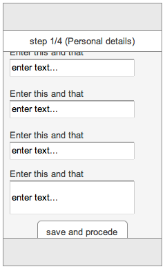
If you have a very long list you could divide everything on to more pages, letting the user save his entered data step by step. That way he will not constantly think everything will get lost if he unintentionally closes his screen, the battery of his mobile drains etc.

And instead of placing your submit button fixed on top/bottom you could show a wizard indicating the procedure:

enter image description here

0

Generally you will want to place any sort of "Submit" or "Next" button at the bottom of the screen. You are concerned about the user scrolling too much to get to the bottom? Something to keep in mind is that most mobile applications are fairly linear and short in each "page", so scrolling down a lot is not really a standard practice. One last thing to consider while you design for better user experience is enabling the user to go back and "fix" any potential mistakes as well (so like a "previous" or "go back button").

Your Answer

By clicking “Post Your Answer”, you agree to our terms of service and acknowledge you have read our privacy policy.

Not the answer you're looking for? Browse other questions tagged or ask your own question.