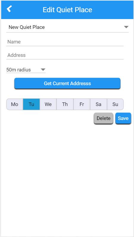
 Consider the form screenshot shown above. The context here is a hybrid app for Android (v 4.4+).
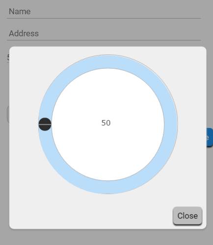
- The distance (50m) selector popups up a dialog with a circular slider going from 50 to 1000m, in 50m increments (i.e. 20 "ticks")
- The Current Address button uses the device GPS to enter the current location address in the address field
- The days of week selectors allow the user to select one or more days
The things I somehow feel could be improved/changed
- The location of the Current Address button
- Making the buttons - particularly the Delete & Save buttons flat
I am not a born and bred designer and I struggle to keep on top of current design trends so I hope that someone here might be able to give me some pointers.


