0

We are designing a flow where the user is expected to enter some additional mandatory data after entering some other data. For example, the user enters amount in a field and does a TAB-OUT. We want the system to automatically pop-up a modal window to tell the system certain mandatory information about the source of funds. It is agreed by everyone that modal window is the best option.

Now, the question: Should the system automatically pop-up a modal window after the user does a TAB-OUT or provide an icon and ask the user to click the icon? One view is, automatic pop-up is better because the step is sequential, mandatory (and hence expected in a sense). It also saves a click. Contrary view is any automatic pop-up is bad since it is "unexpected" for the user since no explicit action was initiated by the user.

The first camp argues that "unexpected" pop-ups are bad when it is used for messages that are meant to solicit unrelated inputs (like advertisements, donations etc) and not when used in an enterprise application where it is an essential step in the process.

A quick background on the nature of system: The system is meant for internal users of an enterprise and therefore the users will be repeating the task multiple times on a day to day basis. The usage is primarily on desktop.

What is the right way to go in this context?

4
  • What's a TAB-OUT and what's preventing you from making this a regular form input? Commented Oct 4, 2016 at 10:08
  • Sorry, there was a typo in my question and probably that created confusion. In the second paragraph it should be "after the user does a tab-out". I mean the user enters some value and presses the TAB key on the keyboard to go out of the field. The question is, whether the key press on TAB key is a good enough user action or we need an icon and a click on that? Commented Oct 4, 2016 at 10:19
  • I see. You should edit your post to correct the typo. Why can't you capture the mandatory data on the same form you get the optional data? I'm not clear on why the modal is necessary. Commented Oct 4, 2016 at 10:23
  • We want a modal for couple of reasons. 1. We want to keep the form small, without lot of vertical scrolling. 2. We may want to view/edit only the data in the modal without having to go through rest of the data. In any case, everyone in the team is convinced on the need for the modal. The question is only on how to bring it up - automatic or on explicit click. Commented Oct 4, 2016 at 11:02

4 Answers 4

0

The modal should be automatic. The modal is being used to capture required inputs from the user while they are inputting data. While the modal may be an unexpected input method for the user it won't be requesting an unexpected activity when it appears. Additionally, giving the user an icon to click is an extra step which creates unnecessary friction.

0

I am also doubting the need for modal in this case but let's put this aside since you are set on it.

I like Hem's idea. Also label that modal correctly, so it is more informational than just an "advertisement". Make it automatic and keep clicks to a minimum. + this seems to be an internal application so there will be a learning curve.

0

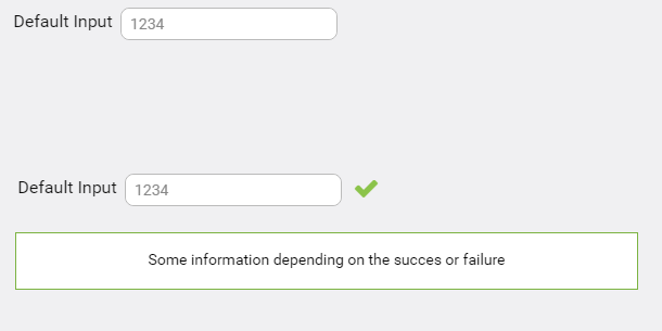
Why don't you show the information inline like below screenshot

enter image description here

2
  • Inline in the same form? That is not considered as ok (leads to long scroll) because we will have more than a dozen fields in the intended popup. As I mentioned in a previous comment, everyone in the team is convinced that we need a popup window. The only contention is on how to bring it up: Since it is for internal users of an enterprise and a mandatory step in the process, do we still consider automatic popup as "unexpected UI behavior"? I think no, but some folks disagree, probably based on textbook definition of what is "unexpected". Since the users have the context, I believe it is ok. Commented Oct 5, 2016 at 6:24
  • can you share a wireframe? if you align succees/failure massge inline with inputs(see the position of green tick), it won't add a verticle scroll. Also putting a dozen fields on popup fails the usage of popup.
    – UXbychoice
    Commented Oct 5, 2016 at 9:20
0

I recommend implementing 'error-prone' method and provide the hints on focus, rather than showing a modal popup to correct the error / mistake done by the user.

BTW, do you have any strong reason to stick with the modal pop-up? just wanted to understand from your perspective...

Your Answer

By clicking “Post Your Answer”, you agree to our terms of service and acknowledge you have read our privacy policy.

Not the answer you're looking for? Browse other questions tagged or ask your own question.