1

UX Question:

Can I have a link open up a modal window by default but also allow the user to open the same link instead as a new window or a new tab?


Quick background of the system: - I have a case management system. - Each case has a unique URL and is made up of events - A case can have 1 event or thousands of events - A user can share a single event from a case

While on a case page, we show a list of events. Each event on the list provides ~ 10% of the info available for that event. To see the rest, the user clicks on "View full event" and a modal window opens up with Next/Prev functionality to browse records without having to close the modal window.

Here's what I am considering:

Scenario 1:

  • Remove modal windows and have the link open in the same browser window
  • This gives the user the option to open link in the same/new window or open it in a new tab.

Scenario 2:

  • Clicking "View full event" still opens a modal window
  • If the user wants, they can right click or shift click the link to open link in new window/new tab.

Would Scenario 2 be bad UX?

Here's a preview of the case screen: https://codepen.io/hectooorr/pen/WMaqNb/

2
  • Do you have access to your users? Would they be able to provide some insight as to how they use/would like to use the system? Commented Feb 26, 2018 at 20:37
  • I only have access to internal testers. Some like it and some really hate the modal window. Here's another scenario... let's say you scroll down to event 50 and you click on "View full event" and open in the same window. Now the browser back button would take you back to the case page but not scrolled down to event 50. If that is even a con... But without the modal you lose the option to quickly browse next/prev events in full event view mode.
    – Hectooorr
    Commented Feb 26, 2018 at 20:56

2 Answers 2

1

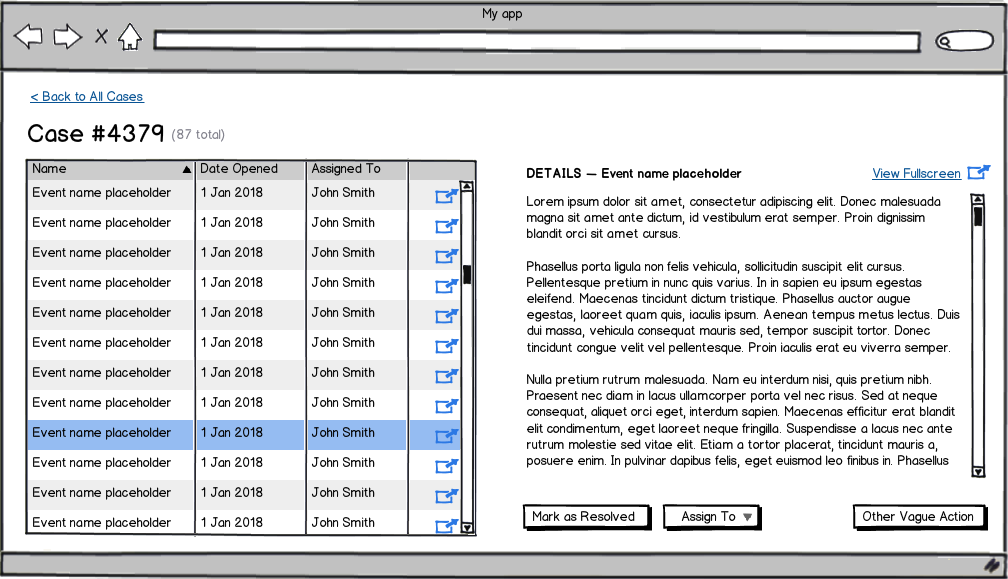
Consider a list-detail pattern1 like the following. I'm not sure how much detail you're needing to show upfront, but perhaps you could have the (potentially long) list of "Events" on the left of the screen, then show details for each on the right of the screen.

PROS

  • Sidesteps the issues caused by modals
  • Allows for a single-click to open in a new tab
  • Allows for a single-click to open an in-page preview (just as your modal was doing)
  • Doesn't rely on "power user"-type features to provide functionality (as the "Shift + click" and "right-click > Open in new tab" behaviors did)
  • Allows you to keep your place in the list while exploring details of an item
  • Provides (probably) the same amount of real estate as the existing modal implementation
  • Region is extensible, by making it scrollable (which is more natural than scrolling in modals)

CONS

  • Requires a bigger change to the existing UI
  • Maybe your "data preview" might not be able to fit it into a one-line table row without some creativity/reevaluation/sacrifice

mockup

download bmml source – Wireframes created with Balsamiq Mockups


1 As @Boat points out, this is typically referred to as the master/detail pattern. Searching online for examples of this pattern may help guide you to a fitting solution, as it is addressing the same issue you're attempting to solve with your modal solution.

5
  • 1
    It's master/detail pattern (designingwebinterfaces.com/…) but I actually like your term more.
    – Boat
    Commented Feb 27, 2018 at 10:27
  • Hey guys, thank your help this far. I put together a rough concept of what the case view looks like codepen.io/hectooorr/pen/WMaqNb
    – Hectooorr
    Commented Feb 27, 2018 at 14:06
  • @Boat Thank you, I knew I had heard it called by a different name. Commented Feb 27, 2018 at 14:16
  • @maxathousand how will this work in responsive screen?
    – NB4
    Commented Mar 14, 2018 at 5:41
  • @NB4 Well, this design wouldn't be ideal for small screen widths. However, OP's use case sounds more like business software, so I would imagine it is almost exclusively used on desktop screens and there is very little need for a mobile or responsive design. If you absolutely needed a mobile-friendly view, I'd probably consider having the right half either open in a modal on select, or perhaps an expand/collapse kind of pattern. Commented Mar 14, 2018 at 13:25
0

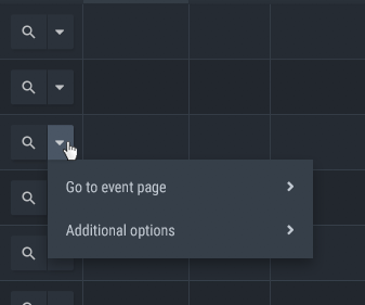
Here's what I came up with. The magnifier opens the modal by default. The link in the context menu goes to a page with the event details there. The user can decide to open the context menu link in a new tab/window.

final solution

Your Answer

By clicking “Post Your Answer”, you agree to our terms of service and acknowledge you have read our privacy policy.

Not the answer you're looking for? Browse other questions tagged or ask your own question.