1

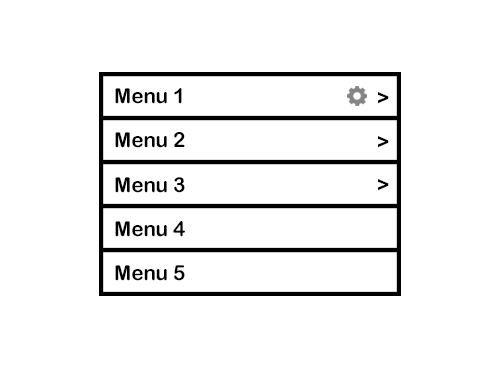
When you tap on Menu 1, it will take you to a different screen. However, tapping on the cog icon will take you to another screen to manage its Settings.

Initially, instead of the cog icon, it said "Settings", but because of internationalization issues and this word being possibly long in other languages, we decided to just use a cog icon.

Do you think this is the most efficient way of laying out a menu item that can have two actions associated with it? Maybe the cog icon should be next to the text itself instead of the arrow?

I also thought about swiping to the right to reveal the cog icon, but doesn't swiping to the right normally mean delete?

Are there other interactions that you would suggest?

enter image description here

3
  • Beenster, edited your title to avoid your question to be flagged as primarily opinion based
    – Devin
    Commented Jul 21, 2016 at 1:34
  • Also, the settings are applied to the menu itself, or to the content this menu item represents? This is a massive difference and possible solutions are different as well
    – Devin
    Commented Jul 21, 2016 at 1:36
  • It's applied to the menu item itself. By the way, thanks for updating the question.
    – M Bo
    Commented Jul 21, 2016 at 1:37

3 Answers 3

2

Oh! I thought menu 4 & 5 weren't tappable because of the missing arrows. So based on this new information and your comment on Big_chair's post I have the following idea:

Results

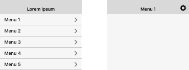
User will be sent to "Menu 1" screen when tapped on Menu 1. On the Navigation Bar of Menu 1 a cog will appear, making the user able to edit the settings (either on the same screen or another screen). This cog will not appear on the others menus screens.

2
  • It must've not been clear on the visuals, should've added arrows to all of them. But they are all tappable. However, for Menu 1, while it is also tappable, it has to have a settings page that leads to another screen that's different from the screen for when you tap the arrow.
    – M Bo
    Commented Jul 21, 2016 at 14:01
  • 1
    @BeensterGreen Just changed my answer based on this new information. Commented Jul 21, 2016 at 16:59
1

How often dos the user need to access these settings?
Because if it's only occasionally, then I don't think it's necessary to display that option permanently.

How about this:

enter image description here

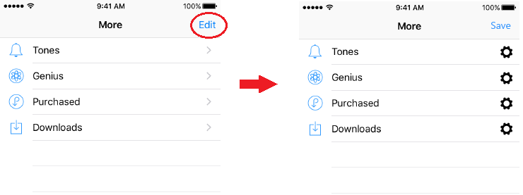
Display something like "Edit" in the top right corner. When the user taps that control you display the settings icon on all the rows.
Then it will probably also be clear what the icon does.

Also, check the Apple HMI guidelines for further references to the TableView.

1
  • Thanks for your reply. Hmm, I think that's a good idea, but there's only really one settings icon and that's for Menu 1. The other menu items don't and won't have settings. And yes, this is something they'd access only occasionally.
    – M Bo
    Commented Jul 21, 2016 at 13:58
0

OK, here's my take: You have at least 3 elements to consider:

  • menu item
  • link to screen
  • a menu item with an associated behavior

While I have no info about what do this settings affect, based on the information provided you have to consider this:

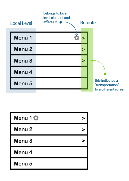
  • menu items are at a "local" level (that is, they show in current screen)
  • arrows are a "shuttle" to a different screen , so they indicate that they'll take you away from where you are (the current screen)
  • settings affect an element that is in the current view. So placing it next to the arrows will indicate that, by clicking that arrow, you'll go to a settings screen, which is not the case.

So, the obvious solution: place the cog next to the element it belongs. Not outside the menu, not at the opposite side of the menu item, just next to the menu item. This way, it's easy for users to see this element is different and it has some associated behavior (which, based on the icon, cognitively indicates that associated behavior is settings) , while it will be obvious all other items' arrows indicate they're going somewhere else (hence, leaving the current view)

see a quick mock and explanation below:

enter image description here

Your Answer

By clicking “Post Your Answer”, you agree to our terms of service and acknowledge you have read our privacy policy.

Not the answer you're looking for? Browse other questions tagged or ask your own question.