2

I have a notification panel which is designed for users to receive notification once something wrong or changes happens in the system. So there are two tasks that are for regular checking. These two tasks are allow users to set the frequency (How often to run the tasks).

I have come up with two designs:

1. Multi-select menu

enter image description here

This one user can input the numbers and select the timer such as second, hour, day and month.

2. Slider

enter image description here

This slider design is really good for mobile. But I have to limit the user, less flexible.

Question:

Which one is better and why? And how does frequency setting design in website view and mobile view?

Thank you.

3 Answers 3

3

Which one is better and why? And how does frequency setting design in website view and mobile view?

Among the choices you have given (slider and drop-down), drop-down is far better than the slider design (regardless of website or mobile) due to these problems with your slider

1) Just by looking at your slider I cannot make out which different options are available for me as a user.

2) If I already know which value I want to select, it can be difficult to reach a specific values if there are too many options in the slider. For example, if a user wants to select the timer such as second, hour, day and month (as your had mentioned in your problem), then it may not be easy for them to reach a specific value (for example try reaching 1 hour, 15 minutes and 10 seconds).

4
  • You made a good point. I understand that it is difficult for users to select desired value right away when using slider. However, slider is better for reducing input validation.
    – Shaohao
    Commented Jan 15, 2016 at 14:04
  • @shaohaolin wouldn't you be pre populating the drop down with valid values only? Commented Jan 15, 2016 at 14:31
  • Just one value will be pre populating, the 12 hours. Other than that, will be a free input text box with selected drop down menu for time unit.
    – Shaohao
    Commented Jan 15, 2016 at 15:12
  • @ShaohaoLin 1) it is still easier for user to enter correct value 2) You can still prevent error by disallowing non-numeric input on the text-field. Commented Jan 15, 2016 at 17:54
3

What qualifies as a good UI implementation for desktop and mobile differs slightly. It also depends on the context in question. User probably wouldn't be able to tell the difference between 15 minutes or 17 minutes, 30 seconds or 1 minute notification.

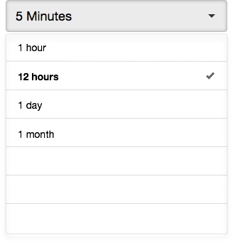
I would do away with free text input box and replace with a drop down to limit the choice. The selection from the drop down also serves as recommendation for the timing of notification. Reduce the cognitive load from the user so they can perform the task more efficiently.

You might want to consider switching between these two interface depending on the platform used to access the panel (media queries for web app). Used the drop down when the user access via desktop and have it switch to slider while they are on mobile. Assuming that the options remain the same.

Hope that helps..

enter image description here

3
  • Can you explain a little more of the second paragraph or maybe provide a screen shot example?
    – Shaohao
    Commented Jan 15, 2016 at 14:06
  • I have edited my answer to include a screenshot. In my opinion, by llimiting the choices, you simplify the UI as well as give user suggestion on what is the optimal time frequency to run the task.
    – adamsoh
    Commented Jan 15, 2016 at 14:31
  • I do consider this design. There is be an issue that how many choices should I give the user as my question mention before. My range covers from second to months. So the drop down menu might be a problem if there are 20 choices. For example, should include 2 hours, 4 hours, 6 hours as options?
    – Shaohao
    Commented Jan 15, 2016 at 15:14
1

Before choosing between them, you should think of the best possible version of each one. Eg:

Text Box

You could let the user type freely but also offer some default options to make them easier for them (Google Calendar does this)
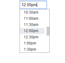
enter image description here

In the case the possible values are not too much you could offer an spinner

enter image description here

Slider

I suggest to read this N.Nielsen article Slider Design: Rules of Thumb. I'll quote its summary and conclusion:

Summary
Selecting a precise value using a slider is a difficult task requiring good motor skills, even if the slider is well designed. If picking an exact value is important to the goal of the interface, choose an alternate UI element.

Conclusion
Use a slider only when the precise value won’t matter to the user, but rather only the approximate range. Make sure that the users can select that range correctly without having to struggle too much to hit a precise value. In addition, any slider labels must be displayed above or beside the slider, rather than below it, in order to remain visible while the user is selecting a value. Alternatively, consider a different UI element that allows users to tap or even type to specify their choice rather than relying on press-and-drag gestures.

Final comment

You need precision so go for the text box, just try to enhance it with another control if possible (which should be chosen depending on each scenario) to offer users some completion shortcuts.

Your Answer

By clicking “Post Your Answer”, you agree to our terms of service and acknowledge you have read our privacy policy.

Not the answer you're looking for? Browse other questions tagged or ask your own question.