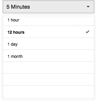
What qualifies as a good UI implementation for desktop and mobile differs slightly. It also depends on the context in question. User probably wouldn't be able to tell the difference between 15 minutes or 17 minutes, 30 seconds or 1 minute notification.
I would do away with free text input box and replace with a drop down to limit the choice. The selection from the drop down also serves as recommendation for the timing of notification. RemoveReduce the cognitive load from the user so they can perform the task more efficiently.
You might want to consider switching between these two interface depending on the platform used to access the panel (media queries for web app). Used the drop down when the user access via desktop and have it switch to slider while they are on mobile. Assuming that the options remain the same.
Hope that helps..

