2

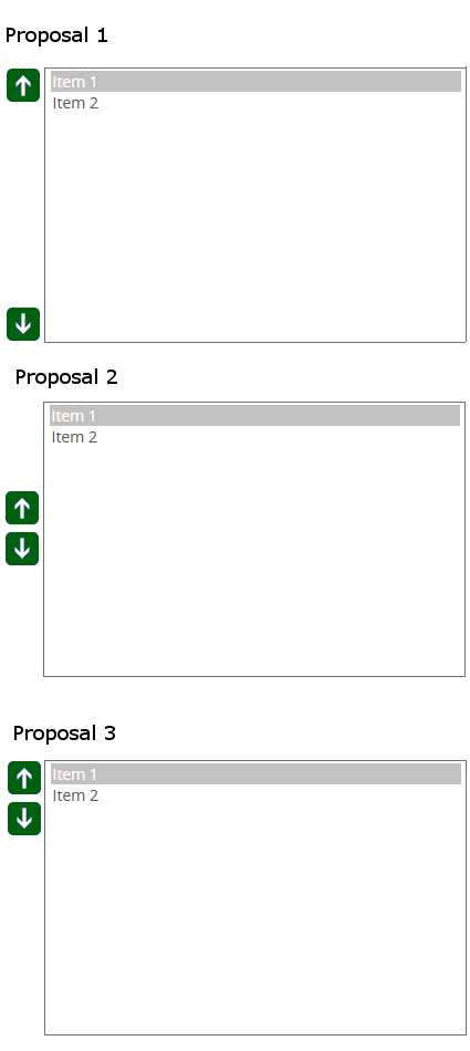
I'm currently working on a interface that allows the user to order elements within in a box by using two arrows(up/down). Having designed and implemented controls of this nature in the past(some allowing for multi-select movement), I'm of the opinion that the location of the two arrows should at the top and the bottom of the relevant list box(Proposal 1).

Others, believe that the interface should be designed such that the arrow are connected and centered against the window(Proposal 2)

While googling around, I've found that still others have proposed interfaces where the icons are connected but aligned to the top of the box, such as(Proposal 3) enter image description here
Much of this may simply be a matter of opinion, as there are many designs already present on the internet with different layouts. However, I would like to know if there exists a standard in the way that these things are created and if so where are they currently being used, is there any "large"(1,000,000+ users) website that has already tackled this question? Maybe this design is outdated and has already been solved by tackling the problem in other way such as drag and drop, or incorporating the up down buttons inside each item, etc... I think the question still is a valid one though as I've created this sort of design for older platforms that do not have all of the flexibility given in HTML, and many of the alternate ways of accomplishing this functionality depend on modern UI language(such as HTML or WPF)

I would like to think that many such controls have already been created and that the community would have already come to a consensus on the most intuitive way to do this, has that been done? If so, then which of the three would be then be considered the most intuitive?

EDIT 1

@MichaelLai has pointed out quite correctly that the decision where to place the arrows or even to place arrows at all is very broad and can depend on the design of the application rather than having a go-to default standard or rule.

I think for this question I should clarify that I'm looking for the best location/orientation of the arrows, rather than some other design including drag and drop or arrows within each item. I have designed such systems in the past and they work well for the products they were used in but I think for this specific question I would like to limit the possible answers to only ones that preserve the basic elements of the proposals(two buttons, and separate window). My hope is that independent of the specific page(or application) I can determine a standard set of rules to determine where I place my arrow icons(if this is even possible).

2 Answers 2

2

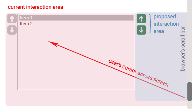
Well, I'd go with your 3rd option, only that on the right. Since most people is right handed, that will prevent your users have to go across your element every time they want to interact with it. And having your buttons close together requires minimum effort to scroll up and down.

I did a very quick sample to visually explain the concept and how you reduce interaction areas

enter image description here

If you need more information on similar subjects, you should take a look to Fitt's Law which explains this concept more in depth

3
  • This is a interesting observation that you made, that the arrows should be to the right of the box, in the examples I posted I made a(unstated and unclear) premise that the listbox would belong on the right side of the screen and that the user would flow left to right, ultimately ending with the list box up and down functions. But I guess more broadly the example you posted likely makes more sense not knowing any other details of the layout(or just asking the question more generally). Commented May 24, 2016 at 18:34
  • I do wonder though, you find the "minimum effort to scroll" preferable to the "anesthetic" qualities of center alignment or proposal one, maybe its all a matter of option, but I wonder do you know of another example of where this is used? I would like to see some real life examples, I'm sure this is being done all over the place, I just can't seem to find any(public) example to compare to, other than some old windows forms examples on google images. Commented May 24, 2016 at 18:36
  • If your form element is at the right, then more reason to place the controls on the right since this minimum effort is really minimum. Also, scroll controls at the right of the element are the default in almost any system I know, I'm not sure if I ever saw controls on the left, probably not.
    – Devin
    Commented May 24, 2016 at 18:47
0

You should realize that there might be very specific reasons why those arrows are placed where they are on the screen, and those reasons might not fit with your purpose.

The other thing is that without a sensible scale or idea of the number of items and the exact frequency and context of usage, it will be hard to determine what the optimal option might be (and this could also change as the application adds more functions and features).

You also have to consider all the other UI elements that surround this particular component, and all the other design patterns and UI components you are going to be using, and whether this design decision has any flow on impact.

Lastly, you could also explore the option where the arrows could be created alongside the individual items, which is actually a common strategy as well if there are a lot of items spread across a large screen and users have to move the items frequently.

1
  • Your probably right, this could be different based on layout, though I think I can say from experience that the reason in many applications that I have worked on for the position of the arrows to be where they were, has been down to the whim of the individual developer working on them(often times me) rather than a studied methodology of what position is more intuitive. I was rather hoping that there was some sort of popular example that I could use as inspiration and refer to when designing such an interface. I'm beginning to believe that such a thing does not exist :( Commented May 25, 2016 at 2:21

Your Answer

By clicking “Post Your Answer”, you agree to our terms of service and acknowledge you have read our privacy policy.

Not the answer you're looking for? Browse other questions tagged or ask your own question.