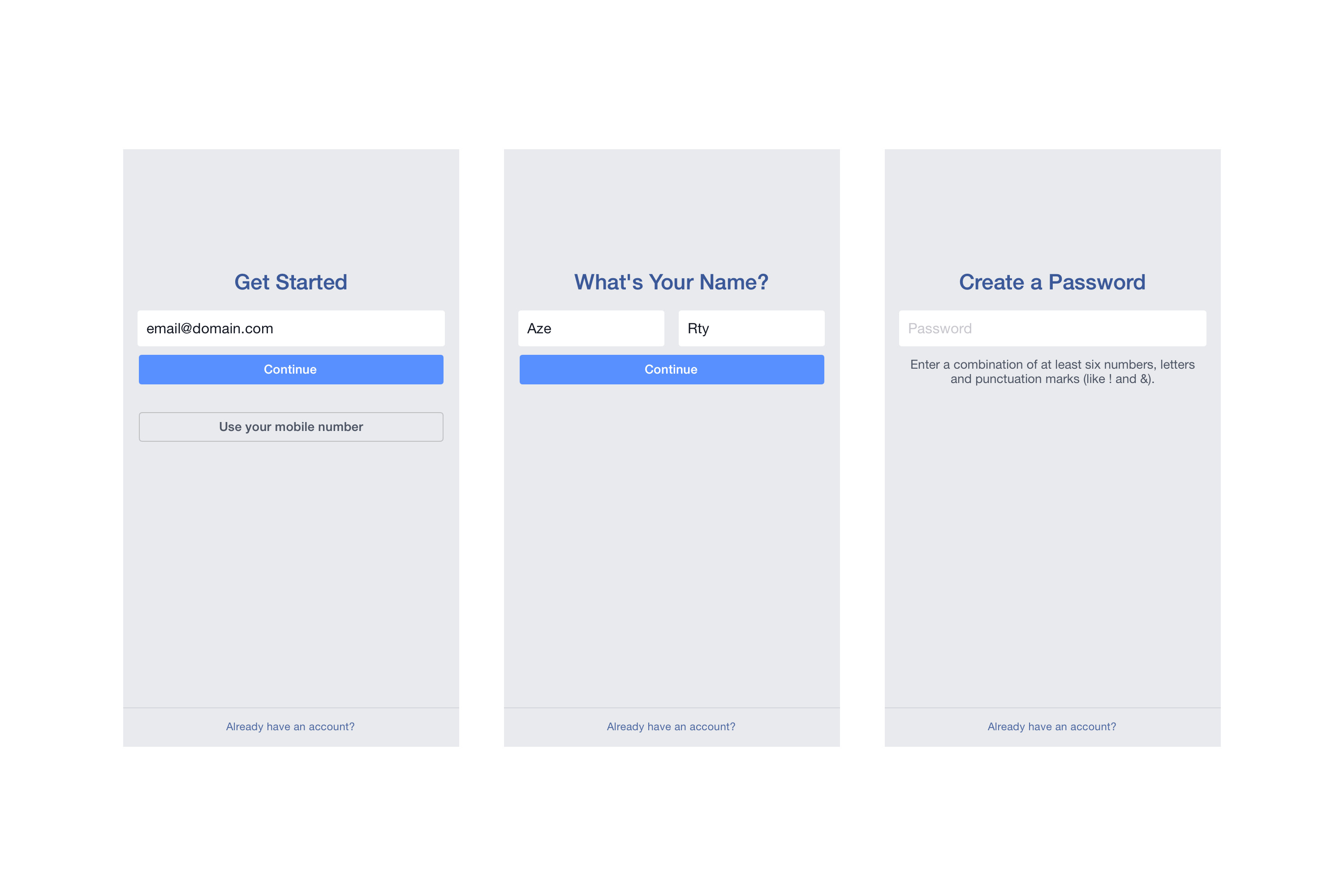
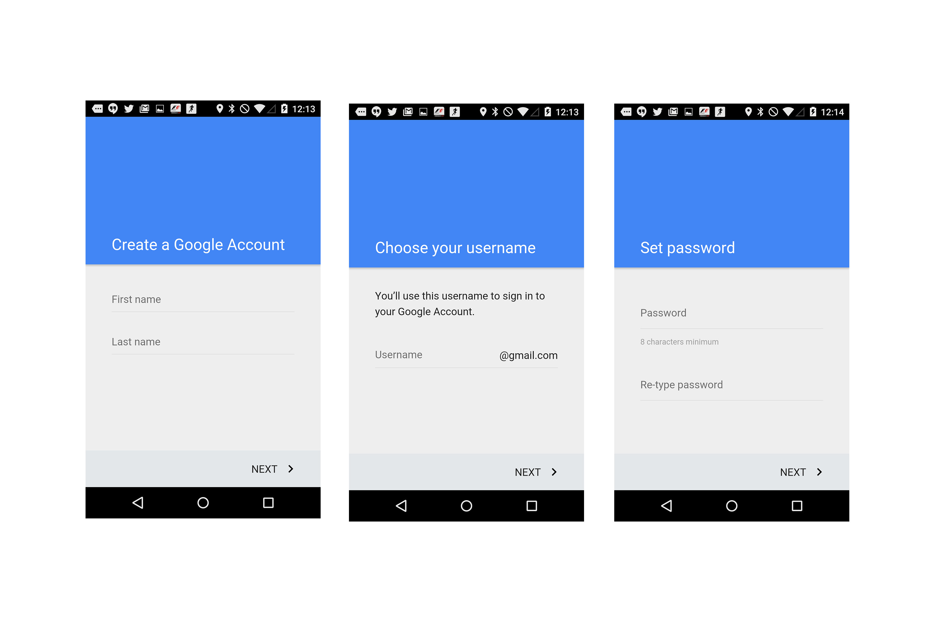
I would like to know if there is some reason to have the account creation tunnel that way.
Is it only because user focus more on an action by page?


I would like to know if there is some reason to have the account creation tunnel that way.
Is it only because user focus more on an action by page?


When designing for mobile first, this approach is very ideal. It will likely lead to more action for the user, but when moving this back to desktop the experience can be cloned.
It is assumed that mobile users might be using this phone while on the go and not on a desk thus 'lengthy' content per page is not very ideal as the user might not be looking at the screen constantly.
I guess it's for having all the focus from the user. Having too much information on the same screen can have a negative effect, give the impression that there is too much to do.