5

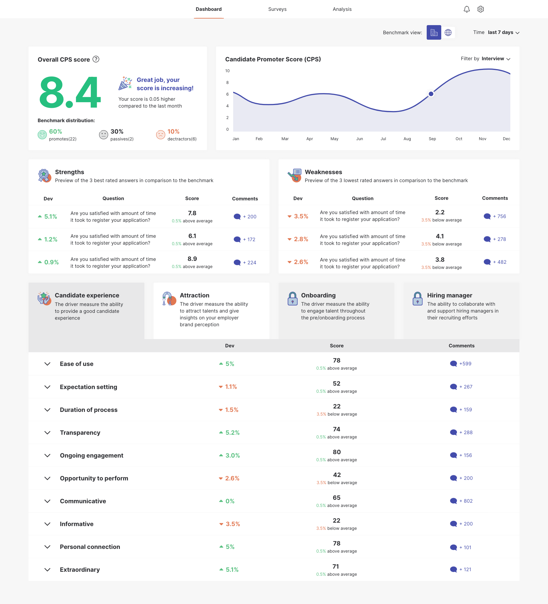
enter image description hereCurrently, I design sections that are locked for the user but also "clickable". When you click on them the user gets an opportunity to contact with sales and CTA button. I wonder how to design this section to make it clear for the user that they are clickable?

The sections aren't in the client's plan, so they should be grayed out...if they are grayed out - how will the user understand that they are clickable? If the sections will be white, will the user understand that they are "locked" and not in his current plan? Any suggestions?[![the dashboard preview with locked sections - currently "grayed- out"][2]][2]

2 Answers 2

4

Don't grey out the sections that are disabled. It is unclear that they are clickable. Make them white like the others, maybe with a slightly blurred overlay or a thick border in orange or yellow-black "under construction" colors. Something that makes them different from the others. Or maybe this isn't even needed, that's up to you to decide. But the grey background is not helpful and is even a bad choice contrast wise.

More important is that you add a button to the bottom with a single line description "You've not subscribed for this yet" and a label like "Subscribe" or "Want this? Contact us!". The lock icon can be added next to the label in the button. But also place one in the upper right corner. That creates a connection between them and the button explains the meaning.

I can only give examples, the details are up to you.

3

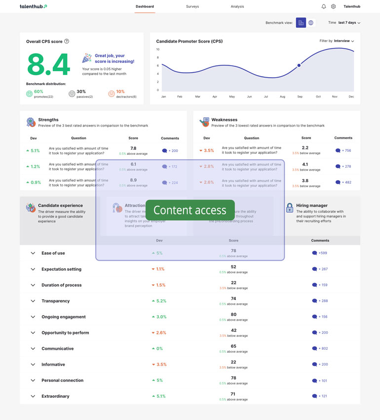
If the section is the whole page (not clear at the explanation), the first approach I can think about is a semi-transparent modal window with a clear CTA access button

enter image description here

4
  • yes and that's exactly what I Work on at the moment :) I'm just concerned if for the user is understandable that the "locked" sections are clickable... Commented Sep 16, 2020 at 13:52
  • 1
    With a clear CTA + text button on the middle of the screen inside a semi-transp. background disturbing to see the whole content... What do you think?
    – Danielillo
    Commented Sep 16, 2020 at 14:00
  • 1
    btw, if you have already tested the example described in the answer, you should have included it in the question. This would save future answers from stepping on the work you have already done. In other words, maximize the resources already used in your search in the question text.
    – Danielillo
    Commented Sep 16, 2020 at 14:33
  • Thank you Danielillo. I'm just concerned does the user will understand that Onboarding and Hiring Manager components leads to other content. I just wonder - if they are grayed-out doesn't seem that they are deactivated - so not clickable? That's the essence of the question. Sorry if I wasn't clear. The modal window appears after clicking into component, the question is does the user understand that this sections are clickable? Commented Sep 16, 2020 at 16:36

Your Answer

By clicking “Post Your Answer”, you agree to our terms of service and acknowledge you have read our privacy policy.

Not the answer you're looking for? Browse other questions tagged or ask your own question.