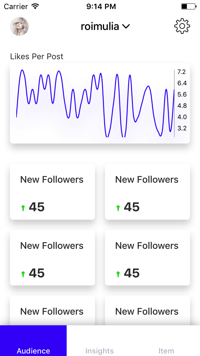
I find ok the approach and I think is ok to have interactive elements that can be clicked in a card layout. Using the same style as in the rest of the app for clickable elements should be enough to suggest the link. You can change the color of the elements in blue on hover and the cursor. You can add an arrow after the clickable title.
For the last question, is important the content in the cards.
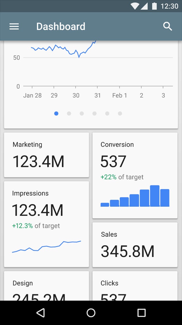
Even is an IOA app, the style seems to be Material Design.
You can find more information about cards here: Material Design - Components - Cards.
When to use
Use a card layout when displaying content that:
As a collection, comprises multiple data types, such as images, movies, and text
Does not require direct comparison (a user is not directly comparing images or text)
- Supports content of highly variable length, such as comments
- Contains interactive content, such as +1 buttons or comments
- Would otherwise be in a grid list but needs to display more content to supplement the image
You can find on Material Design - Components - Cards a similar example, but please note that cards are unnecessary if you have homogeneous content.

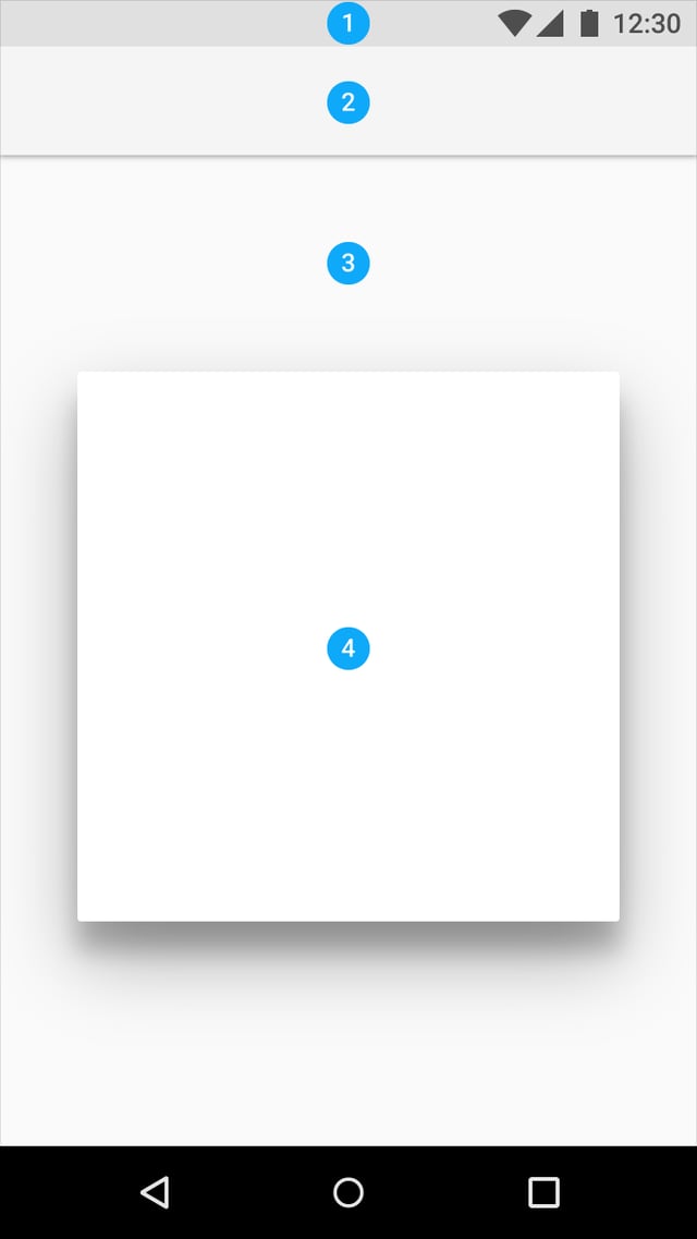
The white background for the cards is ok with the shadow on a light background if you need a subtle effect.
