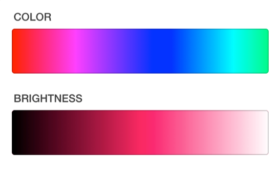
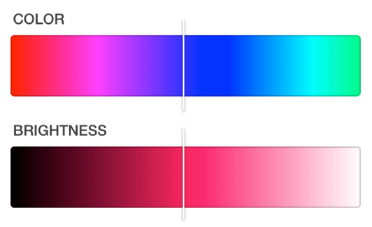
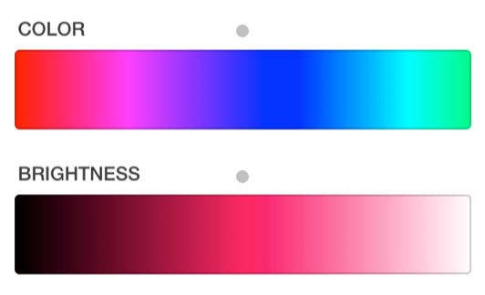
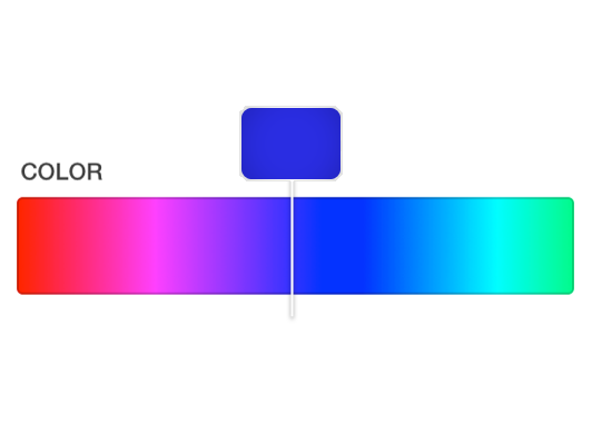
Try using a modified version of the first one, perhaps like so:

What this essentially is is the first one, but with a box above to give an elegant preview of what you are currently pointing at. It will be above the user's fingers, and therefore out of their way.
The reason I chose the first slider is because it has a bar, which is definitely the best way to give an idea of what is being selected, thus making it the most intuitive, and the most elegant.
Some other suggestions I can make is to possibly have the box under the value slider, because of it's position in relation to the color slider will make it crammed to have it over. Although, it is always in your best interest to keep UI consistant, so if you are adding any more than 2 sliders of this type (you have H and V, you can possibly add S) than I highly reccomend you to keep the boxes above the bar at all times (or under, based on where you decide to keep it for the first box).
In response to your requirement
The selector doesn't move at all, it's just the inner part of the selector that moves when you scroll through the colors.
That is reasonable, but for your current problem, I think it is not a good idea to have the box separate, as it can confuse the user.
