9

Perhaps the first example I met was in Windows many years ago and is still with us:

(Image of classic color picker in Windows.)

Pairs of swatches I connected with red line* are nearly indistinguishable. The same in color comb.

         *) freehand[^], yes

In Windows 10 we can spot similar thing:

(Image of accent color picker in Windows 10.)

But the same can be also found in color samplers outside the software world:

(Photo of physical color sampler.)

Is there a reason why they are so close in terms of color space? Who can benefit from picking one such a color instead of the other? Isn't this wasting limited space available for color swatches? Is this caused by low attention paid to the final result or is there any meaningful idea behind this I did not notice yet?

Note: I understand that offered color swatches are not distributed evenly in color space in order to promote certain color design, but still some pairs seem to be unreasonably close and that is my question.

2
  • As shown in shade card above it will be easy for the user to choose from a range of different shades of yellow/red/green etc. Some color may almost look alike but there is a slight difference in shade.
    – NB4
    Commented Jun 19, 2017 at 11:02
  • what @NB4 said. Quite honestly, while they obviously are similar, they look different to me . And for a designer, a small difference in color means something. And same goes for UX... colormatters.com/color-matters-blog/entry/blog-archive/…
    – Devin
    Commented Jun 19, 2017 at 17:24

2 Answers 2

2

A simple answer to the 1st and 3rd Picture: Why are there so similar colors next to each other:

Those are Analogous Colors , they tend to look pleasant together.

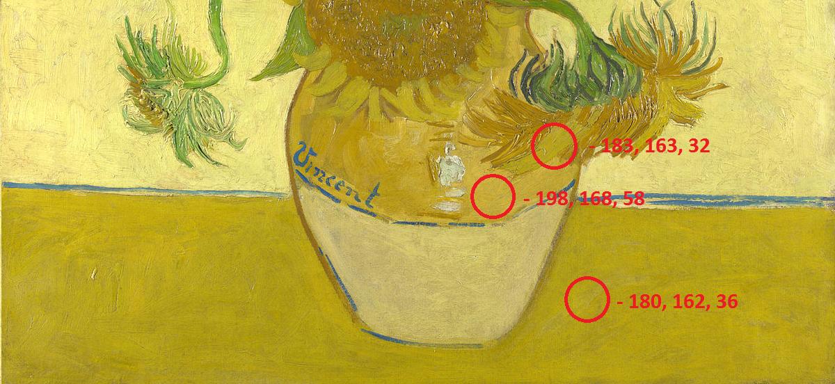
Take this painting "Sunflowers" ( Vincent van Gogh ) as an example. All those colors are alike and some hardly any different from another (The pot and the flower and the desk p.E.)

enter image description here


To the 2nd:

I can not tell you 100% why they decided to put similar colors in there for background themes, but maybe

  • They wanted to provide more choices and just put shades of colors in there
  • They know that those colors are popular and provide similar colors because the users want all of them

Edit: To be honest on my Windows Phone I switched between all those Blue Shades to choose one because even though they are all alike, I just preferred one more than the other.

1
  • Thank you, with hindsight, this answer seems to me good enough in all aspects.
    – miroxlav
    Commented Mar 7, 2019 at 12:03
1

The physical color sampler is organized like that for a reason: the user will be deciding which shade of yellow to pick, and it's easier to compare them side by side. The same thing with the color comb example you gave.

As for the other Windows color pickers, it seems odd to me as well, it's harder to decide which orange to choose when they have another color in between them (the grey background plus the white/black frame will create an optical illusion that makes it harder to distinguish colors accurately).

Your Answer

By clicking “Post Your Answer”, you agree to our terms of service and acknowledge you have read our privacy policy.

Not the answer you're looking for? Browse other questions tagged or ask your own question.