1

When designing a website/mobile you need to choose your neutrals. But I can't get my head around it. Sure I can move the color picker around but I'm trying to generate neutrals in a controlled, consistent and reproductible way. So a bit of methodology would be much appreciated.

I tried generators such as grayscale.design, tints.dev, etc. but there's something I don't get. These generators usually give you a set of ~10 tints and shades by default. Adding more values and you loose contrast between them (I read that best practices are to maintain some sort of contrast ratio between them). Removing some values and you end up with few values to assign to you UI.

Honestly, I feel that even 10 tints and shades are not enough.

First, you generally use only the dark ones and the light one, killing the middle values. So you end up with 5-6 values at best.

Second for a wide range of UI elements. Text, secondary text, muted text, placeholder, inverse text, icons, background, primary surface, secondary surface, tertiary surface, fill, borders, etc.. then you have to multiply those UI elements by the different states: hovered, active, selected, disabled... See the issue? 5-6 gray for dozens of UI applications.

I see lots of article saying that designing your UI in grayscale first before adding colors helps managing contrasts for accessibility but how can I design a whole website with my 5 to 6 gray values.

What are you methodologies to generate enough neutrals, that are spaced enough in term of contrast ratio, that you can assign to dozens of UI elements, each in different states?

2 Answers 2

1

A pretty standard model at the moment is to do something like Material's color scale system, where you pick a primary, secondary, and neutral color, and then make gradations that you'd assign a number to (50 or 100 as the lightest values, 900 as the deepest or darkest). All of your colors stay in the same family, so you don't need 6 different bespoke shades of gray.

This article has some other tips for picking good neutrals, including alternatives to pure black, white, and gray.

0

I see several problems with your statements.

1 - You mention only 5-6 gray, discarding white and black, which are elements of wide relevance in design. The result is not just six grays, but eight contrasting tones.

2 - I think you make an equivalence of elements to be represented with the number of colors and that's not real. An element can have several representations using a few colors in different combinations. An example below with black, white and two grays:

enter image description here

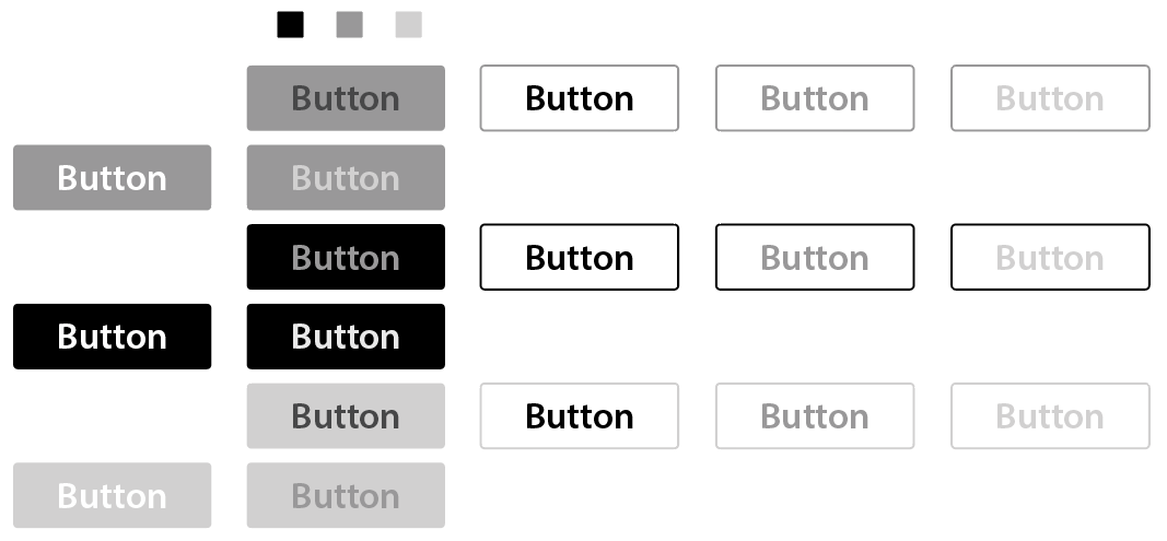
3 - You define all the elements to be represented at the same level and it's more than likely that several of them do not need maximum contrast in relation to functionality. For example, to differentiate rows of a table it is not necessary for one to be black and the other white, a minimum contrast is enough:

enter image description here

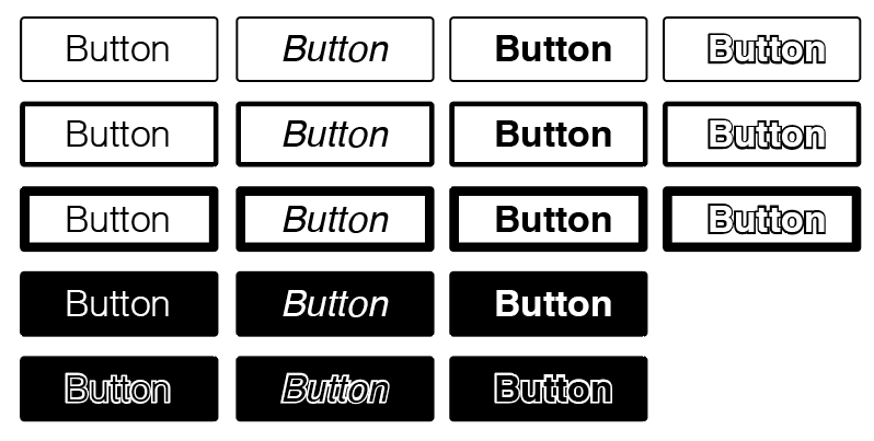
4 - Not everything is resolved with color, there are other types of contrasts. The example below: same element with black and white.

enter image description here

Your Answer

By clicking “Post Your Answer”, you agree to our terms of service and acknowledge you have read our privacy policy.

Not the answer you're looking for? Browse other questions tagged or ask your own question.