3

I'm working a card-based UI concept which allows grouping. As an example I look at a person and see his tasks and documents (and there could be many more categories): card-columns tasks (3 tasks) and documents (2 documents)
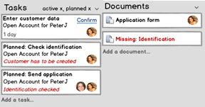
So far so good. Now if I only have one column, it would make sense to use all available space. I could show within one card-column 3 rows (this could mix up, like: column (2rows), 2nd column (1 row), 3rd column (1row).

column with 2 rows

I'm nut sure if this is easily understandable. Google Plus uses 3 rows of cards, but they main purpose is exploring and not searching.

What is the trade-off to have more cards visibile at once vs. more effort of scanning by using multiple columns?

1 Answer 1

1

It makes sense to have multiple columns if:

  1. Your interface is wide and you need to make better use of space. This will be a tradeoff with scan-ability / readability, so you shouldn't do it simply because you have the space.
  2. The logical columns have (or can have) different semantic meanings. In your first example, having two columns makes a lot of sense because they represent different things. Your second example may work, but just by looking at it I can't tell whether it overflows left-right-left or top-down-top, so I'm sure other users will face the same uncertainty. If you're confident (user testing) that this won't be an issue for you users, then go for it. But the only way you're really going to know is by doing user testing.

Your Answer

By clicking “Post Your Answer”, you agree to our terms of service and acknowledge you have read our privacy policy.

Not the answer you're looking for? Browse other questions tagged or ask your own question.