2

I'm redoing the layout for a website that contains technical articles. The demographics are mostly engineers. I'm trying to decide between two different layout styles for the actual article listings, and I was hoping to get your opinions.

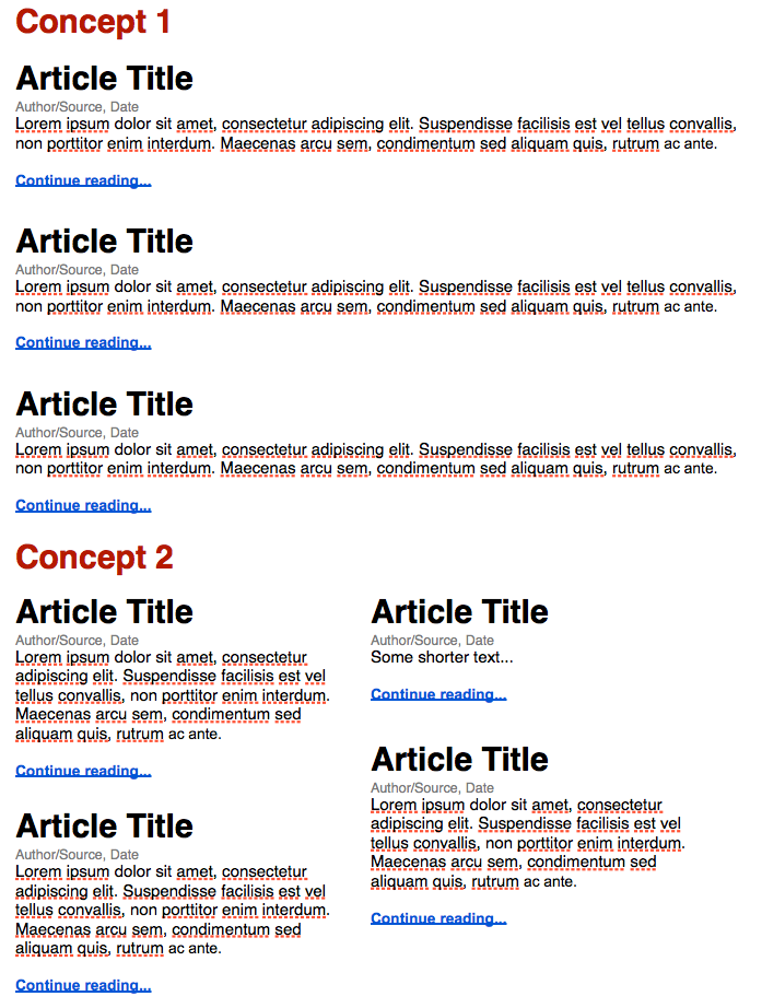
In the first layout style, articles would be placed in a linear fashion, spanning a single column. In the second style, they are laid out somewhat like Pinterest; that is, spanning two columns, and the article height is based on the length of the summary, giving each item a staggered appearance compared to all other articles.

The second layout saves space and manages to fit more articles onto a single screen, but it might get confusing to some users, where the first layout is easy to understand and navigate... or at least, that's what I think, and I'd appreciate your opinions. Again, this layout needs to be geared toward an older-than-average audience of mostly engineers.

You'll have to forgive me, but the easiest way I could think of to illustrate the concept was in an image. The two different layouts are labeled "Concept 1" and "Concept 2" in this image:

Two layout concepts

5
  • 3
    Is there a specific ordering to the articles? If so, that might push you towards something more like #1 than #2, IMHO.
    – rbwhitaker
    Commented Feb 13, 2014 at 21:07
  • 1
    Concept 1 because that's what usability experts do. Commented Feb 13, 2014 at 23:17
  • 1
    You need test it, with eye tracking if it's possible. But, I think the concept 1 seems reduce the cognitive load better than 2.
    – user43016
    Commented Feb 14, 2014 at 3:21
  • 1
    I think this question is too vague, since it really depends on a lot of other variables. But I would advise you to maybe checkout link , since I think SE has probably searched what engineers tend to like in design aspects.
    – user39400
    Commented Feb 14, 2014 at 5:39
  • Concept 2 has the added challenge that your typography/styling needs to be such that body text base lines in each column line up exactly. If they don't that will detract heavily from the aesthetics and readability. I have yet to find a magazine, newspaper or any other multi-column publication that respects itself, whose body text base lines don't align across columns. They might be around online (where the type setting may be done by non-professionals), but in print...? Doubt it. Commented Feb 14, 2014 at 17:44

5 Answers 5

5

First, don't think that concept 2 gives you more space, that is a common error usually caused by poor design and understanding of the idea of presenting a summary. If the summary is going to be, let say, 100 words on concept 1, it has to be 100 words on concept 2 also. Plus if the font size is going to be, let say, 10pt on concept 1, it has yo be 10pt con concept 2. You can make some minor adjustments, but don't assume that one gives you more space, that is wrong. Concept 2 seems to fit more blocks on screen, but also remember that it requires more white space around.

Concept 1 is a traditional design, which means that everybody will understand it immediately, of course some aspects like sorting have to be addressed, the most common one being newest on top and oldest at the bottom and other pages. Of course you can be using categories instead of chronological sorting, which also would be good as long as you inform the user about that. This presentation is good for one kind of sorting, whichever you decide to use, but you can not mix.

Concept 2 is less common, although also old and used. This design is more flexible if you want to provide more than one sorting option at the same time, which can be confusing if you don't design it properly. If you still use one sorting, you have to make clear to the user what is the order or the elements, left to right and then down or left column and then right column. You should also keep the minimum height of each unit/article tall enough so there can not be two articles beside one.

Two problems that you may have with the second option, is the reduced with of the columns, remember that you have to keep the column to a reasonable width or it will be a bit annoying to read, and it may happen that you have a lot of very short lines because long words don't fit on the space left. Other problem, is scalability to big screens. This is not an intrinsic problem of this design, but more of a typical poor choice or bad designers. Remember that you have to allow for some stretching of the columns on big screens of you will end up with tiny blocks wasting lots of space.

On both options, remember to make clear each unit of information, you can use, for instance, a box or a shadow for each block. This is specially important if you use the concept 2 since it is a bit more cramped.

I'd stick to concept 1, you can always make it look nice keeping all the usability benefits, plus is easier to adapt to different screen sizes.
3

Both layouts are correct, so the choice depends on what this specific group of users prefers. Thus, the only good answer here seems to be: you need to test it.

(Even though I do have my favorite, yet it's just my preference.)

3

I would make the decision based on responsive design.

With that in mind, I personally think concept 1 is the best because it's simpler, cleaner, and much more responsive than the other.

2

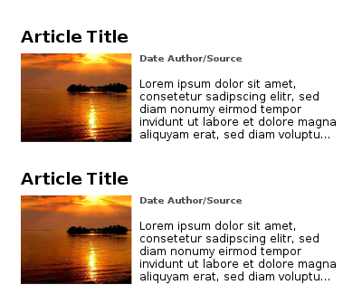
Concept 3

(Image size reduced in width - you need to adjust it to your site of course)
It's basically Concept 1 of your suggestions with Images.
This is the traditional way of displaying short introductions into articles.

Just a few things changed in this design:

  • The "read more..." text has been removed. It's better to link the whole introduction text to the final article.
  • Use images. Images are eyecatchers and most users won't read just a wall of text (tl;dr...)

What you should keep in mind:
Other users have other display sizes, some zoom in or out in their browser and so on.
Try to make your design in a way it adjusts with that or it'll break on some computers.

2
  • Thanks for the tips. Do you have any sources regarding the "read more..." comment? I thought it might be a good visual cue to instruct users that they can, in fact, click on the articles.
    – Nick S.
    Commented Apr 8, 2014 at 17:18
  • Simply use onMouseOver to change the text style. E.g. underline everything. Users already recognize that as a link. Everything else is just my personal experience after creating a couple dozen websites.
    – chill0r
    Commented Apr 8, 2014 at 18:38
0

It depends on what type of site you are making. Concept 1 encourages user to read entries in order, most likely from newest to oldest. The typical use case for it is a blog of a single person or a company or a product.

Concept 2 encourages user to notice and (maybe) read (or shoud I say consume) as many entries as possible. This layout suits better for huge and quickly updating sites (news sites, collective blogs).

Probably the best choice is combination of two, with a larger pane for inline entries and a smaller for quick links which Concept 2 basically is.

1
  • some evidence for these statements would be good, particularly the second, considering that huge and quickly updating sites like Twitter and Facebook don't really use this concept
    – Toni Leigh
    Commented Feb 14, 2014 at 9:42

Your Answer

By clicking “Post Your Answer”, you agree to our terms of service and acknowledge you have read our privacy policy.

Not the answer you're looking for? Browse other questions tagged or ask your own question.