2

There is a docked panel with two columns. I need to give users possibility to choose what content will be visible in which column.

There will be probably 7-8 different content types. My first thought were two dropdown lists in each column (which is not that bad idea). There could be also a Tab solution, but in this scenario we would have to duplicate each tab for both columns. My last idea was something button-like, but it might be a bit confusing.

Navigation above the columns could have buttons for every content type. Clicking a left or right side of the button would activate content in particular column and highlight a left/right bar on the button. The button could have additional icons and be split by two by a dashed line etc. The con is it's something new to users and they didn't got used to id, so might be difficult at first.

enter image description here

Does anybody have other ideas how to approach this? Actually I think, dropdowns might be still the best (and simple! (kiss)) solution.

3
  • To me it kind of depends on what kind of "content types" you mean, and what other options are available. If there are other options available I'd put an "Edit" gear ⚙ and have a settings sheet that included the content type. (I might go that route anyway to avoid UI clutter.) Commented May 14, 2017 at 14:24
  • Could you explain a bit better what your example is supposed to achieve? What you describe initially sounds like 2 columns with settings, but your example shows 4 columns with in total 8 tabs. (side note; is the amount of columns relevant? Are they dependent on eachother e.g. if content not shown left, it is shown right?) Commented Apr 9, 2018 at 20:48
  • @PixelSnader The buttons – I believe – are the different content-types that could be shown in each of the two columns (better names would be Content Type 1, ... Content Type 4, without mentioning "column"). The idea is clicking on one of these will display that content in either the left- or right-hand column (depending on which side of the button you clicked-on).
    – TripeHound
    Commented Aug 8, 2018 at 9:03

2 Answers 2

1

I think I'd agree that a single dropdown above each column is the easiest and most intuitive solution. Having a separate list of buttons (like that shown in your wireframe) introduces an unnecessary level of abstraction by separating the control from the result.

Perhaps if you expected the user to be frequently changing what's displayed in each column (every few seconds) something like buttons or tabs would be more appropriate but otherwise the dropdown idea sounds sensible.

1
  • Thanks @matt-obee, frequent changing was my point for doing these buttons, but just like I said before I will probably stick with dropdown (unfortunately forcing users to make some additional clicks) Commented Feb 13, 2017 at 13:04
0

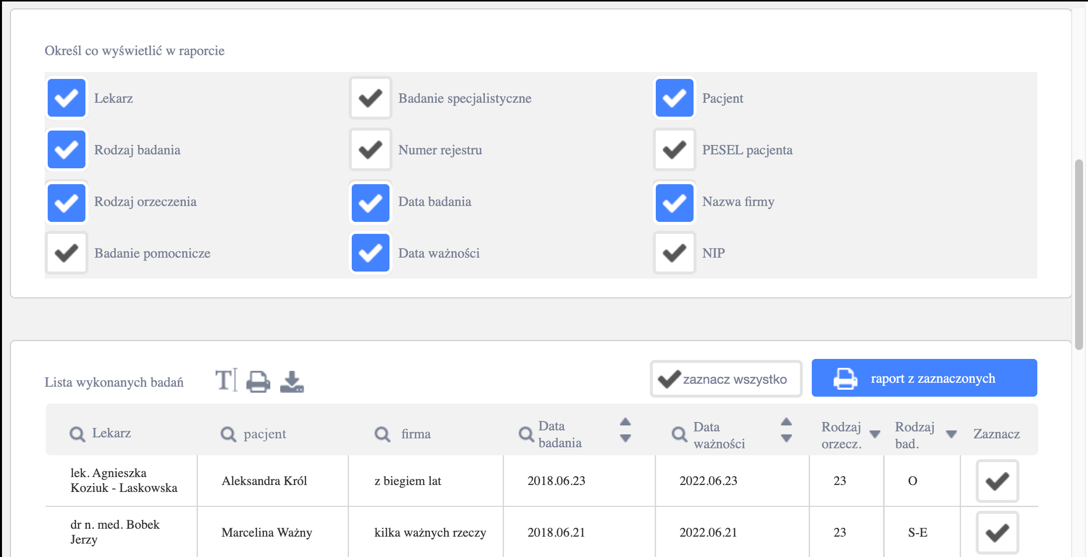
I had a similar problem with my design. I solve it like thisYou can chose what to show in a table by checkers It require more space, but it also minimize cognitive load and number of clicks.

However there is nothing else on this subpage. Only the table and the filters for creating the table. This way proximity is not a problem here.

Your Answer

By clicking “Post Your Answer”, you agree to our terms of service and acknowledge you have read our privacy policy.

Not the answer you're looking for? Browse other questions tagged or ask your own question.