3

My team is developing a widget that uses a grid layout to display a list of webpage links, and we would like to have an inline add button so that our users will be able to add more pages to the list.
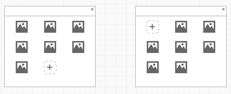
enter image description here

We disagree on where in the list the button should go.

I think that putting it at the end of the list (on the left) is better; it shows where the new page link will show up once it is added.

Another member of the team thinks that putting it at the beginning is better, so that users will always know where the add button is.

1
  • The one on the right (button at top-left) is most standard.
    – Shahar
    Commented Aug 14, 2014 at 22:05

6 Answers 6

4

You need to think about the user flow here. What's being added? Is it common to add something, then, immediately after that you interact with it? Or is this just for the sake of adding new elements?

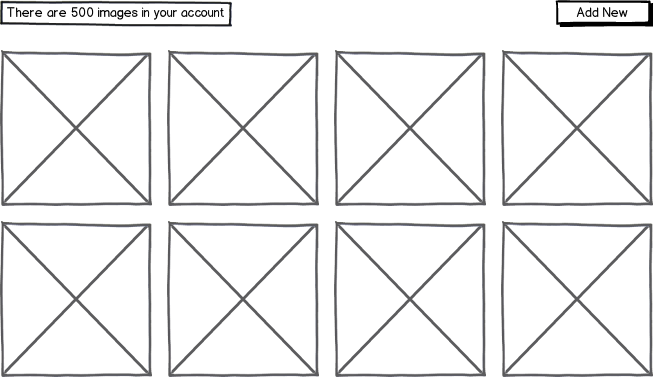
Also, design wise, think about scalability. What happens when that list gets really REALLY long? Does the user have to scroll all the way to the bottom to add another element? That's why having it on the top left (very first thing) is a better way of doing it. Or you could do the following:

mockup

download bmml source – Wireframes created with Balsamiq Mockups

Really think about the user flow and scalability. Knowing that will then help you design a better interface for the user.

1

Here's the actual issue with this:

If you don't put it at the top left, it'll always be in a different position, and thus be less easy to locate for a user.

This is without even taking into account pagination. What are you going to do if there are 10 pages? Stick it on the last page? Stick it on every page?

0

If the latest item will appear on the top, then add the "add button" on the top left. If the latest item will appear at the bottom, then I would recommend adding the "add button" at the bottom.

You guys might also want to consider adding a wide add button, that spans across 3 columns, at the top. That way it'll be quickly visible to the user.

2
  • The add button is very likely going to be used less often than clicking on the page links. Would that influence your answer in any way? Commented Aug 14, 2014 at 22:30
  • 1
    @prototypetolyfe: As you will use the Add button less, can't you integrate it on the top bar, where you have the "X", so giving less highlighting to it?
    – sergiol
    Commented Aug 14, 2014 at 23:27
0

Is this really a choice between just two options? I think there are more solutions than presented. Maybe it's better not to include the functionality for editing the list in the list itself. This way there is a clear distinction between content and functionality.

One option would be to place to the button in the upper right corner. This is, for example, how Apple it does in most of its iOs apps. You could also make it fixed in the bottom. This way, the button will always be there, no matter how many items there are. I always would advice you to make it in a way so that it is coherent with the rest of the system. So both the platform and the design of the rest of the application should influence your design decision.

0

Why not both?

Have it consistently placed at the beginning of the list (top left).

Add new items to the beginning of the list (slide the others along/down).

This also keeps the newest items more visible (at the beginning of the list), and older items less visible (towards the end) - which may be preferable, depending on what your use case is.

0

My opinon is that the new button should be at the end of the list. This will also force your users to look through the list before adding, and maybe this is something you want them to do e.g. avoid duplicate links.

Consider also adding a button that will take you at the end of the list.

Your Answer

By clicking “Post Your Answer”, you agree to our terms of service and acknowledge you have read our privacy policy.

Not the answer you're looking for? Browse other questions tagged or ask your own question.