0

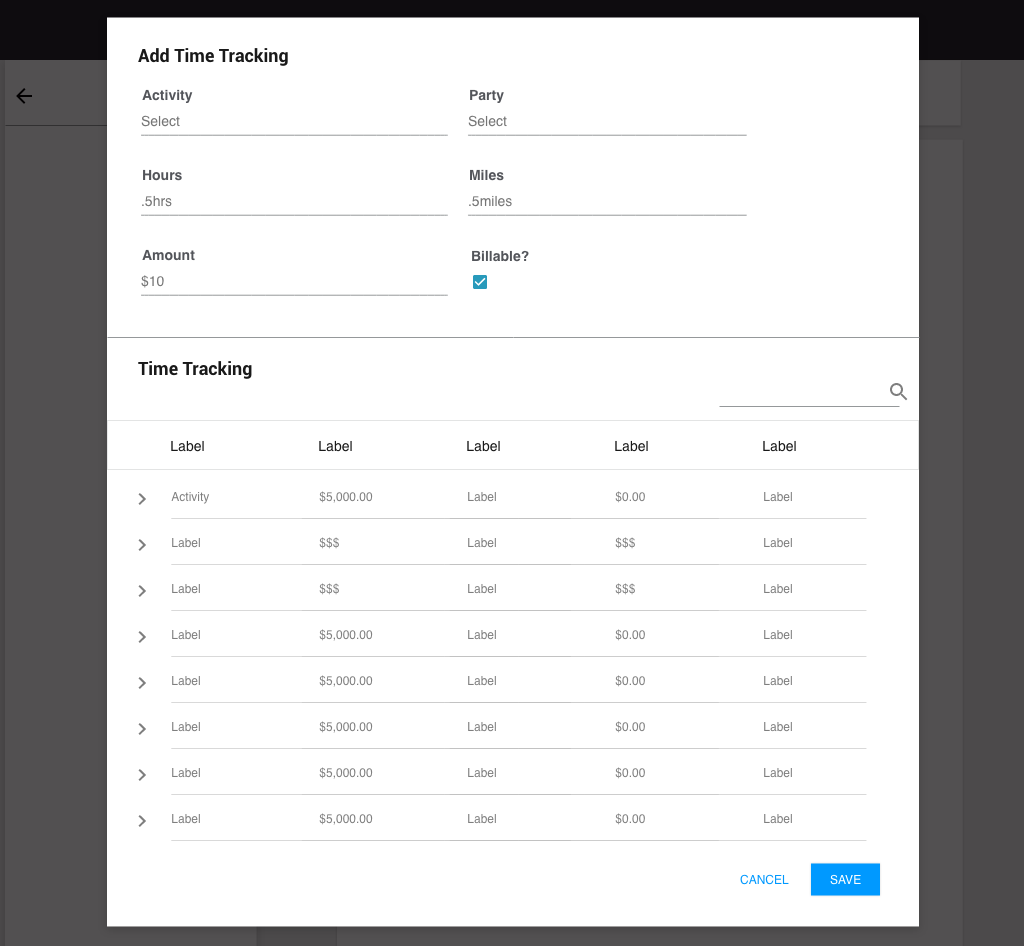
My team and I have run into a scenario where we want to be able to add time tracking to every part of the system. However, we need a way to see what has already been tracked, so the users don't duplicate what they already have done (we wouldn't want to overcharge!). The only solution that I can think of is putting the grid of all time tracking below the required fields needed to make a new row .

I was curious to see what your general thoughts of having a grid in a popup.

enter image description here

1
  • 1
    Will the Time Tracking section be all time tracking entries? Is there a way to identify a duplicate entry based off some field?
    – Tory
    Commented Nov 1, 2016 at 16:00

2 Answers 2

3

There isn't anything inherently wrong or right in using a grid on a popup. As everything in life (and specifically UX) - it depends. The main question to be answered is - does it provide value to the time tracking process? There are few parameters that influence such a decision:

  • What do you expect the user to learn from it? Let's say that you solve algorithmically the problem of identifying duplicate entries, why will the user need to see existing entries? Why not simply enter the task time tracking info and that's it?
  • Is it heavy on resources or gpu? That's for the developers to answer, and it may affect the time that it takes for such a popup to load. If it will be too slow, maybe you'd prefer to change the data scope.
  • What is the time scope for such a feature? It's priority? There are different ways to implement this kind of solution, with different levels of complexity. In a perfect world I would suggest to unite the list and the new item fields to a view similar to Google Calendar with inline item editing - but this may take a lot of time and effort to develop, and it's only an internal feature. You'll decide the level that is right for your organization.

As I said, there isn't right or wrong here, just a set of decisions for you to take according to your specific needs and resources.

Good luck!

0

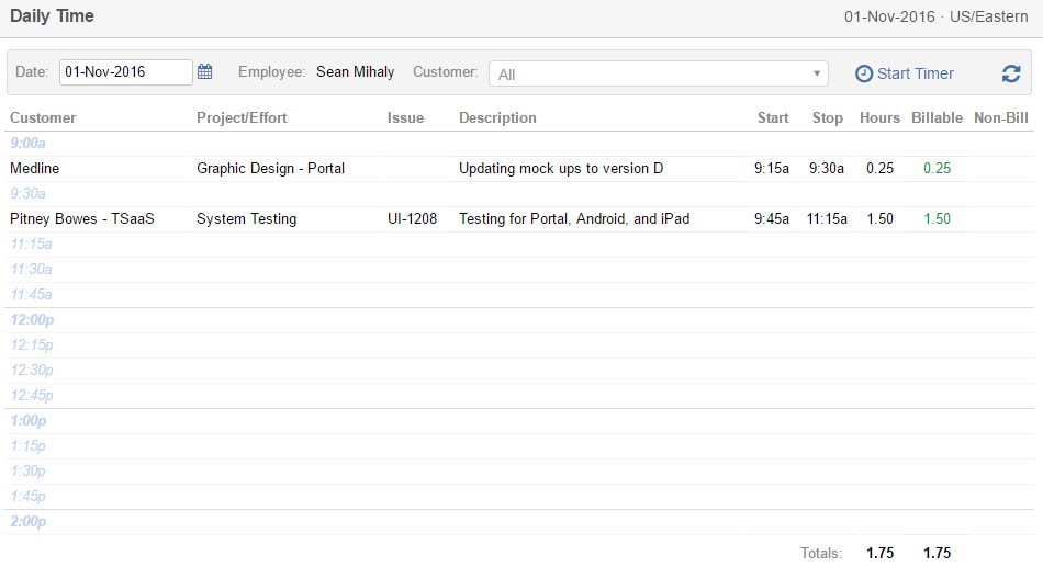
Here is a screenshot of what my company's time tracker looks like. On this page, you can see that chunks of times are truncated down into individual lines instead of showing blocks of time a la Google Calendar. New 15 minute increments appear as the day progresses, but one can still fill those minutes even though it may not have actually hit that 15 minute increment yet.

Time Tracker

So, to answer your question more directly, I think that a table could work for you, but perhaps consider including a feature like the one I mentioned above, where "spent" minutes are collapsed to help limit the length of the table vertically.

Your Answer

By clicking “Post Your Answer”, you agree to our terms of service and acknowledge you have read our privacy policy.

Not the answer you're looking for? Browse other questions tagged or ask your own question.