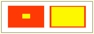
5

I am developing a GUI desktop application using wxPython. It is not a website or any web application. I have four boxes in my GUI. I want them to be distinct. Of course They have a different labels/names also I have a border separating them from each other. Eg image provided below:
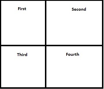
enter image description here

I thought of adding colors to them, to differentiate them better as shown below:
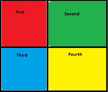
2

My question I was wondering is there any such rule to decide what colors are better in contrast to each other? I mean what colors are best in different to each other. How should I decide what colors to use? My feeling is that some colors are not the best. For eg below:
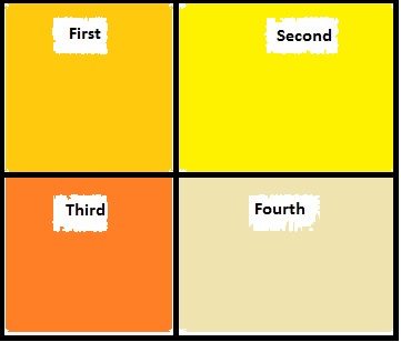
enter image description here

Thanks.

0

4 Answers 4

13

The seven colour contrasts

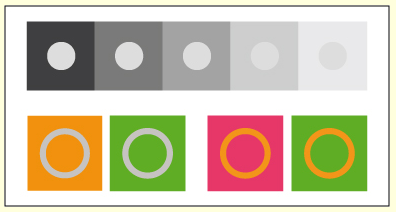
  • Pure Colour Contrast

enter image description here

  • Light-Dark Contrast

enter image description here

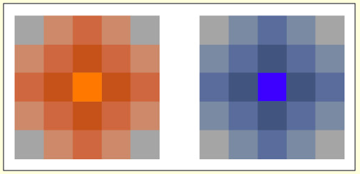
  • Simultaneous Contrast

enter image description here

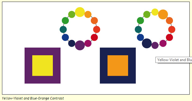
  • Complementary Contrast

enter image description here

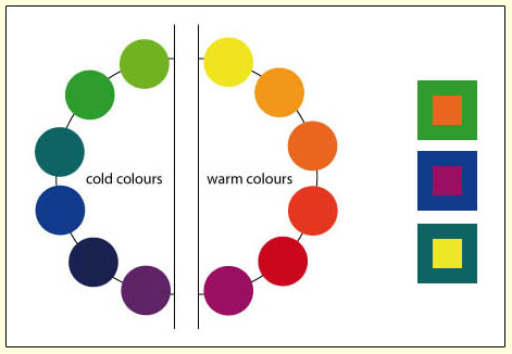
  • Warm-Cold Contrast

enter image description here

  • Quality Contrast (or Intensity Contrast)

enter image description here

  • Quantity Contrast

enter image description here

Read here complete information

0
1

The short answer is that, yes there are. There is a good article listing tools for that already, so I won't simply restate that here.

If you want to know more on colour theory, then I would suggest asking in graphicdesign.stackexchange as this wouldn't be the right place for that.

1
  • Thanks for the link, I first thought of graphicdesign.stackexchange , but then I thought that as I am not creating any graphics/images so they may ask me to move to some where else. :)
    – ρss
    Commented May 12, 2014 at 11:26
1

I would suggest using distinctive icons rather than relying on distinctive colours.

  • Black text on bright primary colours can be difficult to read.
  • Not everyone sees colours the same way, so relying on them to convey information is not ideal.
  • Bright colours should be used sparingly in a UI, otherwise it will feel busy and confusing. Reserve them for a few things that need to urgently draw the user's attention.
8
  • Thanks, 1. I think icons won't help. In my app if the user clicks inside a box some event will start. That is the reason why I need to fill them with colors, so that user knows where he/she can click. Icon will confine the clicking region and user may get confused whether to click on the icon or where else. 2. Regarding the text, the text will have a light background as shown in image 3.
    – ρss
    Commented May 12, 2014 at 11:24
  • @pss What are the actions? If you give me more details of what you are trying to achieve I may be able to give some nicer suggestions.
    – Franchesca
    Commented May 12, 2014 at 11:27
  • My app contains a frame window. This frame window contains an image with different boxes. Below the image there will be a panel, when ever an user clicks on any one of the box a particular value is retrieved from some server(depending upon which box was clicked) and displayed in the panel below. When user clicks on an other box then the value will be retrieved from the server again and displayed and so on.. nothing special
    – ρss
    Commented May 12, 2014 at 11:48
  • @pss so the value only depends on which box was clicked, i.e. there are 4 different values?
    – Franchesca
    Commented May 12, 2014 at 11:57
  • Yes, any how I don't see any relation between the values/events and the color of the boxes. Please correct me if I am wrong. My question is for the different colors of the different boxes. So, I think we should not discuss about what happens upon clicking of the boxes, because the image containing these boxes is never going to change in any manner(color, size etc.) during the the execution of my app.
    – ρss
    Commented May 12, 2014 at 12:04
1

Consider making the backgrounds the same or very similar and differing using the foreground (text) colors instead.

If you do differ the background colors, please make sure they do not defer much in contrast, so that viewers' eyes will not have to adapt to the varying intensity levels when moving their eyes from region to region. Consider making all the background shades off-black or all of them off-white, so the differences will be easy on the eye (make sure the backgrounds do not differ too much in color).


Personally, I find multiple background colors messy and distracting (e.g. this example), whereas multiple foreground colors help me notice differences, as long as the foreground colors all differ enough in contrast from the background.

For high contrast, where the color differences are more noticeable, use a dark background color with bright foreground colors instead (see references in my answers: [1], [2]).

For guidelines on choosing high contrast foreground vs background colors you can refer to my answer here [3].

1
  • Thanks for the answer. I got some useful suggestions from it.
    – ρss
    Commented May 12, 2014 at 13:02

Your Answer

By clicking “Post Your Answer”, you agree to our terms of service and acknowledge you have read our privacy policy.

Not the answer you're looking for? Browse other questions tagged or ask your own question.