0

I have a text area, and need to make its background color different from the surrounding background (frame, which has other object in it) color. I do not want to make their colors too different, so the difference should be subtle. And I want to use light colors for both backgrounds, and a dark color for the text. As a result, I have the choice of using a slightly dark frame with light text area, or light frame with a slightly dark text area as below.
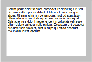
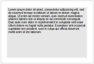
enter image description here enter image description here

What psychological difference will the two have? Is either generally superior than the other? Is there any advice on how much color difference I should have between the frame and the text area? I think that if it is took much, then that will distract the user, and if it is too less, then the text area border will not be clear.

4 Answers 4

1

The second example has less contrast between the text and the background. This will make the text harder to read than the first one. I would go for better readability.

1
  • Thanks for the answer. All the answers seem to converge on the same choice, so I think they are all correct.
    – sawa
    Commented Jul 20, 2014 at 9:51
1

Just ask this question to yourself -- "what would I recognize as a place to type in? A white box? Or a dark box?"

Since you are talking about a textarea where user has to type something, it is good to leave the input area lighter..

1
  • Thanks for the answer. All the answers seem to converge on the same choice, so I think they are all correct.
    – sawa
    Commented Jul 20, 2014 at 9:50
1

I will take white content area for two reasons.

  1. Higher contrast between text and text area background.
  2. Grey background around text area make the text area optically raised. So the place for content will be more readily distinguishable.
1
  • Thanks for the answer. All the answers seem to converge on the same choice, so I think they are all correct.
    – sawa
    Commented Jul 20, 2014 at 9:50
1

For readability, it's necessary to have contrast, but not necessary and even detrimental to have too much contrast. Therefore grey background and black text, or white background and grey text (like #383838) is better than white and black.

This question goes into more detail, top answer (as this is an internal link I'm not going to summarise (plagiarise lol) and I suggest a vote for my answer is combined with a vote for this question and answer(s)):

Is there a problem with using black text on white backgrounds?

Also, I give you the Kindle, a device specifically designed for reading text and which uses shades of grey for background and text:

Kindle Google Image Search

As for the choice, I would look to the left one, where the box stands out more due to being light on dark, but I would not use black for the text.

Your Answer

By clicking “Post Your Answer”, you agree to our terms of service and acknowledge you have read our privacy policy.

Not the answer you're looking for? Browse other questions tagged or ask your own question.